Style combination · Contrasts
Cyworld Minihompy × International Typographic Style
Neutral grid and objective type against a page made of bought ornaments, pastel skins and a cute avatar.
Mix them and make something Cyworld Minihompy International Typographic Style
01
What each style brings
Each part of the design comes from the style with the stronger say in it, and each style gives at least two.
Cyworld Minihompy & Minimi (Korean Mini-Homepage Culture) International Typographic Style
- Type from International Typographic Style
- Colour from International Typographic Style
- Form from Cyworld Minihompy
- Composition from International Typographic Style
- Surface from Cyworld Minihompy
02
The type
Open fonts standing in for each style’s own type, which is often hand-drawn or commercial.
Text · Cyworld Minihompy
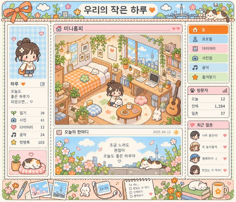
The personal mini-homepage of Korea's Cyworld: one fixed, framed template that every user decorated item by item with a paid currency of acorns (dotori). A title bar; a left column with profile photo, mood line and friend list; in the centre the miniroom, a small isometric room of bought pixel furniture where a small pixel-style avatar (the minimi) lives; a right-hand menu of tabs; and a visitor counter. Selfies, diary entries, guestbook notes and wistful captions made it, in Korean press words, the nation's collective diary and photo album.
Inter; Cyworld Minihompy used Gulim (굴림), the default Korean Windows system face of Korean web pages and Dotum (돋움), the companion Korean system sans
03
The colours
The ground and leading colours come from International Typographic Style, with a counter-accent from Cyworld Minihompy. The ink reads on the ground at 4.5:1 or more.
Cyworld Minihompy & Minimi (Korean Mini-Homepage Culture) International Typographic Style
-
#f2f0e9ground · 36% -
#111111ink · 14% -
#e1251baccent · 18% -
#f58220accent · 14% -
#1f4e9caccent · 10% -
#a9cfe8accent · 8%
As CSS
:root {
  --ground: #f2f0e9;
  --ink: #111111;
  --accent-1: #e1251b;
  --accent-2: #f58220;
  --accent-3: #1f4e9c;
  --accent-4: #a9cfe8;
  --font-display: "Inter Tight", sans-serif;
  --font-text: "Inter", sans-serif;
}
Use it with care
Cyworld Minihompy & Minimi (Korean Mini-Homepage Culture): Cyworld, minihompy and minimi are trade names of a company that has relaunched the service: draw new avatars, rooms and frames rather than copying Cyworld's own items, logo or interface art. Real minihompys hold private people's selfies, diaries and comments; do not reproduce or scrape them as examples. The palette is an evocation of the pastel skins and light frames, not a sourced record of Cyworld's interface colours; the orange is unsourced.
04
The two styles

05
More combinations
With Cyworld Minihompy
- Isometric Pixel Art Pairs well · Borrow a denser pixel diorama for the miniroom panel, but keep the profile frame, photos and friends' comments around it.
- Japanese Dense Web Design Contrasts · Both pack framed panels onto one screen, but the Japanese portal informs strangers while the minihompy decorates one person's page for friends.
- Newtro (Korean New-Retro) Pairs well · Two Korean nostalgia currents: pair a framed minihompy layout with newtro's flat hand-lettered emblems for a 2000s throwback.
With International Typographic Style
- Art Nouveau Contrasts · Ornamental curves against an orthogonal grid make a strong deliberate tension.
- Brutalist Web Design Pairs well · Strip the grid to raw HTML defaults to get a rawer, contemporary take on Swiss honesty.
- Psychedelic Poster Contrasts · Its exact opposite on legibility; borrow one swirling element to break a too-cold Swiss layout.
- Japanese Postwar Modernism Pairs well · Add Japanese restraint and emblematic colour fields to the grid for warmth without losing order.
- American Traditional Tattoo Flash Contrasts · Rational grid and sans-serif against sentimental, hand-lettered emblems: one flash motif on a Swiss layout makes a sharp contrast.
- Graffiti & Hip-Hop Graphics Contrasts · Put a single tag or throw-up over a strict Swiss grid to stage the clash between institutional order and a street voice.
- Pop Art Graphics Contrasts · Set one loud appropriated Pop image inside a strict grid with a neutral grotesque so the irony reads as deliberate rather than chaotic.
- Italian Painted Film Poster (Rome Studios) Contrasts · Grid, restraint and photographic objectivity are the opposite of a crowded painted montage.