Style combination · Pairs well
Corporate Memphis × Isometric Tech Illustration
Its rubbery flat figures often stand inside isometric scenes on the same landing page; keep them small so the grid still rules.
Mix them and make something Corporate Memphis Isometric Tech Illustration
01
What each style brings
Each part of the design comes from the style with the stronger say in it, and each style gives at least two.
Corporate Memphis Isometric Tech Illustration
- Type from Isometric Tech Illustration
- Colour from Corporate Memphis
- Form from Corporate Memphis
- Composition from Isometric Tech Illustration
- Surface from Corporate Memphis
02
The type
Open fonts standing in for each style’s own type, which is often hand-drawn or commercial.
Display · Isometric Tech Illustration
Hello
Inter Tight, standing in for Geometric and neo-grotesque web sans-serifs set flat beside the drawing, such as those of the SaaS interfaces the illustrations sit in (a working recommendation: the style has no settled typographic canon)
Text · Corporate Memphis
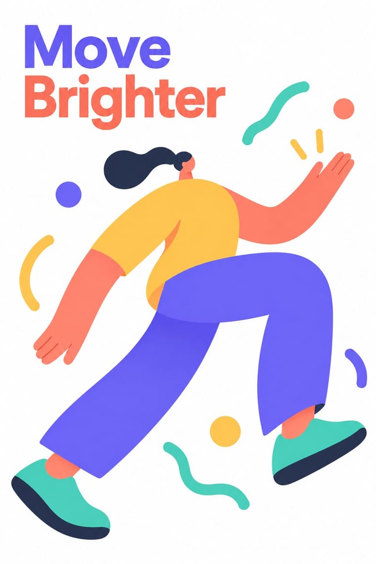
The flat vector illustration style that became the default visual voice of big tech in the late 2010s: faceless, ethnically non-specific figures with elongated limbs and tiny heads, drawn in bright flat colour among blobs, leaves and confetti. Codified in Buck's Alegria system for Facebook (2017) and spread by open libraries such as unDraw and Humaaans, it was later named, half-mockingly, after the Memphis Group.
Hanken Grotesk; Corporate Memphis used Circular and Airbnb Cereal
03
The colours
The ground and leading colours come from Corporate Memphis, with a counter-accent from Isometric Tech Illustration. The ink reads on the ground at 4.5:1 or more.
Corporate Memphis Isometric Tech Illustration
-
#ffffffground · 36% -
#2f2e41ink · 14% -
#ffc857accent · 18% -
#6c63ffaccent · 14% -
#ff7f6eaccent · 10% -
#3ec7b0accent · 8%
As CSS
:root {
  --ground: #ffffff;
  --ink: #2f2e41;
  --accent-1: #ffc857;
  --accent-2: #6c63ff;
  --accent-3: #ff7f6e;
  --accent-4: #3ec7b0;
  --font-display: "Inter Tight", sans-serif;
  --font-text: "Hanken Grotesk", sans-serif;
}
04
The two styles

05
More combinations
With Corporate Memphis
- Polish Poster School Contrasts · Polish poster metaphor and painterly ambiguity show how much illustration can say once it stops being generic.
- Risograph & Indie Print Culture Pairs well · Add riso grain and two spot inks to the figures to escape the over-familiar SaaS sheen and give them printed warmth.
- DTC 'Blanding' / Millennial Minimalism Pairs well · Its photo-led start-up sibling: pair Corporate Memphis figures with blanding's pastel ground and geometric sans when a brand needs both people and product.
- Brutalist Web Design Contrasts · Brutalism's raw honesty is the opposite of this friendly gloss; reach for it when a brand needs credibility over cheer.
- Memphis Design Contrasts · The original's real colour clash, irony and Sottsass or Du Pasquier patterns are the foil to generic confetti blobs; borrow one genuine Memphis pattern to give the illustration an edge.
- Rubber-Hose Revival (Cartoon Mascot Graphics) Contrasts · Both draw stretched figures in flat colour, but the revival gives each brand its own outlined, nostalgic mascot where Corporate Memphis uses interchangeable faceless people.
- CalArts Style (Rounded Cartoon Character Design) Pairs well · Both use flat fills and simplified figures; borrow its pastel UI-illustration palette, but keep faces and expressions, which Corporate Memphis drops.
- Data Humanism Contrasts · Both aim to feel warm and human, but Corporate Memphis draws generic faceless figures for mood, while data humanism draws the specific data of specific people. Replace stock warmth with a drawing of real data when a brand needs sincerity.
With Isometric Tech Illustration
- Bitmap & Pixel Graphics Pairs well · Draw the same isometric world in visible pixels for an eBoy-like, game-flavoured version.
- Claymorphism & Soft 3D Contrasts · Soft, inflated 3D forms against crisp axonometric blocks: the same toy worlds, rendered rather than projected.
- Isotype Pictorial Statistics Pairs well · Borrow Isotype's counted pictograms to turn a diorama into an honest explainer of quantities.
- Low Poly Illustration Contrasts · Faceted meshes with perspective against parallel-projected boxes in three flat tones.
- Indie Pixel Art Revival Contrasts · Clean, front-lit, rational SaaS geometry against moody, side-on, nostalgic landscapes built from visible pixels.
- Isometric Pixel Art Contrasts · Same tilted projection, opposite temper: sparse vector SaaS diagrams on white against a crammed, ironic pixel city.