Style combination · Contrasts
Australian Poster Collective Screenprints × Australian Travel Poster
Forty years later Australian screenprint collectives pasted up land-rights, union and feminist posters that answered the official sunlit image; pair the two to show whose Australia a poster sells.
Mix them and make something Australian Poster Collective Screenprints Australian Travel Poster
01
What each style brings
Each part of the design comes from the style with the stronger say in it, and each style gives at least two.
Australian Poster Collective Screenprints Australian Travel Poster (ANTA Era)
- Type from Australian Travel Poster
- Colour from Australian Poster Collective Screenprints
- Form from Australian Travel Poster
- Composition from Australian Poster Collective Screenprints
- Surface from Australian Poster Collective Screenprints
02
The type
Open fonts standing in for each style’s own type, which is often hand-drawn or commercial.
Display · Australian Travel Poster
Pop
Poiret One, standing in for Hand-drawn Art Deco sans capitals
Text · Australian Poster Collective Screenprints
Screenprinted posters from the political poster collectives and community workshops that spread across Australia from Sydney's Tin Sheds, where Earthworks began in 1971. Early Earthworks posters borrowed psychedelic and Art Nouveau decoration before turning hard-edged and political; Redback Graphix then set fluorescent inks against black. Unsigned, punning and local, they served union, feminist, land-rights and community clients and were pasted up across the cities.
Archivo; Australian Poster Collective Screenprints used Hand-cut stencil lettering and Press-type (Letraset) display faces
03
The colours
The ground and leading colours come from Australian Poster Collective Screenprints, with a counter-accent from Australian Travel Poster. The ink reads on the ground at 4.5:1 or more.
Australian Poster Collective Screenprints Australian Travel Poster (ANTA Era)
-
#111111ground · 36% -
#f2ede3ink · 14% -
#f6e000accent · 18% -
#c8381eaccent · 14% -
#ff8a1faccent · 10% -
#e3b23caccent · 8%
As CSS
:root {
  --ground: #111111;
  --ink: #f2ede3;
  --accent-1: #f6e000;
  --accent-2: #c8381e;
  --accent-3: #ff8a1f;
  --accent-4: #e3b23c;
  --font-display: "Poiret One", sans-serif;
  --font-text: "Archivo", sans-serif;
}
Use it with care
Australian Poster Collective Screenprints: Land-rights posters were often made with or for Aboriginal organisations (the Central and Northern Land Councils, Boomalli) and can include designs, stories and clan imagery that belong to particular Aboriginal artists and communities; the Aboriginal flag was designed by Luritja artist Harold Thomas in 1971. Do not borrow Aboriginal motifs, dot or cross-hatch patterns as a 'protest look'; work with First Nations artists and organisations under protocols such as Creative Australia's Protocols for using First Nations Cultural and Intellectual Property in the Arts.
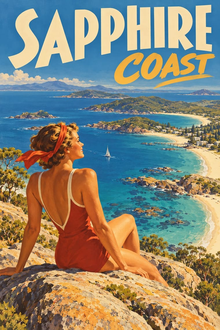
Australian Travel Poster (ANTA Era): This was settler Australia's image of itself for tourists, settlers and investors. Its designers borrowed Aboriginal imagery for 'a distinctly Australian look': the National Library's curators note motifs drawn from x-ray art, rock paintings and material culture, as in Sellheim's boomerang poster of 1957, and Jillian Barnes shows how Trompf's 'Winter Tours to Central Australia' for Commonwealth Railways 'applied the Santa Fe railway aesthetic', the American railroad's romantic tourist image of Native Americans, to Central Australia, replacing 'Indians' of the pueblos with Arrernte ('Arunta') men, and put modern white travellers at the centre and the Arrernte men small, servile and at the rear, standing for the past. Do not reuse its boomerangs, corroboree figures, x-ray or rock-art motifs, or its picture of Aboriginal people, as period decoration: Aboriginal designs belong to particular peoples and clans, so work with First Nations artists under Creative Australia's Protocols for using First Nations Cultural and Intellectual Property in the Arts. Treat its colonial subjects, Cook's landing at Botany Bay and 'the tallest trees in the British Empire', as celebrations of British settlement on unceded Aboriginal land, not neutral heritage. Many posters are still in copyright, credited by the National Library to the Percy Trompf Artistic Trust, the Northfield family and the Sellheim and Annand families: license them or paint your own place and light.
04
The two styles

05
More combinations
With Australian Poster Collective Screenprints
- WPA Silkscreen Posters Pairs well · An earlier public-service silkscreen tradition; combine its calm stencil figures with the collectives' fluoro colour and puns.
- Cuban Revolutionary Poster (OSPAAAL & ICAIC) Contrasts · Cuban posters were state-commissioned single ideas; these were unsigned community jobs with text bands and local jokes, so decide whose voice the poster carries.
- Psychedelic Poster Pairs well · Early Earthworks posters grew out of psychedelic decoration; reintroduce a hand-drawn ornamental border when a hard-edged stencil feels too austere.
- Risograph & Indie Print Culture Pairs well · Today's riso studios inherit the fluoro inks, short runs and collective workshops; borrow Redback's black keyline to give riso colour more punch.
- BUGA UP Billboard Alteration Contrasts · Same Australian dissent, but studio screenprints made from scratch against alterations made on the advertiser's own board.
- See Red Women's Workshop Feminist Screenprints Pairs well · Sister screenprint collectives of the same years; add their brighter inks and halftone for a louder campaign poster.
- Screenprinted Gig & Alt-Movie Poster Contrasts · Both hand-pull flat, hand-lettered screenprints from the same psychedelic root and both reach for fluoro inks; the Australian collectives printed for unions, marches and community causes (and some bands), often from photo stencils, and pasted them up at night, while the gig and alt-movie poster prints for one show, one film and a collector's wall, trading agitation for wit and nostalgia.
- Grapus (French Militant Graphic Collective) Pairs well · Both credit a collective rather than a designer and work for unions and community clients; borrow the Australians' hand-cut screenprint stencils when a Grapus-style idea must be printed cheaply and locally.
With Australian Travel Poster
- WPA Silkscreen Posters Contrasts · The Federal Art Project also made travel and national-park posters in the 1930s, but in flat, layered screenprint for public programmes; set them side by side to choose between commercial painted lithography and a few opaque public-service inks.
- Mexican Calendar Chromo (Cromos calendáricos) Contrasts · Its nearest neighbour by genome: both print idealising painted realism in deep space for a romantic, sunlit ideal. The calendar puts a small sponsor's name under an academic oil-painting melodrama; the ANTA poster sells a place by name, in big drawn capitals on a solid band, with a bather or rider as the traveller's stand-in. Use the calendar for legend and glamour, this for a destination.
- City Pop Illustration Pairs well · Both paint idealised, sunlit leisure places under a deep blue sky; add city pop's hard-edged shadows and empty pools to an ANTA beach for a contemporary resort poster.
- Early Turkish Republican Graphic Design Pairs well · A state-promoted lithographic school of the same years that also advertised tourism under bold drawn lettering. Görey's figures, from his Munich training in Hohlwein's orbit, stand in crisp patches of light on a light ground where ANTA opens a painted vista; borrow its framed emblem and giant letters for a tighter, flatter ANTA sheet.
- Socialist Realist Propaganda Poster Contrasts · The same lithographed naturalism, deep space, giant foreground figures and lettered slogans for official clients. Socialist realism makes the figure a heroic worker on a rising diagonal under red; ANTA makes it a bather, rider or tourist at leisure in a landscape of light. Choose by whether the poster calls people to work or to a holiday.
- Greek Tourism Modernism (EOT) Contrasts · Both are national tourism posters selling sun to foreign visitors under the country's name, but ANTA painted a deep, peopled vista while EOT set one cut-out sign on flat colour; compare them to choose between the painted destination and the modernist emblem.
- Art Deco Contrasts · Its parent: Trompf's colour lithography is described as 'bold, simplified realism in an Art Deco style', and the National Gallery of Victoria's resource for its Art Deco exhibition says Sellheim 'has incorporated a distinctive Art Deco typeface into his designs'. It keeps Deco's capitals, airbrush and flat colour but swaps Cassandre's machine geometry, chevrons and luxury for sunlit beaches, bush and wildlife; use Deco when the subject is speed and glamour, this when it is a place and its light.
- London Transport Design Pairs well · The National Gallery of Victoria traces ANTA's poster programme to the London Underground and LNER posters, and ANTA also commissioned Tom Purvis, the LNER's poster artist from 1923 to 1943 and by the late 1930s 'the biggest name in British commercial design', to make its 1938 150th-anniversary posters for London billboards (NLA Z100). Borrow Pick's fixed emblem and consistent lettering band to hold a series of varied painted views together.