Style combination · Pairs well
Australian Travel Poster × London Transport Design
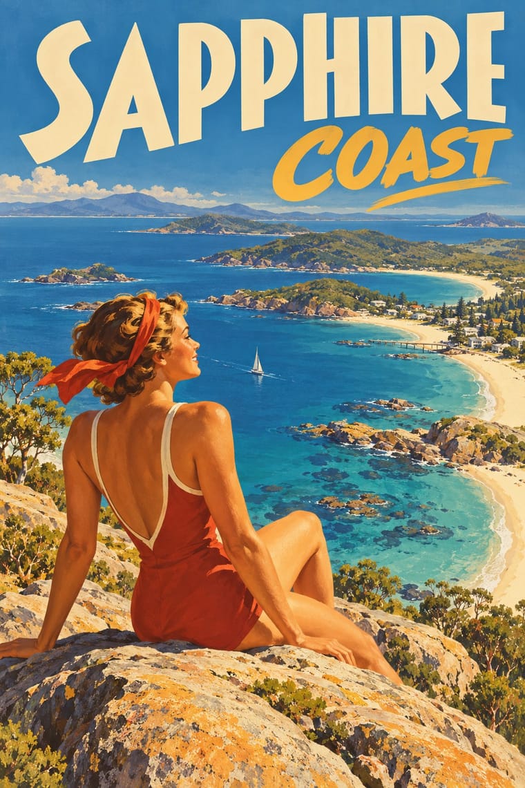
The National Gallery of Victoria traces ANTA's poster programme to the London Underground and LNER posters, and ANTA also commissioned Tom Purvis, the LNER's poster artist from 1923 to 1943 and by the late 1930s 'the biggest name in British commercial design', to make its 1938 150th-anniversary posters for London billboards (NLA Z100). Borrow Pick's fixed emblem and consistent lettering band to hold a series of varied painted views together.
Mix them and make something Australian Travel Poster London Transport Design
01
What each style brings
Each part of the design comes from the style with the stronger say in it, and each style gives at least two.
Australian Travel Poster (ANTA Era) London Transport Design
- Type from Australian Travel Poster
- Colour from London Transport Design
- Form from London Transport Design
- Composition from Australian Travel Poster
- Surface from Australian Travel Poster
02
The type
Open fonts standing in for each style’s own type, which is often hand-drawn or commercial.
Display · Australian Travel Poster
Home
Poiret One, standing in for Hand-drawn Art Deco sans capitals
Text · London Transport Design
The design programme Frank Pick built for London's Underground from 1908 and the London Passenger Transport Board (1933–40), continued by Harold Hutchison (1947–66). Fixed elements recurred across stations, notices and maps: Edward Johnston's humanist sans (1916), the red-ring-and-blue-bar roundel and Harry Beck's diagram (1933). Pick, an admirer of Morris and Lethaby, carried the craft ideal of 'fitness for purpose' into transport. Around those constants he commissioned lithographed posters from many artists, Kauffer, Bawden and Man Ray among them: varied art in one consistent system.
Fira Sans; London Transport Design used Edward Johnston's Underground sans (1916) and Poster artists' own hand-drawn lettering on lithographed pictorial posters
03
The colours
The ground and leading colours come from London Transport Design, with a counter-accent from Australian Travel Poster. The ink reads on the ground at 4.5:1 or more.
Australian Travel Poster (ANTA Era) London Transport Design
-
#f4f1e8ground · 36% -
#1c1c1cink · 14% -
#d0352baccent · 18% -
#d9a441accent · 14% -
#00782aaccent · 10% -
#1f3a93accent · 8%
As CSS
:root {
  --ground: #f4f1e8;
  --ink: #1c1c1c;
  --accent-1: #d0352b;
  --accent-2: #d9a441;
  --accent-3: #00782a;
  --accent-4: #1f3a93;
  --font-display: "Poiret One", sans-serif;
  --font-text: "Fira Sans", sans-serif;
}
Use it with care
Australian Travel Poster (ANTA Era): This was settler Australia's image of itself for tourists, settlers and investors. Its designers borrowed Aboriginal imagery for 'a distinctly Australian look': the National Library's curators note motifs drawn from x-ray art, rock paintings and material culture, as in Sellheim's boomerang poster of 1957, and Jillian Barnes shows how Trompf's 'Winter Tours to Central Australia' for Commonwealth Railways 'applied the Santa Fe railway aesthetic', the American railroad's romantic tourist image of Native Americans, to Central Australia, replacing 'Indians' of the pueblos with Arrernte ('Arunta') men, and put modern white travellers at the centre and the Arrernte men small, servile and at the rear, standing for the past. Do not reuse its boomerangs, corroboree figures, x-ray or rock-art motifs, or its picture of Aboriginal people, as period decoration: Aboriginal designs belong to particular peoples and clans, so work with First Nations artists under Creative Australia's Protocols for using First Nations Cultural and Intellectual Property in the Arts. Treat its colonial subjects, Cook's landing at Botany Bay and 'the tallest trees in the British Empire', as celebrations of British settlement on unceded Aboriginal land, not neutral heritage. Many posters are still in copyright, credited by the National Library to the Percy Trompf Artistic Trust, the Northfield family and the Sellheim and Annand families: license them or paint your own place and light.
London Transport Design: The roundel is a registered trade mark of Transport for London, which licenses it: draw your own emblem rather than reproducing it. New Johnston, used exclusively by TfL, and its 2016 successor Johnston100, which TfL commissioned from Monotype, are TfL's corporate typefaces; Johnston's 1916 design has been out of copyright since 2015, and for the historic letter use P22 Underground, the revival the London Transport Museum licensed to P22, or another humanist sans, not TfL's fonts. Some commissions served empire, such as Bawden's poster for the 1924 British Empire Exhibition, which the V&A describes as imperial propaganda that included human displays; do not reuse that imagery as neutral nostalgia.
04
The two styles
05
More combinations
With Australian Travel Poster
- WPA Silkscreen Posters Contrasts · The Federal Art Project also made travel and national-park posters in the 1930s, but in flat, layered screenprint for public programmes; set them side by side to choose between commercial painted lithography and a few opaque public-service inks.
- Mexican Calendar Chromo (Cromos calendáricos) Contrasts · Its nearest neighbour by genome: both print idealising painted realism in deep space for a romantic, sunlit ideal. The calendar puts a small sponsor's name under an academic oil-painting melodrama; the ANTA poster sells a place by name, in big drawn capitals on a solid band, with a bather or rider as the traveller's stand-in. Use the calendar for legend and glamour, this for a destination.
- City Pop Illustration Pairs well · Both paint idealised, sunlit leisure places under a deep blue sky; add city pop's hard-edged shadows and empty pools to an ANTA beach for a contemporary resort poster.
- Early Turkish Republican Graphic Design Pairs well · A state-promoted lithographic school of the same years that also advertised tourism under bold drawn lettering. Görey's figures, from his Munich training in Hohlwein's orbit, stand in crisp patches of light on a light ground where ANTA opens a painted vista; borrow its framed emblem and giant letters for a tighter, flatter ANTA sheet.
- Socialist Realist Propaganda Poster Contrasts · The same lithographed naturalism, deep space, giant foreground figures and lettered slogans for official clients. Socialist realism makes the figure a heroic worker on a rising diagonal under red; ANTA makes it a bather, rider or tourist at leisure in a landscape of light. Choose by whether the poster calls people to work or to a holiday.
- Greek Tourism Modernism (EOT) Contrasts · Both are national tourism posters selling sun to foreign visitors under the country's name, but ANTA painted a deep, peopled vista while EOT set one cut-out sign on flat colour; compare them to choose between the painted destination and the modernist emblem.
- Art Deco Contrasts · Its parent: Trompf's colour lithography is described as 'bold, simplified realism in an Art Deco style', and the National Gallery of Victoria's resource for its Art Deco exhibition says Sellheim 'has incorporated a distinctive Art Deco typeface into his designs'. It keeps Deco's capitals, airbrush and flat colour but swaps Cassandre's machine geometry, chevrons and luxury for sunlit beaches, bush and wildlife; use Deco when the subject is speed and glamour, this when it is a place and its light.
- Australian Poster Collective Screenprints Contrasts · Forty years later Australian screenprint collectives pasted up land-rights, union and feminist posters that answered the official sunlit image; pair the two to show whose Australia a poster sells.
With London Transport Design
- Isotype Pictorial Statistics Pairs well · Contemporary inventions of the public information graphic; pair Beck's schematic network with Neurath's counted pictograms for maps and statistics that share one flat, rational language.
- Plakatstil / Sachplakat Contrasts · The Sachplakat reduced every poster to one object and a brand name, while Pick let each artist choose a different picture inside a fixed frame; use the contrast to decide between one formula and a curated plurality.
- Corporate Identity Modernism Contrasts · The post-war corporate identity programmes kept the idea of one system across every touchpoint but swapped Johnston's humanist sans for neo-grotesques and the many commissioned artists for a standards manual; choose London Transport for a warm public voice, corporate modernism for neutral uniformity.
- Vorticism & BLAST Typography Pairs well · Set a Vorticist field of angular planes under calm, evenly spaced lettering for a poster that has machine-age energy but still reads as a public service.
- Hauntology & Ghost Box Design Pairs well · Borrow the logic of a public-service programme (fixed elements, a roundel, varied pictures within one system) to give an invented hauntological institution a believable house style.
- British Road Signage (Kinneir & Calvert) Contrasts · Pick's Underground also held one public system together with a sans and a few colours, but surrounded it with commissioned artists' posters; the road signs allow no art at all, so choose London Transport when a system needs a cultural voice and the road signs when it must only inform.
- Legible City Wayfinding (Heads-Up Pedestrian Maps) Pairs well · The parent: Legible London is a TfL system in TfL's New Johnston that extends the Underground's single-system idea from stations to the streets between them; borrow the discipline of one family repeated everywhere.
- Penguin Paperback Design (Three Bands to the Marber Grid) Pairs well · Both are British systems with a fixed emblem and a Johnston-to-Gill humanist sans; pair London Transport's commissioned pictorial art with Penguin's genre colour bands when one identity has to carry many varied items.