Style combination · Pairs well
Australian Poster Collective Screenprints × Grapus
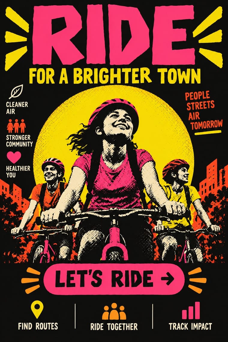
Both credit a collective rather than a designer and work for unions and community clients; borrow the Australians' hand-cut screenprint stencils when a Grapus-style idea must be printed cheaply and locally.
Mix them and make something Australian Poster Collective Screenprints Grapus
01
What each style brings
Each part of the design comes from the style with the stronger say in it, and each style gives at least two.
Australian Poster Collective Screenprints Grapus (French Militant Graphic Collective)
- Type from Grapus
- Colour from Australian Poster Collective Screenprints
- Form from Grapus
- Composition from Australian Poster Collective Screenprints
- Surface from Australian Poster Collective Screenprints
02
The type
Open fonts standing in for each style’s own type, which is often hand-drawn or commercial.
Display · Grapus
Act
Caveat, standing in for Handwriting in brush, felt-tip marker and crayon, written on the artwork in capitals or mixed case and often running sideways or round the picture, as on Poésies Aubervilliers (1983) and Peace! (1990)
Text · Australian Poster Collective Screenprints
Screenprinted posters from the political poster collectives and community workshops that spread across Australia from Sydney's Tin Sheds, where Earthworks began in 1971. Early Earthworks posters borrowed psychedelic and Art Nouveau decoration before turning hard-edged and political; Redback Graphix then set fluorescent inks against black. Unsigned, punning and local, they served union, feminist, land-rights and community clients and were pasted up across the cities.
Archivo; Australian Poster Collective Screenprints used Hand-cut stencil lettering and Press-type (Letraset) display faces
03
The colours
The ground and leading colours come from Australian Poster Collective Screenprints, with a counter-accent from Grapus. The ink reads on the ground at 4.5:1 or more.
Australian Poster Collective Screenprints Grapus (French Militant Graphic Collective)
-
#111111ground · 36% -
#f2ede3ink · 14% -
#f6e000accent · 18% -
#ff8a1faccent · 14% -
#d62b2baccent · 10% -
#ff3e8aaccent · 8%
As CSS
:root {
  --ground: #111111;
  --ink: #f2ede3;
  --accent-1: #f6e000;
  --accent-2: #ff8a1f;
  --accent-3: #d62b2b;
  --accent-4: #ff3e8a;
  --font-display: "Caveat", cursive;
  --font-text: "Archivo", sans-serif;
}
Use it with care
Australian Poster Collective Screenprints: Land-rights posters were often made with or for Aboriginal organisations (the Central and Northern Land Councils, Boomalli) and can include designs, stories and clan imagery that belong to particular Aboriginal artists and communities; the Aboriginal flag was designed by Luritja artist Harold Thomas in 1971. Do not borrow Aboriginal motifs, dot or cross-hatch patterns as a 'protest look'; work with First Nations artists and organisations under protocols such as Creative Australia's Protocols for using First Nations Cultural and Intellectual Property in the Arts.
Grapus (French Militant Graphic Collective): Grapus images were conceived and signed collectively, and Pierre Bernard and his former colleagues publicly disputed authorship and copyright in 2006, after his Erasmus Prize and a poster catalogue, so credit 'Grapus' rather than one designer; logos such as the Secours populaire's winged hand belong to the organisations that commissioned them, and the posters' party symbols and partisan slogans (the hammer and sickle, the PLO line on Palestine) should not be reused as neutral decoration.
04
The two styles
05
More combinations
With Australian Poster Collective Screenprints
- WPA Silkscreen Posters Pairs well · An earlier public-service silkscreen tradition; combine its calm stencil figures with the collectives' fluoro colour and puns.
- Cuban Revolutionary Poster (OSPAAAL & ICAIC) Contrasts · Cuban posters were state-commissioned single ideas; these were unsigned community jobs with text bands and local jokes, so decide whose voice the poster carries.
- Psychedelic Poster Pairs well · Early Earthworks posters grew out of psychedelic decoration; reintroduce a hand-drawn ornamental border when a hard-edged stencil feels too austere.
- Risograph & Indie Print Culture Pairs well · Today's riso studios inherit the fluoro inks, short runs and collective workshops; borrow Redback's black keyline to give riso colour more punch.
- BUGA UP Billboard Alteration Contrasts · Same Australian dissent, but studio screenprints made from scratch against alterations made on the advertiser's own board.
- See Red Women's Workshop Feminist Screenprints Pairs well · Sister screenprint collectives of the same years; add their brighter inks and halftone for a louder campaign poster.
- Screenprinted Gig & Alt-Movie Poster Contrasts · Both hand-pull flat, hand-lettered screenprints from the same psychedelic root and both reach for fluoro inks; the Australian collectives printed for unions, marches and community causes (and some bands), often from photo stencils, and pasted them up at night, while the gig and alt-movie poster prints for one show, one film and a collector's wall, trading agitation for wit and nostalgia.
- Australian Travel Poster (ANTA Era) Contrasts · Forty years later Australian screenprint collectives pasted up land-rights, union and feminist posters that answered the official sunlit image; pair the two to show whose Australia a poster sells.
With Grapus
- Punk & DIY Zine Contrasts · Both scribble over photographs, but punk's photocopied blacks and ransom-note type are cheap and nihilist, while Grapus prints bright offset colour, mostly on white, in an optimistic, party-backed voice.
- Solidarność & Polish Underground Graphics Pairs well · Opposite sides of the communist divide but the same Polish poster lineage: Janiszewski's crowded red letters and Grapus's loose handwriting both make a movement's voice look written by people, not set by an office.
- Atelier Populaire (May '68 Screenprint Poster) Contrasts · The founders came out of the 1968 workshops, but the Beaux-Arts atelier pulled one flat ink, one brushed silhouette and a slogan in rough capitals; Grapus layers photographs, paint and coloured handwriting, mostly on white. Use the first for overnight urgency, Grapus for a warmer, longer campaign.
- International Typographic Style Contrasts · Grapus rejected the Swiss style taught at the Arts Déco; set a scrawled, painted headline against a grid of neutral sans to stage that quarrel between personal voice and neutrality.