Style combination · Pairs well
Art Nouveau × Ornamental Romantasy Book Cover
An analyst's comparison, not a documented influence: borrow its flowing plant borders and integrated lettering for the frame, while accepting that the contemporary cover is digitally illustrated.
Mix them and make something Art Nouveau Ornamental Romantasy Book Cover
01
What each style brings
Each part of the design comes from the style with the stronger say in it, and each style gives at least two.
Art Nouveau Ornamental Romantasy Book Cover
- Type from Ornamental Romantasy Book Cover
- Colour from Art Nouveau
- Form from Art Nouveau
- Composition from Ornamental Romantasy Book Cover
- Surface from Art Nouveau
02
The type
Open fonts standing in for each style’s own type, which is often hand-drawn or commercial.
Display · Ornamental Romantasy Book Cover
Rose
Limelight, standing in for Decorative display capitals with flourishes, often integrated into the surrounding border or foliage
Text · Art Nouveau
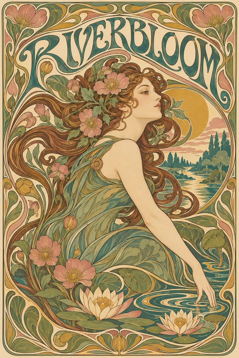
An international 'new art' that sought a modern style free of historical revival, drawing its forms from plant growth and the female figure. Graphic work flows with whiplash curves and stylised flowers, frames idealised women in arches, halos and mosaic borders, and draws custom lettering that bends to fill the space, fusing image, ornament and type into one decorative surface.
Bodoni Moda; Art Nouveau used Arnold Böcklin and Eckmann
03
The colours
The ground and leading colours come from Art Nouveau, with a counter-accent from Ornamental Romantasy Book Cover. The ink reads on the ground at 4.5:1 or more.
Art Nouveau Ornamental Romantasy Book Cover
-
#efe2c4ground · 36% -
#4b3b2aink · 14% -
#c9a24baccent · 18% -
#f2b705accent · 14% -
#3f7a75accent · 10% -
#e87722accent · 8%
As CSS
:root {
  --ground: #efe2c4;
  --ink: #4b3b2a;
  --accent-1: #c9a24b;
  --accent-2: #f2b705;
  --accent-3: #3f7a75;
  --accent-4: #e87722;
  --font-display: "Limelight", sans-serif;
  --font-text: "Bodoni Moda", serif;
}
04
The two styles
05
More combinations
With Art Nouveau
- Fileteado Porteño Pairs well · Fileteado's acanthus scrolls share the whiplash; combine them for ornate, hand-made lettering frames.
- International Typographic Style Contrasts · Ornamental curves against an orthogonal grid make a strong deliberate tension; let one botanical flourish break a cold grid.
- Psychedelic Poster Pairs well · San Francisco poster artists lifted Mucha's figures and whiplash wholesale; push the curves into saturated, vibrating colour for a 1960s-flavoured revival.
- Russian Constructivism Contrasts · Organic sensuality versus machine-age diagonals: use the opposition to stage nature against industry.
- Vienna Secession Contrasts · Set French whiplash against the Viennese square to show the turn from organic to geometric ornament within one decorative idiom.
- Skønvirke (Danish Art Nouveau, Bindesbøll) Contrasts · Shares the hand-lettering and abundance but swaps the whiplash line and the female figure for blunt abstract masses; set side by side they show the heavy Danish variant.
- Expressionist Woodcut Graphics Contrasts · The parent's smooth whiplash and floral harmony is exactly what the gouge splinters; use one against the other to stage order breaking down.
- Beggarstaffs Poster (Nicholson & Pryde) Contrasts · Its curving floral line is the opposite of cut masses; set side by side to show how much a poster can drop.
With Ornamental Romantasy Book Cover
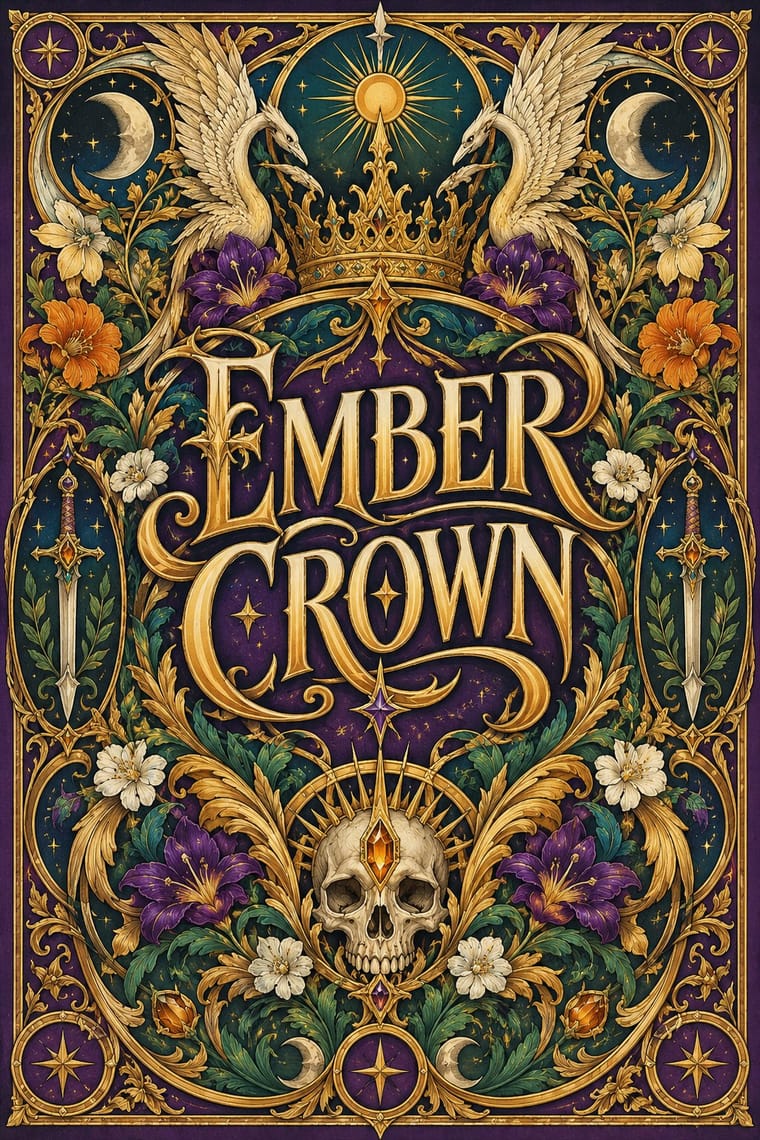
- Illustrated Rom-Com Book Cover (Cartoon Couple Cover) Contrasts · Both are contemporary romance covers, but the rom-com cover uses two simplified lovers on a bright flat ground; this one replaces them with a title-led emblem inside ornamental symbolism.
- Arts & Crafts Movement Pairs well · An analyst's comparison, not a documented influence: borrow its dense botanical borders around a monumental title to suggest a heritage, storybook weight.