Style combination · Pairs well
Art Deco × Hebrew Poster Lettering
The airbrushed products, laurel wreaths and extruded letters of the 1930s commercial posters share Deco's polish; pair them for packaging or retro advertising that needs a Hebrew or bilingual voice.
Mix them and make something Art Deco Hebrew Poster Lettering
01
What each style brings
Each part of the design comes from the style with the stronger say in it, and each style gives at least two.
Art Deco Hebrew Poster Lettering & Early Israeli State Design
- Type from Hebrew Poster Lettering
- Colour from Art Deco
- Form from Art Deco
- Composition from Art Deco
- Surface from Hebrew Poster Lettering
02
The type
Open fonts standing in for each style’s own type, which is often hand-drawn or commercial.
Display · Hebrew Poster Lettering
Atlas
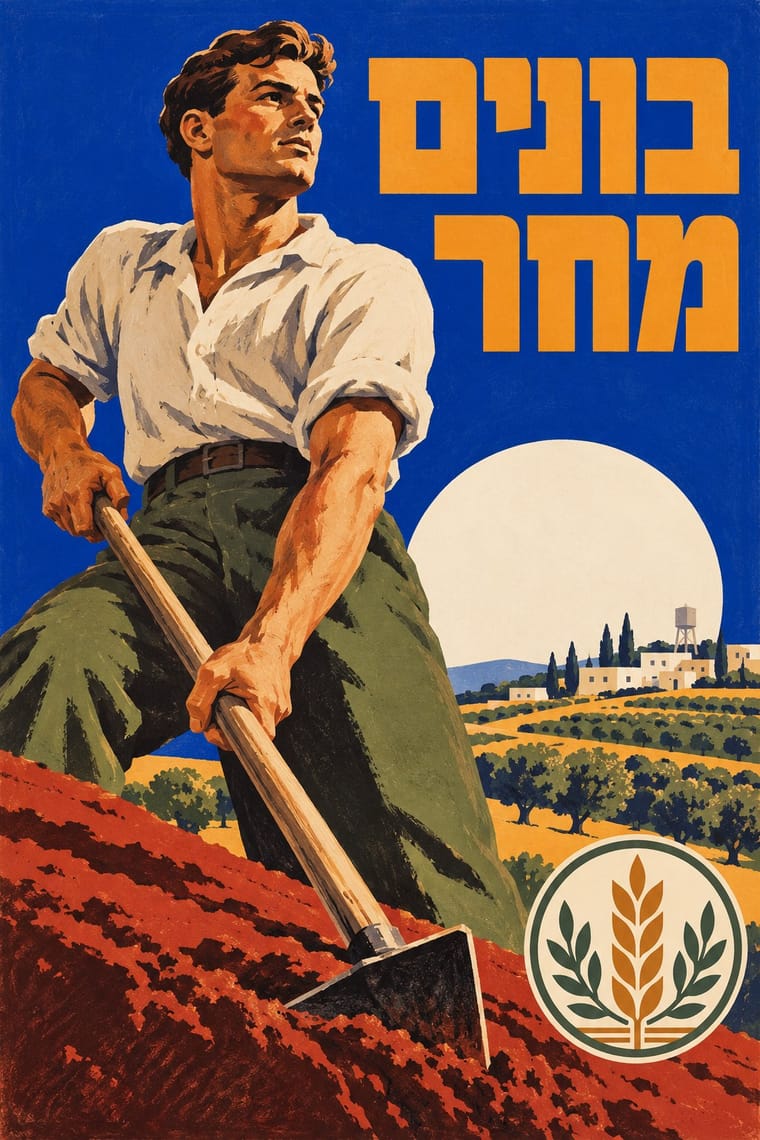
Reem Kufi; Hebrew Poster Lettering used Hand-drawn Hebrew block letters, heavy and square, drawn for each poster and label; Franz Krausz kept one consistent letter style, while the Shamir brothers fitted the lettering to each subject and Brush-written and cursive Hebrew lettering for slogans
Text · Art Deco
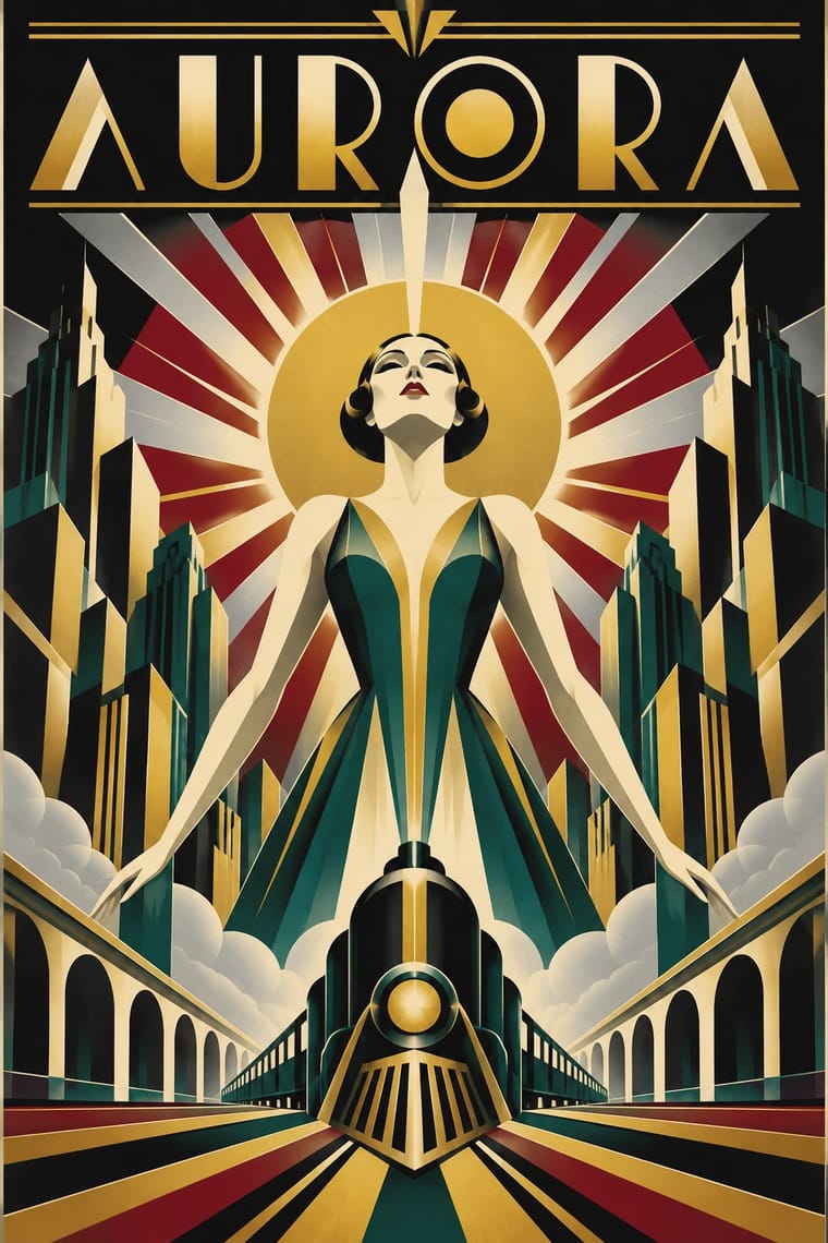
The glamorous modern style named after the 1925 Paris Exposition des Arts Décoratifs, which disciplined ornament into geometry: sunbursts, chevrons, stepped forms and sleek stylised figures rendered in lacquer-smooth colour with metallic accents. In Cassandre's and Colin's posters, fashion magazines, cinemas and luxury packaging it spoke of speed, travel, jazz and wealth.
Jost; Art Deco used Broadway and Bifur
03
The colours
The ground and leading colours come from Art Deco, with a counter-accent from Hebrew Poster Lettering. The ink reads on the ground at 4.5:1 or more.
Art Deco Hebrew Poster Lettering & Early Israeli State Design
-
#111111ground · 36% -
#f1e6cfink · 14% -
#c9a227accent · 18% -
#0038b8accent · 14% -
#8c1c26accent · 10% -
#0f5c55accent · 8%
As CSS
:root {
  --ground: #111111;
  --ink: #f1e6cf;
  --accent-1: #c9a227;
  --accent-2: #0038b8;
  --accent-3: #8c1c26;
  --accent-4: #0f5c55;
  --font-display: "Reem Kufi", cursive;
  --font-text: "Jost", sans-serif;
}
Use it with care
Hebrew Poster Lettering & Early Israeli State Design: This is the graphic language of the Zionist movement and the new Israeli state in a land shared with Palestinian Arabs: its pioneer, settlement and tourism imagery, 'Visit Palestine' (1936) among it, served the project of Jewish immigration and statehood in the years that led to the displacement of Palestinians in 1948, the Nakba, so present it as political history rather than a neutral regional or 'Holy Land' look, and think twice before reusing it to brand places whose ownership is contested. 'Visit Palestine' is built around the Dome of the Rock, a Muslim shrine, and since David Tartakover reissued it with Krausz's permission in 1995 it has hung in Palestinian homes, shops and Palestinian Authority offices and been reworked by Palestinian artists such as Amer Shomali (2009): it now belongs to two conflicting national memories, so do not use it, or pastiches of it, as a neutral Israeli or Palestinian brand image. Its state symbols are still in force: Israel's Flag and Emblem Law of 1949 (since 2004 the Flag, Emblem and National Anthem Law) requires a permit from the Interior Ministry to produce or use the emblem, so do not adapt it or pass new work off as official. The menorah, the Shema and Torah-scroll calligraphy are also Jewish sacred forms: have any Hebrew checked by a fluent reader, and do not distort scripture or use the names of God as decoration.
04
The two styles
05
More combinations
With Art Deco
- Googie & Atomic Age Pairs well · Googie's atomic starbursts extend Deco's celestial ornament; mix them for retro hospitality and signage.
- Punk & DIY Zine Contrasts · Puncture Deco polish with a single torn, photocopied edge when luxury needs irony.
- Art Nouveau Contrasts · Deco straightened Nouveau's whiplash; place a rigid sunburst beside one sinuous curve to show the evolution.
- Streamline Moderne Pairs well · Fold Streamline speed lines and rounded corners into a Deco layout to move from stepped geometry toward aerodynamic sweep.
- Basel Object Poster (Swiss Sachplakat) Contrasts · A source as well as a foil: Leupin studied at the École Paul Colin in Paris in 1935-36 and took strong impressions from Colin and from Colin's rival Cassandre. Both make a product a heroic icon, but Deco stylises it into a geometric silhouette with airbrushed gradation and geometric capitals, while Basel paints the real object, its material and its label, as a still life.
- Estridentismo (Stridentist) Graphics Pairs well · Both drew the 1920s skyline; pair Deco's setback towers and block display letters with Stridentist black-and-white relief for a skyscraper poster with a rougher, revolutionary edge.
- Vienna Secession Pairs well · Carry the Secession's squares, chequers and gold into Deco's stepped geometry for a luxurious but disciplined look.
- Greek Tourism Modernism (EOT) Contrasts · Katzourakis studied poster design under Paul Colin in Paris; set a Deco travel poster's heroic, airbrushed destination beside this flat, cut-out sign to show how the tourist poster was stripped down after the war.
With Hebrew Poster Lettering
- Bezalel School Contrasts · The Jerusalem national art that came before it used the same menorah, ancient coins and hand-drawn Hebrew, but packed them into gilded, ornamental, biblical frames; the Tel Aviv studios reduced them to a single emblem on flat colour, and the emblem committee of 1949 deliberately left out overtly religious symbols.
- Socialist Realist Propaganda Poster Contrasts · Both idealise the worker, the soldier and the pioneer, but the Tel Aviv posters sell juice and cigarettes beside national campaigns and keep a lighter, airbrushed commercial finish; compare them when a heroic figure must also feel approachable.
- Plakatstil / Sachplakat Contrasts · Its parent by training: the Shamir brothers studied at the applied-arts school in Berlin-Charlottenburg and Krausz took night classes at the Reimann school in Berlin, and their juice and cigarette posters are object posters. They add right-to-left Hebrew lettering, airbrushed modelling and, after 1948, the emblems of a state.
- Early Turkish Republican Graphic Design Contrasts · Two new states in the region built their image in hand-lettered posters and state paper in the same decades; Turkey drew its letters in the new Latin alphabet, while these designers drew Hebrew letters for a newly revived spoken language.
- Israeli Political Poster (Tartakover to Lemel) Contrasts · Compare the earlier entry's hand-drawn Hebrew, painted heroes and official emblems with this strand's set slogans and photographic contradictions; use the contrast to move from affirmative national address to situated criticism without implying a documented line of descent.