Style combination · Pairs well
Art Deco × Estado Novo Folk Modernism
This is Deco's stylised figure with the glamour stripped out; add Deco's stepped geometry and wide-tracked capitals to give a folk subject a sharper 1930s commercial finish.
Mix them and make something Art Deco Estado Novo Folk Modernism
01
What each style brings
Each part of the design comes from the style with the stronger say in it, and each style gives at least two.
Art Deco Estado Novo Folk Modernism (SPN)
- Type from Art Deco
- Colour from Art Deco
-
Estado Novo Folk Modernism avoids dark ground: this is where the two pull against each other.
- Form from Estado Novo Folk Modernism
- Composition from Art Deco
- Surface from Estado Novo Folk Modernism
02
The type
Open fonts standing in for each style’s own type, which is often hand-drawn or commercial.
Text · Estado Novo Folk Modernism
The official image of Salazar's Estado Novo, shaped by António Ferro's Secretariado de Propaganda Nacional (SPN, 1933; SNI from 1944). Modernists such as Almada Negreiros, Fred Kradolfer, Bernardo Marques and Tom gave rural families, regional costume, folk crafts and national emblems a simplified modern form. The regime fixed the subject more than the drawing, from Kradolfer's synthesis to Martins Barata's detailed school charts. Lithographed posters preached 'Deus, Pátria, Família' to a largely illiterate public; pavilions, photobooks and Panorama addressed literate and foreign audiences.
Libre Caslon Text; Estado Novo Folk Modernism used Hand-drawn poster capitals, lettered with the picture for lithographic printing and Roman inscriptional capitals with Cross-of-Christ word separators
03
The colours
The ground and leading colours come from Art Deco, with a counter-accent from Estado Novo Folk Modernism. The ink reads on the ground at 4.5:1 or more.
Art Deco Estado Novo Folk Modernism (SPN)
-
#111111ground · 36% -
#f1e6cfink · 14% -
#c9a227accent · 18% -
#8c1c26accent · 14% -
#b8322aaccent · 10% -
#0f5c55accent · 8%
As CSS
:root {
  --ground: #111111;
  --ink: #f1e6cf;
  --accent-1: #c9a227;
  --accent-2: #8c1c26;
  --accent-3: #b8322a;
  --accent-4: #0f5c55;
  --font-display: "Poiret One", sans-serif;
  --font-text: "Libre Caslon Text", serif;
}
Use it with care
Estado Novo Folk Modernism (SPN): This was the official propaganda of an authoritarian dictatorship, whose idealised peasant served the myth of 'honoured poverty'. The crafts it staged, such as Barcelos clay figures, Viana do Castelo embroidery and regional costume, remain living community traditions. Do not present the regime's version of them as neutral heritage, or its Catholic and heraldic symbols as decoration. Its celebration of the Discoveries served a living colonial empire: the 1940 Exposição do Mundo Português showed 138 men, women and children recruited in the colonies, among reconstructed villages, as a 'human zoo'. Do not reuse its caravels, padrões and imperial slogans as innocent heritage.
04
The two styles
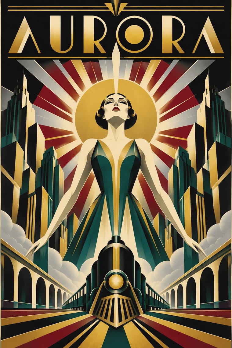
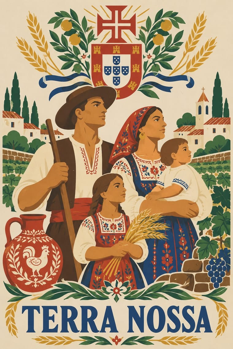
05
More combinations
With Art Deco
- Googie & Atomic Age Pairs well · Googie's atomic starbursts extend Deco's celestial ornament; mix them for retro hospitality and signage.
- Punk & DIY Zine Contrasts · Puncture Deco polish with a single torn, photocopied edge when luxury needs irony.
- Art Nouveau Contrasts · Deco straightened Nouveau's whiplash; place a rigid sunburst beside one sinuous curve to show the evolution.
- Streamline Moderne Pairs well · Fold Streamline speed lines and rounded corners into a Deco layout to move from stepped geometry toward aerodynamic sweep.
- Basel Object Poster (Swiss Sachplakat) Contrasts · A source as well as a foil: Leupin studied at the École Paul Colin in Paris in 1935-36 and took strong impressions from Colin and from Colin's rival Cassandre. Both make a product a heroic icon, but Deco stylises it into a geometric silhouette with airbrushed gradation and geometric capitals, while Basel paints the real object, its material and its label, as a still life.
- Estridentismo (Stridentist) Graphics Pairs well · Both drew the 1920s skyline; pair Deco's setback towers and block display letters with Stridentist black-and-white relief for a skyscraper poster with a rougher, revolutionary edge.
- Vienna Secession Pairs well · Carry the Secession's squares, chequers and gold into Deco's stepped geometry for a luxurious but disciplined look.
- Greek Tourism Modernism (EOT) Contrasts · Katzourakis studied poster design under Paul Colin in Paris; set a Deco travel poster's heroic, airbrushed destination beside this flat, cut-out sign to show how the tourist poster was stripped down after the war.
With Estado Novo Folk Modernism
- Socialist Realist Propaganda Poster Contrasts · Both are 1930s state doctrine, but the SPN flattened and decorated a pastoral, Catholic idyll where Soviet posters modelled heroic industrial bodies; use the pair to choose between consoling and mobilising.
- WPA Silkscreen Posters Pairs well · Both turned 1930s state poster programmes toward the rural and the regional; borrow WPA's flat layered landscapes and add SPN heraldry for regional tourism or heritage pieces.
- Spanish Civil War Poster Contrasts · Its Iberian contemporary: Republican posters are diagonal, urgent and red-and-black, while the Estado Novo's are static, pale and 'pseudo-tranquil'; set them side by side to stage revolt against order.
- Greek Tourism Modernism (EOT) Contrasts · Both are southern European state images aimed partly at foreign visitors, but the SPN staged a static rural, Catholic idyll in lithographed figures, while EOT turned antiquity and the islands into cut-out signs on colour; compare them to choose between folk narrative and modernist emblem.