Style combination · Pairs well
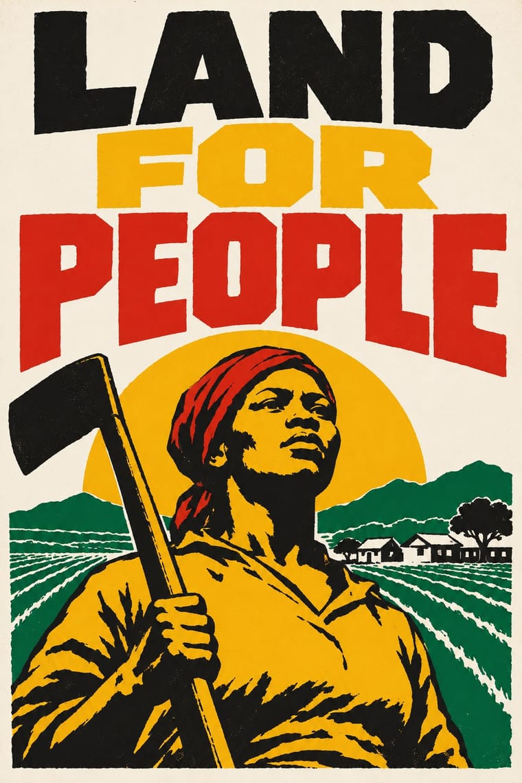
South African Resistance Poster × WPA Silkscreen Posters
Another public-service silkscreen culture of flat inks and plain capitals; borrow its calmer layout when a meeting poster needs to inform rather than shout.
Mix them and make something South African Resistance Poster WPA Silkscreen Posters
01
What each style brings
Each part of the design comes from the style with the stronger say in it, and each style gives at least two.
South African Resistance Poster WPA Silkscreen Posters
- Type from South African Resistance Poster
- Colour from WPA Silkscreen Posters
- Form from South African Resistance Poster
- Composition from WPA Silkscreen Posters
- Surface from South African Resistance Poster
02
The type
Open fonts standing in for each style’s own type, which is often hand-drawn or commercial.
Display · South African Resistance Poster
Fiesta
Allerta Stencil, standing in for Hand-cut stencil capitals
Text · WPA Silkscreen Posters
Posters made by the Federal Art Project of the Works Progress Administration to promote health campaigns, education, theatre, travel and the national parks during the Depression. Unemployed artists adapted commercial silkscreen to print runs by hand, which gave the work its flat, opaque layered colour, simplified stylised forms and clear geometric lettering in a public-service voice.
Jost; WPA Silkscreen Posters used Hand-cut stencil lettering in geometric sans-serif capitals and Futura (Paul Renner, 1927) and similar geometric sans-serifs
03
The colours
The ground and leading colours come from WPA Silkscreen Posters, with a counter-accent from South African Resistance Poster. The ink reads on the ground at 4.5:1 or more.
South African Resistance Poster WPA Silkscreen Posters
-
#efe6cfground · 36% -
#222222ink · 14% -
#c8622daccent · 18% -
#f2b51daccent · 14% -
#d7261eaccent · 10% -
#3d5a7aaccent · 8%
As CSS
:root {
  --ground: #efe6cf;
  --ink: #222222;
  --accent-1: #c8622d;
  --accent-2: #f2b51d;
  --accent-3: #d7261e;
  --accent-4: #3d5a7a;
  --font-display: "Allerta Stencil", sans-serif;
  --font-text: "Jost", sans-serif;
}
Use it with care
South African Resistance Poster: The photograph of the dying Hector Pieterson (Sam Nzima, 16 June 1976) and the portraits of detainees and the dead show real people whose families and communities still remember them, and ANC, UDF and COSATU colours and the spear and shield are the marks of living organisations. Use them with context and permission rather than as generic protest styling.
04
The two styles

05
More combinations
With South African Resistance Poster
- Cuban Revolutionary Poster (OSPAAAL & ICAIC) Contrasts · State-funded Cuban posters are polychrome and conceptual where these are literal, text-heavy and cheap; pick by whether the audience needs an idea or an instruction.
- Rorke's Drift Linocut Contrasts · Same country, overlapping and then following it (1978–1994): screenprinted slogans and emblems for mass protest against small, hand-printed editions that tell a story; use the poster to mobilise and the linocut to bear witness.
- Atelier Populaire (May '68 Screenprint Poster) Pairs well · Both chose hand-made silkscreen because it was cheap, quick and teachable to non-artists; borrow the struggle posters' organisation emblems and second ink when a campaign must stay recognisable beyond one day's slogan.
- Extinction Rebellion Graphics Pairs well · Both are cheap workshop prints with heavy capitals and an organisation's emblem; XR adds a centrally specified twelve-colour kit where the struggle posters kept to one to three hand-cut inks.
- Drum Magazine & Sophiatown Photojournalism Contrasts · The later South African struggle poster argues with screenprinted slogans, emblems and drawn figures; Drum argued through candid photography and urban glamour inside a commercial magazine.
- See Red Women's Workshop Feminist Screenprints Pairs well · Community silkscreen for movements; add its heavy slogans and organisation emblems to See Red's drawn everyday scenes.
- South African Vernacular Design (Ijusi) Contrasts · The struggle posters spoke with one voice in two or three inks; Ijusi, after 1994, mixes many voices, languages and colours. Quote the stencilled slogans as history, not as decoration.
- Minjung Woodcut Graphics (Korean People's Art) Pairs well · Exact contemporaries in another democracy struggle; set a carved figure beside community screenprint colour for solidarity graphics.
With WPA Silkscreen Posters
- Flat Design Pairs well · Its flat layered shapes translate directly to vector; use the national-park look for warm, civic flat illustration.
- Psychedelic Poster Contrasts · Calm, legible public information versus deliberate optical overload; choose WPA clarity when a message must reach everyone.
- Risograph & Indie Print Culture Pairs well · Both layer a few opaque inks; borrow WPA's stylised landscapes and plain messages for contemporary riso posters.
- Socialist Realist Propaganda Poster Pairs well · Both mobilised a 1930s public with state-funded posters; add socialist realism's heroic low-angle figures to WPA's flat silkscreen colour when a civic campaign needs more urgency.
- Australian Travel Poster (ANTA Era) Contrasts · The Federal Art Project also made travel and national-park posters in the 1930s, but in flat, layered screenprint for public programmes; set them side by side to choose between commercial painted lithography and a few opaque public-service inks.
- Australian Poster Collective Screenprints Pairs well · An earlier public-service silkscreen tradition; combine its calm stencil figures with the collectives' fluoro colour and puns.
- Early Turkish Republican Graphic Design Pairs well · Both are 1930s state-backed poster programmes for public institutions and tourism; combine WPA silkscreen flatness with Görey's modelled figures for civic campaigns.
- Estado Novo Folk Modernism (SPN) Pairs well · Both turned 1930s state poster programmes toward the rural and the regional; borrow WPA's flat layered landscapes and add SPN heraldry for regional tourism or heritage pieces.