Style combination · Contrasts
Superflat × Yuru-chara
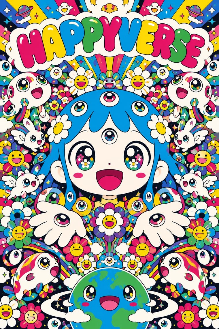
Superflat turns Japanese character culture into gallery irony, crowded and cute-grotesque; yuru-chara keeps characters sincere, civic and plain, one figure at a time.
01
What each style brings
Each part of the design comes from the style with the stronger say in it, and each style gives at least two.
Superflat Yuru-chara (Japanese Local Mascot Design)
- Type from Yuru-chara
- Colour from Superflat
- Form from Yuru-chara
- Composition from Yuru-chara
- Surface from Superflat
02
The type
Open fonts standing in for each style’s own type, which is often hand-drawn or commercial.
Display · Yuru-chara
Pop
Zen Maru Gothic, standing in for Maru gothic (rounded gothic) Japanese type, such as Morisawa's Shin Maru Go, for captions, event banners and goods
Text · Yuru-chara
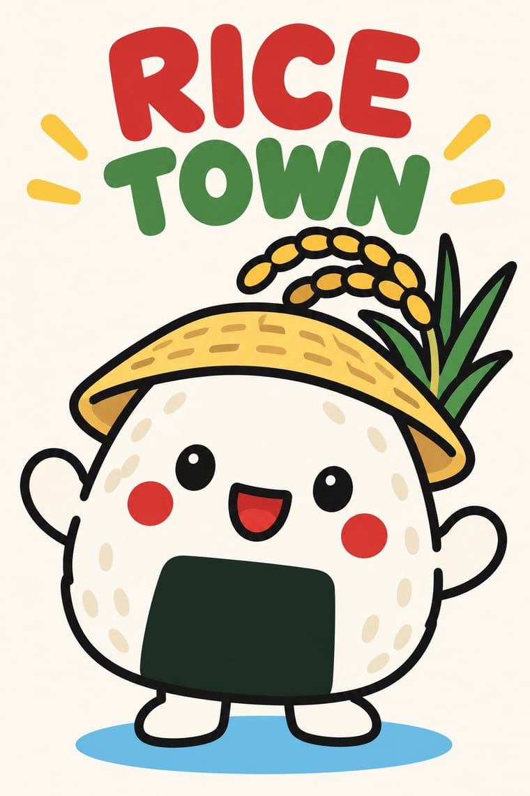
Japan's local mascots: characters commissioned by prefectures, towns and tourism bodies to stand for a place, named yuru-kyara ('loose characters') by the illustrator Jun Miura around 2000. Each body is built from a local product, landmark or legend, such as Hikonyan's samurai helmet or Barysan's towel belly band, drawn as one frontal figure with a big head and a few flat colours, and lived out as a walk-about costume. Hikonyan (2007) set off the boom; Kumamon (2010), licensed free for goods that promote Kumamoto, made it an industry.
Zen Maru Gothic; Yuru-chara used Hand-drawn kana name lettering in thick, rounded strokes set beside the figure, spelling the mascot's name in hiragana or katakana, as in くまモン, ひこにゃん or バリィさん and Maru gothic (rounded gothic) Japanese type, such as Morisawa's Shin Maru Go, for captions, event banners and goods
03
The colours
The ground and leading colours come from Superflat, with a counter-accent from Yuru-chara. The ink reads on the ground at 4.5:1 or more.
Superflat Yuru-chara (Japanese Local Mascot Design)
-
#fbfaf5ground · 36% -
#1a1a1aink · 14% -
#ffd900accent · 18% -
#ffd23faccent · 14% -
#00a0e9accent · 10% -
#e3242baccent · 8%
As CSS
:root {
  --ground: #fbfaf5;
  --ink: #1a1a1a;
  --accent-1: #ffd900;
  --accent-2: #ffd23f;
  --accent-3: #00a0e9;
  --accent-4: #e3242b;
  --font-display: "Zen Maru Gothic", sans-serif;
  --font-text: "Zen Maru Gothic", sans-serif;
}
Use it with care
Superflat: Some canonical works use explicit otaku sexual imagery, such as Murakami's My Lonesome Cowboy (1998), and associated artists engage with lolicon art: Mr. describes himself as a lolicon and Henmaru Machino parodies it; never sexualise childlike figures. The mushroom-cloud skulls of Murakami's Time Bokan works and the title Little Boy, the name of the Hiroshima bomb, refer to the atomic bombings, and critics such as Dong-Yeon Koh argue that this victim narrative obscures Japanese aggression in China and Korea; do not use mushroom clouds or skulls as cute decoration. Handle borrowed Buddhist iconography and phrases, such as Kannon, with respect, and draw original characters and flowers: Mr. DOB, the smiling flowers and the Louis Vuitton monogram are owned designs.
Yuru-chara (Japanese Local Mascot Design): Mascots are owned designs: Kumamon's copyright is held by Kumamoto Prefecture, which allows free use in Japan only with its permission and a displayed permit number, and Hikone and Hikonyan's illustrator fought over the character's rights from 2007 through mediation, a 2011 court ruling and a 2012 settlement, so invent an original character for each place and agree rights with the illustrator first. Keep sacred figures out of the joke: Buddhist groups in Nara objected that Sento-kun, a Buddha-like child with deer antlers, insulted the Buddha. And do not use a cute mascot to soften a contested public risk, as with the tritium mascot that Japan's Reconstruction Agency made to promote releasing treated water from Fukushima, pulled a day after its release in April 2021.
04
The two styles
05
More combinations
With Superflat
- Kawaii Design Contrasts · Kawaii offers sincere, simple, pastel cuteness for fancy goods; switch to Superflat when the cute should be saturated, crowded, many-eyed and ironic, a comment on consumer culture rather than a product of it.
- Pop Art Graphics Contrasts · Both turn commodities into art; take Pop's repetition and frontal commodity but swap its halftone and off-register silkscreen for Superflat's smooth vector fills and anime characters, so the print process disappears.
- Minimalist Graphic Design Contrasts · One dense field of smiling flowers on an otherwise empty white page gives a minimal layout a single loud focal point without giving up its calm.
- Ukiyo-e Woodblock Prints Pairs well · Murakami traces Superflat's flatness back to Hokusai's prints; borrow the woodblock keyline, the stylised wave and the cropped composition and fill them with Superflat's saturated characters.
- Techno-Futurist Graphics Pairs well · groovisions, whose Chappie figure showed in the 2001 Superflat exhibition, links the two; set Superflat characters inside techno-futurist logos, grids and katakana captions for a slicker, more corporate parody.
- Angura Theatre Poster Contrasts · Both quote ukiyo-e and Pop from Japan, but angura crams photographs and fluorescent silkscreen into a rebellious collage while Superflat draws everything smooth and flat; set one flat Superflat character against an angura photomontage for a clash of eras.
- Story Manga (Postwar Japanese Comics) Contrasts · Murakami's Superflat lifts anime and manga figures out of the story onto one flat, glossy, polychrome plane for the gallery; story manga keeps the sequence, the depth of its backgrounds and its single black ink.
- Lo-fi Anime Aesthetic Contrasts · Both draw on anime, but superflat flattens otaku imagery into ironic, polychrome, all-over fields with no depth; choose lofi for one sincere, softly lit room with depth, and superflat when the brief wants pop density and knowing play.
With Yuru-chara
- Japanese Postwar Modernism Contrasts · Postwar Japanese identities give institutions abstract, grid-built marks; a yuru-chara gives a prefecture a face, a name and a body that walks into festivals and shakes hands.
- Kamon (Japanese Family Crests) Pairs well · Borrow the place's own heraldry, a daimyō family crest or the town's emblem: a flat crest on the mascot's sash, banner or packaging anchors the loose figure in local history, as Hikonyan's helmet anchors it in the Ii family's red armour.
- Kawaii Design Contrasts · Both build on rounded, big-headed cute figures, but kawaii sells polished pastel fancy goods for private pleasure, while a yuru-chara speaks for a town in a few bold colours and keeps its awkwardness.
- Newtro (Korean New-Retro) Contrasts · Newtro reissues a firm's own decades-old mascot, polished; a yuru-chara is newly invented for a place and its looseness is left in.
- Corporate Memphis Contrasts · Corporate Memphis draws faceless, placeless figures for global platforms; a yuru-chara is a single named character built from one town's products and legends.
- Front-of-Pack Warning Octagons (Latin American Food Warning Seals) Contrasts · Mascot design is exactly what a sealed pack must give up in Chile and Mexico; put the two side by side to show how much of a snack's appeal is carried by a character.
- Rubber-Hose Revival (Cartoon Mascot Graphics) Pairs well · Both build a mascot from the thing it promotes; borrow the yuru-chara's costume-ready frontal figure and licensing for a rubber-hose brand character.
- Natural Wine Label Art Pairs well · Super Glou's drunken-cat mascot and Jauma's cosmic cat work like local mascots; borrow the yuru-chara habit of one soft, recurring character who appears in a new scene for each product.