Style combination · Pairs well
Kamon × Yuru-chara
Borrow the place's own heraldry, a daimyō family crest or the town's emblem: a flat crest on the mascot's sash, banner or packaging anchors the loose figure in local history, as Hikonyan's helmet anchors it in the Ii family's red armour.
01
What each style brings
Each part of the design comes from the style with the stronger say in it, and each style gives at least two.
Kamon (Japanese Family Crests) Yuru-chara (Japanese Local Mascot Design)
- Type from Yuru-chara
- Colour from Kamon
- Form from Yuru-chara
- Composition from Kamon
- Surface from Kamon
02
The type
Open fonts standing in for each style’s own type, which is often hand-drawn or commercial.
Display · Yuru-chara
Fiesta
Zen Maru Gothic, standing in for Maru gothic (rounded gothic) Japanese type, such as Morisawa's Shin Maru Go, for captions, event banners and goods
Text · Kamon
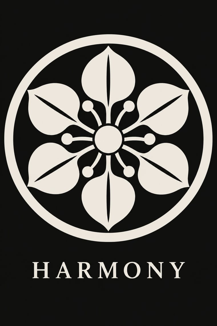
Japan's family crests: small one-colour emblems that reduce a plant, animal, tool or pattern to a flat silhouette, mirrored or repeated around a centre, often ringed and drawn with compass and brush. Begun on Heian court carriages and spread to samurai and all of society, mon are usually inherited, granted or freely chosen rather than designed, varied in small codified ways for branch families, and placed in fixed positions on formal kimono, shop curtains, lacquer and banners. Covers the formal crest (jōmon), not the decorative coloured kaga-mon or pictorial date-mon and share-mon.
Shippori Mincho; Kamon used Kago-moji, the thick, squared Edo lettering often reversed out in white, for names set beside a crest and Brush-written kaisho (regular-script) kanji for shop names and family names on curtains and lanterns
03
The colours
The ground and leading colours come from Kamon, with a counter-accent from Yuru-chara. The ink reads on the ground at 4.5:1 or more.
Kamon (Japanese Family Crests) Yuru-chara (Japanese Local Mascot Design)
-
#f3efe6ground · 36% -
#121212ink · 14% -
#b38f3daccent · 18% -
#ffd23faccent · 14% -
#8c2d25accent · 10% -
#e3242baccent · 8%
As CSS
:root {
  --ground: #f3efe6;
  --ink: #121212;
  --accent-1: #b38f3d;
  --accent-2: #ffd23f;
  --accent-3: #8c2d25;
  --accent-4: #e3242b;
  --font-display: "Zen Maru Gothic", sans-serif;
  --font-text: "Shippori Mincho", serif;
}
Use it with care
Kamon (Japanese Family Crests): Mon are inherited marks of particular families, shrines, temples and institutions. Only the imperial chrysanthemum is named in Japanese law: the Trademark Act (art. 4(1)(i)) bars registering it or anything like it. The government's paulownia, though the official emblem of the Prime Minister and Cabinet, was never given the same legal restrictions, while famous crests registered as trademarks, such as Mitsubishi's three diamonds, are protected as marks. Do not use the chrysanthemum, the government paulownia, or any identifiable family's, shrine's or temple's crest as decoration or as a brand. Imperial emblems can also recall Japan's wartime empire for audiences in Korea and China. The manji (卍), a standard crest (the Hachisuka clan; the temple crest of Sensō-ji), is read in the West as the Nazi swastika: avoid it outside a Japanese context that explains it. Draw new crests by the tradition's rules instead of borrowing real ones, and commission or credit working monsho uwaeshi, who still draw and paint crests by hand.
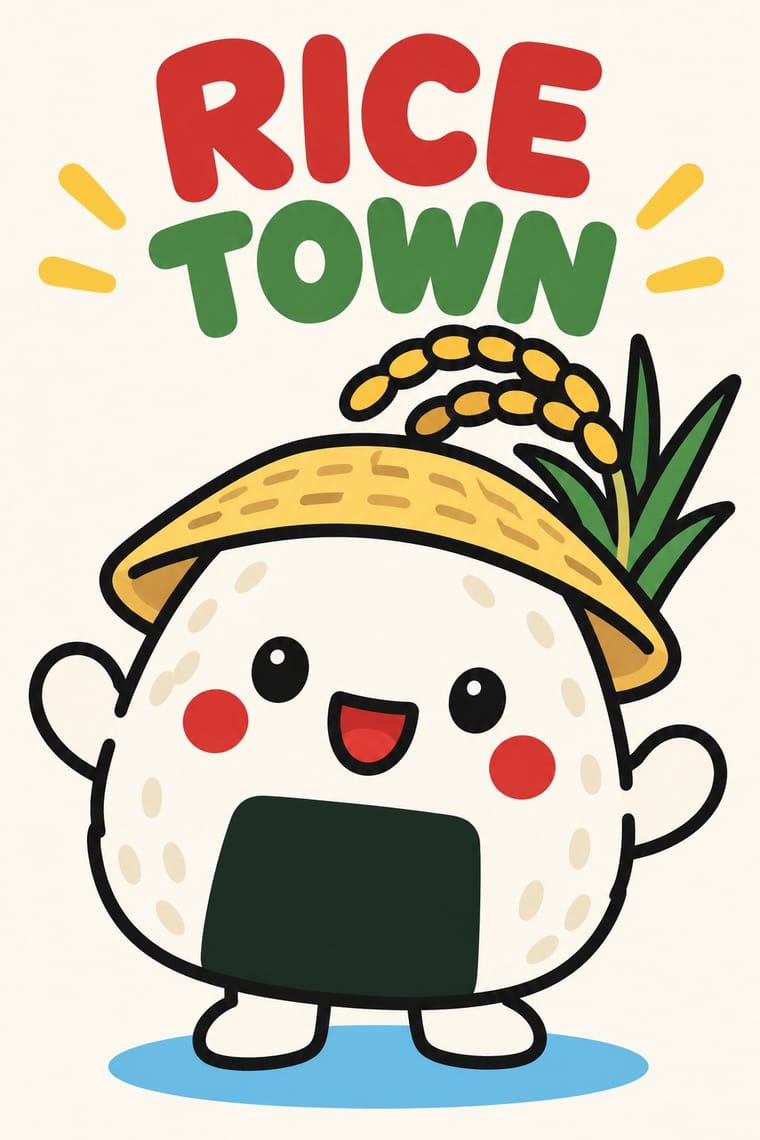
Yuru-chara (Japanese Local Mascot Design): Mascots are owned designs: Kumamon's copyright is held by Kumamoto Prefecture, which allows free use in Japan only with its permission and a displayed permit number, and Hikone and Hikonyan's illustrator fought over the character's rights from 2007 through mediation, a 2011 court ruling and a 2012 settlement, so invent an original character for each place and agree rights with the illustrator first. Keep sacred figures out of the joke: Buddhist groups in Nara objected that Sento-kun, a Buddha-like child with deer antlers, insulted the Buddha. And do not use a cute mascot to soften a contested public risk, as with the tritium mascot that Japan's Reconstruction Agency made to promote releasing treated water from Fukushima, pulled a day after its release in April 2021.
04
The two styles
05
More combinations
With Kamon
- Ukiyo-e Woodblock Prints Pairs well · Kabuki actors had their own mon, and actor prints show them on the costume, as on the sleeve of Ichikawa Yaozō III in a print of 1796; pair a flat crest with ukiyo-e figures to identify characters without captions.
- Islamic Geometric & Calligraphic Tradition Contrasts · Both are built with compass and straight edge, but girih tiles the whole surface without end while a mon closes one motif inside a ring; borrow the tessellation for a ground and the crest for the single sign on it.
- Corporate Identity Modernism Pairs well · A mon already behaves like a corporate mark (one colour, scalable, placed in fixed positions), as Mitsubishi's three diamonds show; use crest construction rules to build a logo family with codified variants for subsidiaries.
- Ma & Wabi-sabi Aesthetics Contrasts · Both set a single sign in emptiness, but wabi-sabi wants it off-centre, irregular and brush-marked while a mon is exact, symmetric and compass-drawn; set a crest's geometry against wabi-sabi's rough, quiet grounds when packaging or interiors need that tension.
- Japanese Postwar Modernism Pairs well · Postwar Japanese designers drew on kamon for their single emblematic symbols; pair a compass-drawn crest with a grotesque or Gothic caption on an empty field for an identity that is plainly modern but rooted.
- Northwest Coast Formline Design Contrasts · Both are hereditary crest systems, but formline fills a red-and-black field with split, swelling creatures while a mon is a tiny symmetric silhouette in emptiness; compare them to decide between abundance and reduction.
- Japonisme Pairs well · Through Japonisme, mon fed late-19th-century Western pattern design, Louis Vuitton's monogram among them; borrow a crest's compass-built flat silhouette for a Western repeat or monogram, drawn new rather than copied from a real family.
- European Heraldry Contrasts · Both mark kinship with hereditary emblems varied in small codified ways, but a mon is a one-colour silhouette drawn round a centre, while a coat of arms is a shield of contrasting tinctures read by the rule of tincture.
With Yuru-chara
- Japanese Postwar Modernism Contrasts · Postwar Japanese identities give institutions abstract, grid-built marks; a yuru-chara gives a prefecture a face, a name and a body that walks into festivals and shakes hands.
- Kawaii Design Contrasts · Both build on rounded, big-headed cute figures, but kawaii sells polished pastel fancy goods for private pleasure, while a yuru-chara speaks for a town in a few bold colours and keeps its awkwardness.
- Newtro (Korean New-Retro) Contrasts · Newtro reissues a firm's own decades-old mascot, polished; a yuru-chara is newly invented for a place and its looseness is left in.
- Superflat Contrasts · Superflat turns Japanese character culture into gallery irony, crowded and cute-grotesque; yuru-chara keeps characters sincere, civic and plain, one figure at a time.
- Corporate Memphis Contrasts · Corporate Memphis draws faceless, placeless figures for global platforms; a yuru-chara is a single named character built from one town's products and legends.
- Front-of-Pack Warning Octagons (Latin American Food Warning Seals) Contrasts · Mascot design is exactly what a sealed pack must give up in Chile and Mexico; put the two side by side to show how much of a snack's appeal is carried by a character.
- Rubber-Hose Revival (Cartoon Mascot Graphics) Pairs well · Both build a mascot from the thing it promotes; borrow the yuru-chara's costume-ready frontal figure and licensing for a rubber-hose brand character.
- Natural Wine Label Art Pairs well · Super Glou's drunken-cat mascot and Jauma's cosmic cat work like local mascots; borrow the yuru-chara habit of one soft, recurring character who appears in a new scene for each product.