Style combination · Contrasts
Front-of-Pack Warning Octagons × Yuru-chara
Mascot design is exactly what a sealed pack must give up in Chile and Mexico; put the two side by side to show how much of a snack's appeal is carried by a character.
Mix them and make something Front-of-Pack Warning Octagons Yuru-chara
01
What each style brings
Each part of the design comes from the style with the stronger say in it, and each style gives at least two.
Front-of-Pack Warning Octagons (Latin American Food Warning Seals) Yuru-chara (Japanese Local Mascot Design)
- Type from Front-of-Pack Warning Octagons
- Colour from Front-of-Pack Warning Octagons
- Form from Yuru-chara
-
Front-of-Pack Warning Octagons avoids stylised figuration: this is where the two pull against each other, which is the point of the contrast.
- Composition from Yuru-chara
- Surface from Front-of-Pack Warning Octagons
02
The type
Open fonts standing in for each style’s own type, which is often hand-drawn or commercial.
Display · Front-of-Pack Warning Octagons
Notice
Inter Tight, standing in for Arial Bold (Robin Nicholas and Patricia Saunders for Monotype, 1982): prescribed in Chile's Decree 13, Diagram No. 1 ('la familia "Arial", específicamente en su presentación "bold"'), for 'ALTO EN', the nutrient and 'Ministerio de Salud'
Text · Yuru-chara
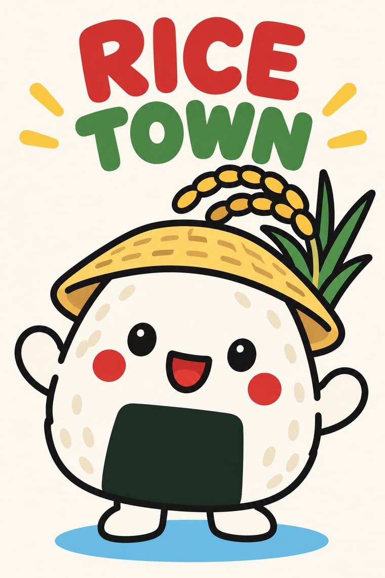
Japan's local mascots: characters commissioned by prefectures, towns and tourism bodies to stand for a place, named yuru-kyara ('loose characters') by the illustrator Jun Miura around 2000. Each body is built from a local product, landmark or legend, such as Hikonyan's samurai helmet or Barysan's towel belly band, drawn as one frontal figure with a big head and a few flat colours, and lived out as a walk-about costume. Hikonyan (2007) set off the boom; Kumamon (2010), licensed free for goods that promote Kumamoto, made it an industry.
Zen Maru Gothic; Yuru-chara used Hand-drawn kana name lettering in thick, rounded strokes set beside the figure, spelling the mascot's name in hiragana or katakana, as in くまモン, ひこにゃん or バリィさん and Maru gothic (rounded gothic) Japanese type, such as Morisawa's Shin Maru Go, for captions, event banners and goods
03
The colours
The ground and leading colours come from Front-of-Pack Warning Octagons, with a counter-accent from Yuru-chara. The ink reads on the ground at 4.5:1 or more.
Front-of-Pack Warning Octagons (Latin American Food Warning Seals) Yuru-chara (Japanese Local Mascot Design)
-
#000000ground · 36% -
#ffffffink · 14% -
#ffcc00accent · 18% -
#ffd23faccent · 14% -
#e30613accent · 10% -
#0072bcaccent · 8%
As CSS
:root {
  --ground: #000000;
  --ink: #ffffff;
  --accent-1: #ffcc00;
  --accent-2: #ffd23f;
  --accent-3: #e30613;
  --accent-4: #0072bc;
  --font-display: "Inter Tight", sans-serif;
  --font-text: "Zen Maru Gothic", sans-serif;
}
Use it with care
Front-of-Pack Warning Octagons (Latin American Food Warning Seals): The octagons are legal instruments owned by health ministries, and imitating them on real products, in advertising or in generated images can mislead shoppers about a food's composition or pass for an official warning. Use the visual language for health communication, research or clearly fictional work, check each country's current specification before reproducing a seal, and do not turn the warning into decoration or a parody that could make a sign meant to discourage consumption appealing again.
Yuru-chara (Japanese Local Mascot Design): Mascots are owned designs: Kumamon's copyright is held by Kumamoto Prefecture, which allows free use in Japan only with its permission and a displayed permit number, and Hikone and Hikonyan's illustrator fought over the character's rights from 2007 through mediation, a 2011 court ruling and a 2012 settlement, so invent an original character for each place and agree rights with the illustrator first. Keep sacred figures out of the joke: Buddhist groups in Nara objected that Sento-kun, a Buddha-like child with deer antlers, insulted the Buddha. And do not use a cute mascot to soften a contested public risk, as with the tritium mascot that Japan's Reconstruction Agency made to promote releasing treated water from Fukushima, pulled a day after its release in April 2021.
04
The two styles
05
More combinations
With Front-of-Pack Warning Octagons
- Plain Tobacco Packaging Contrasts · Plain packaging erases the brand and hands the face to a shock photograph; the octagons leave the brand intact and add a small, uniform black sign. Choose between them by deciding whether the warning should replace the design or interrupt it.
- ACT UP & Gran Fury AIDS Activist Graphics Pairs well · Both speak in white bold capitals on black; take Gran Fury's wit when a nutrition campaign must persuade around the shelf rather than only on the pack.
- Corporate Identity Modernism Pairs well · The seal is built like a corporate mark, from a unit grid, one typeface, one colour and a size table; borrow the standards-manual discipline when a public-health sign must stay identical across thousands of packs.
- Nutri-Score (Front-of-Pack Colour-Grade Label) Contrasts · The Latin American seals warn in black, one nutrient at a time, by law; Nutri-Score grades the whole food on a coloured five-step scale and is voluntary in most countries. Choose the octagon to stop a purchase and the colour scale to steer a comparison.
With Yuru-chara
- Japanese Postwar Modernism Contrasts · Postwar Japanese identities give institutions abstract, grid-built marks; a yuru-chara gives a prefecture a face, a name and a body that walks into festivals and shakes hands.
- Kamon (Japanese Family Crests) Pairs well · Borrow the place's own heraldry, a daimyō family crest or the town's emblem: a flat crest on the mascot's sash, banner or packaging anchors the loose figure in local history, as Hikonyan's helmet anchors it in the Ii family's red armour.
- Kawaii Design Contrasts · Both build on rounded, big-headed cute figures, but kawaii sells polished pastel fancy goods for private pleasure, while a yuru-chara speaks for a town in a few bold colours and keeps its awkwardness.
- Newtro (Korean New-Retro) Contrasts · Newtro reissues a firm's own decades-old mascot, polished; a yuru-chara is newly invented for a place and its looseness is left in.
- Superflat Contrasts · Superflat turns Japanese character culture into gallery irony, crowded and cute-grotesque; yuru-chara keeps characters sincere, civic and plain, one figure at a time.
- Corporate Memphis Contrasts · Corporate Memphis draws faceless, placeless figures for global platforms; a yuru-chara is a single named character built from one town's products and legends.
- Rubber-Hose Revival (Cartoon Mascot Graphics) Pairs well · Both build a mascot from the thing it promotes; borrow the yuru-chara's costume-ready frontal figure and licensing for a rubber-hose brand character.
- Natural Wine Label Art Pairs well · Super Glou's drunken-cat mascot and Jauma's cosmic cat work like local mascots; borrow the yuru-chara habit of one soft, recurring character who appears in a new scene for each product.