Style combination · Contrasts
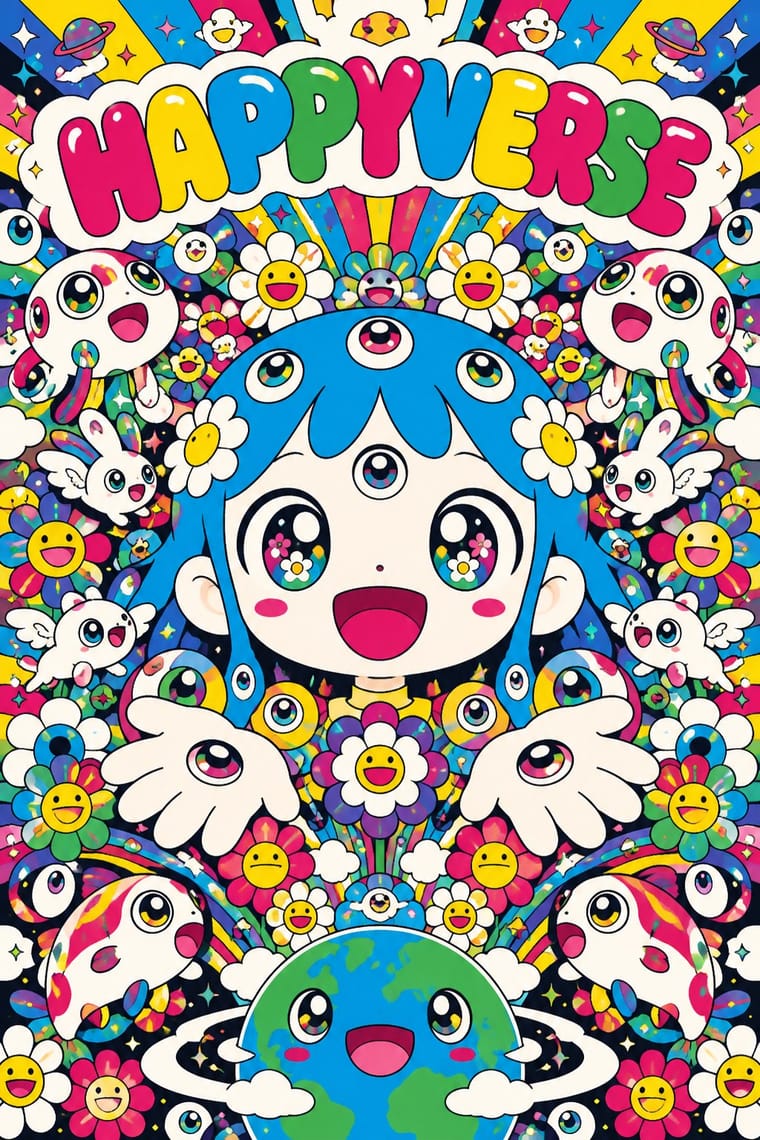
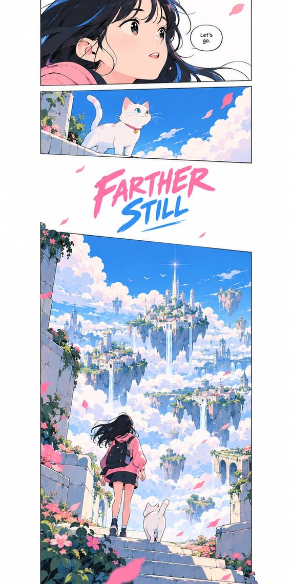
Superflat × Korean Webtoon Graphics
Both grow from East Asian comics, but Superflat spreads cartoon figures across one flat, crowded plane while the webtoon gives one beat per screen, cinematic depth and a lot of empty gutter.
Mix them and make something Superflat Korean Webtoon Graphics
01
What each style brings
Each part of the design comes from the style with the stronger say in it, and each style gives at least two.
Superflat Korean Webtoon Graphics
- Type from Korean Webtoon Graphics
- Colour from Superflat
- Form from Superflat
- Composition from Korean Webtoon Graphics
- Surface from Korean Webtoon Graphics
-
Superflat avoids painterly brushwork: this is where the two pull against each other, which is the point of the contrast.
02
The type
Open fonts standing in for each style’s own type, which is often hand-drawn or commercial.
Display · Korean Webtoon Graphics
Hello
Comic Neue, standing in for Comic font in rounded balloons (typeset digital comic fonts in rounded-rectangle or oval balloons, the one to read first placed highest; this follows English-language practice: Blambot's Smack Attack in Walter Ostlie's WEBTOON lettering guide)
Text · Superflat
The flat, saturated, cartoon-crowded look that Takashi Murakami named in his exhibition and manifesto Superflat (Tokyo, 2000; US tour 2001). It draws a line from Edo painting and prints to postwar anime and manga, and flattens high and low, art and merchandise into one plane. Smiling flowers, many-eyed characters and anime figures come in unshaded polychrome, smooth and glossy, cute and grotesque at once, sold as handbags and album covers as well as paintings. This entry follows the drawn core of Murakami and his Kaikai Kiki circle; the shows also held photography, video and sculpture.
Zen Maru Gothic; Superflat used Letters drawn into the character and Many-coloured repeated monogram
03
The colours
The ground and leading colours come from Superflat, with a counter-accent from Korean Webtoon Graphics. The ink reads on the ground at 4.5:1 or more.
Superflat Korean Webtoon Graphics
-
#fbfaf5ground · 36% -
#1a1a1aink · 14% -
#ffd900accent · 18% -
#3d8bfdaccent · 14% -
#00a0e9accent · 10% -
#ff7aa8accent · 8%
As CSS
:root {
  --ground: #fbfaf5;
  --ink: #1a1a1a;
  --accent-1: #ffd900;
  --accent-2: #3d8bfd;
  --accent-3: #00a0e9;
  --accent-4: #ff7aa8;
  --font-display: "Comic Neue", cursive;
  --font-text: "Zen Maru Gothic", sans-serif;
}
Use it with care
Superflat: Some canonical works use explicit otaku sexual imagery, such as Murakami's My Lonesome Cowboy (1998), and associated artists engage with lolicon art: Mr. describes himself as a lolicon and Henmaru Machino parodies it; never sexualise childlike figures. The mushroom-cloud skulls of Murakami's Time Bokan works and the title Little Boy, the name of the Hiroshima bomb, refer to the atomic bombings, and critics such as Dong-Yeon Koh argue that this victim narrative obscures Japanese aggression in China and Korea; do not use mushroom clouds or skulls as cute decoration. Handle borrowed Buddhist iconography and phrases, such as Kannon, with respect, and draw original characters and flowers: Mr. DOB, the smiling flowers and the Louis Vuitton monogram are owned designs.
Korean Webtoon Graphics: Series characters and artwork, such as those of Tower of God, Solo Leveling or Lore Olympus, belong to their creators and platforms; draw original characters, and do not trace or closely copy a working artist's panels or signature look. Korean webtoon creators have opposed AI-generated webtoon art: from 2 May 2023 some 60 'AI Webtoon Boycott' strips filled Naver Webtoon's Challenge Comics section for amateurs, and over 200 cartoonists said on social media that they would join, calling AI that learns without the original creators' permission theft. Label generated images as AI-made and never present them as a webtoon artist's work.
04
The two styles
05
More combinations
With Superflat
- Kawaii Design Contrasts · Kawaii offers sincere, simple, pastel cuteness for fancy goods; switch to Superflat when the cute should be saturated, crowded, many-eyed and ironic, a comment on consumer culture rather than a product of it.
- Pop Art Graphics Contrasts · Both turn commodities into art; take Pop's repetition and frontal commodity but swap its halftone and off-register silkscreen for Superflat's smooth vector fills and anime characters, so the print process disappears.
- Minimalist Graphic Design Contrasts · One dense field of smiling flowers on an otherwise empty white page gives a minimal layout a single loud focal point without giving up its calm.
- Ukiyo-e Woodblock Prints Pairs well · Murakami traces Superflat's flatness back to Hokusai's prints; borrow the woodblock keyline, the stylised wave and the cropped composition and fill them with Superflat's saturated characters.
- Techno-Futurist Graphics Pairs well · groovisions, whose Chappie figure showed in the 2001 Superflat exhibition, links the two; set Superflat characters inside techno-futurist logos, grids and katakana captions for a slicker, more corporate parody.
- Angura Theatre Poster Contrasts · Both quote ukiyo-e and Pop from Japan, but angura crams photographs and fluorescent silkscreen into a rebellious collage while Superflat draws everything smooth and flat; set one flat Superflat character against an angura photomontage for a clash of eras.
- Story Manga (Postwar Japanese Comics) Contrasts · Murakami's Superflat lifts anime and manga figures out of the story onto one flat, glossy, polychrome plane for the gallery; story manga keeps the sequence, the depth of its backgrounds and its single black ink.
- Lo-fi Anime Aesthetic Contrasts · Both draw on anime, but superflat flattens otaku imagery into ironic, polychrome, all-over fields with no depth; choose lofi for one sincere, softly lit room with depth, and superflat when the brief wants pop density and knowing play.
With Korean Webtoon Graphics
- Pop Art Graphics Contrasts · Pop froze a single comic panel and blew up its Ben-Day dots and off-register inks; the webtoon keeps the sequence, drops the print screen for smooth digital colour and lets the scroll do the drama.
- Kawaii Design Pairs well · For a slice-of-life or children's strip, give the webtoon's stacked panels kawaii's round, pastel characters and rounded type, keeping the long white gutters for comic timing.
- Lianhuanhua Picture-Story Books Contrasts · Both are picture stories for a mass readership, but lianhuanhua frames one monochrome line drawing per pocket-book page with a caption below; switch to the webtoon when the story should run as one full-colour column with the gutter, not the page turn, setting the pace.
- Out-of-Square Hangul Typography Pairs well · Set the series title and the big sound words in out-of-square Hangul, whose syllables hang from one top line and vary in height, to give a webtoon a Korean typographic voice of its own.
- Story Manga (Postwar Japanese Comics) Contrasts · The Korean webtoon turned manhwa, Korean comics shaped in part by Japanese manga, into a single full-colour scroll column with long empty gutters, first on PC portals and then on phones; return to story manga for a printed spread of black-and-white panels read right to left, with screentone and panels that bleed and break.
- Burmese Parabaik Painting (Konbaung Folding Books) Pairs well · A parabaik is a continuous strip read panel by panel; turn its horizontal concertina into a vertical scroll and keep the caption band under each scene for a long-form story.
- Chat Reaction-Sticker Cartooning (LINE) Pairs well · Both are app-native character cartooning; webtoon sequences scenes, stickers compress a scene into one beat.
- Visual Novel Graphics (Sprites, Backgrounds and Textbox UI) Contrasts · Scroll-driven panels against click-driven screens: the same drawn figures, opposite pacing.