Style combination · Contrasts
Showa Modern Commercial Art and Zuan-moji × Taishō Roman
Set its soft, pastel, romantic lyrical figure against the hard-edged flat geometry of Showa modern to calibrate sentiment against machine-age confidence.
Mix them and make something Showa Modern Commercial Art and Zuan-moji Taishō Roman
01
What each style brings
Each part of the design comes from the style with the stronger say in it, and each style gives at least two.
Showa Modern Commercial Art and Zuan-moji Taishō Roman & Lyrical Illustration
- Type from Showa Modern Commercial Art and Zuan-moji
- Colour from Showa Modern Commercial Art and Zuan-moji
- Form from Showa Modern Commercial Art and Zuan-moji
-
Taishō Roman avoids geometric primitives: this is where the two pull against each other, which is the point of the contrast.
- Composition from Taishō Roman
- Surface from Taishō Roman
02
The type
Open fonts standing in for each style’s own type, which is often hand-drawn or commercial.
Display · Showa Modern Commercial Art and Zuan-moji
Rose
Shippori Mincho, standing in for Zuan-moji (図案文字), designed display lettering for kanji
Text · Showa Modern Commercial Art and Zuan-moji
The commercial graphic design of Japan's interwar modern-city years, when trained design workers (zuan-ka) made flat, stylised posters for department stores, subways and cosmetics. Kanji and kana were drawn as designed lettering (zuan-moji) beside stylised modern-girl figures and machine-age motifs. Sugiura's early work was Art Nouveau, and Yamana's Shiseido work was softer and more elegant, so the look is less rigid than the Art Deco of the West and less lyrical and pastel than Taisho Roman.
Shippori Mincho; Showa Modern Commercial Art and Zuan-moji used Zuan-moji (図案文字), designed display lettering for kanji and Zuan-moji (図案文字), designed display lettering for kana
03
The colours
The ground and leading colours come from Showa Modern Commercial Art and Zuan-moji, with a counter-accent from Taishō Roman. The ink reads on the ground at 4.5:1 or more.
Showa Modern Commercial Art and Zuan-moji Taishō Roman & Lyrical Illustration
-
#f1e8d4ground · 36% -
#1b1b1bink · 14% -
#e0a82eaccent · 18% -
#b8333aaccent · 14% -
#1f4e79accent · 10% -
#d98b8faccent · 8%
As CSS
:root {
  --ground: #f1e8d4;
  --ink: #1b1b1b;
  --accent-1: #e0a82e;
  --accent-2: #b8333a;
  --accent-3: #1f4e79;
  --accent-4: #d98b8f;
  --font-display: "Shippori Mincho", serif;
  --font-text: "Shippori Mincho", serif;
}
04
The two styles
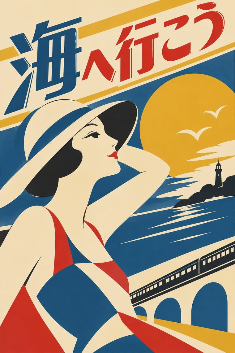
05
More combinations
With Showa Modern Commercial Art and Zuan-moji
- Edo-moji Commercial Lettering (Kanteiryū, Yose-moji, Sumō-ji) Pairs well · Both treat lettering as drawn design; fill an Edo-moji-style heavy brush shape with Showa modern flat geometry.
- Japanese Postwar Modernism Contrasts · Postwar modernism swaps the decorative figure for emblems and empty fields; compare to see how much the figure and lettering carry.
- Shanghai Modern & Yuefenpai Pairs well · Both put a modern-girl figure in East Asian commercial posters; combine the Japanese geometric lettering with Shanghai's painterly figure for a pan-Asian Deco look.
With Taishō Roman
- Ukiyo-e Woodblock Prints Pairs well · Yumeji's beauties continue the bijin-ga print; pair a woodblock-printed pattern ground with a lyrical modern figure.
- Japanese Postwar Modernism Contrasts · Postwar modernism replaced this sentimental figure with emblems and empty fields; set one against the other to calibrate warmth against austerity.
- Kawaii Design Pairs well · Nakahara Jun'ichi's large-eyed girls link the two; give kawaii characters Taishō's muted palette and wistful mood for an older, nostalgic audience.
- Art Nouveau Pairs well · Its source of line: keep Art Nouveau's contour but drop the ornamental excess, leaving one figure and a few flowers for an intimate Taishō register.
- Shōjo Manga (Japanese Girls' Comics) Pairs well · Its root: Takahashi Macoto took Nakahara Jun'ichi's large, doll-like eyes with highlights and long lashes and added dots, stars and colour to the iris. Borrow jojōga's single wistful figure, muted cream paper and hand lettering for a cover or title page with a period mood.
- Mavo Contrasts · The same Taishō Tokyo in two moods: pastel lyrical illustration of modern girls against Mavo's black linocuts, newsprint and price tags.
- Story Manga (Postwar Japanese Comics) Pairs well · Jojōga's large, highlighted, long-lashed eyes passed from Nakahara Jun'ichi to Takahashi Macoto, who added stars and dots to the iris, and so into shōjo manga; add Taishō lyrical faces, kimono patterns and soft lines to a manga page for a period romance.
- Republican Chinese Book Cover Design (Lu Xun & Tao Yuanqing) Pairs well · Feng Zikai found Takehisa Yumeji's lyrical drawings in Tokyo; Yumeji's soft line suits the quiet, literary register of these covers.