Style combination · Pairs well
Polish Poster School × Screenprinted Gig
Both swap the star's photograph for one idea; add the Polish school's painted ambiguity to a flat screenprint when a film poster needs to unsettle rather than wink.
Mix them and make something Polish Poster School Screenprinted Gig
01
What each style brings
Each part of the design comes from the style with the stronger say in it, and each style gives at least two.
Polish Poster School Screenprinted Gig & Alt-Movie Poster
- Type from Screenprinted Gig
- Colour from Screenprinted Gig
- Form from Polish Poster School
- Composition from Polish Poster School
- Surface from Polish Poster School
02
The type
Open fonts standing in for each style’s own type, which is often hand-drawn or commercial.
Display · Screenprinted Gig
Pop
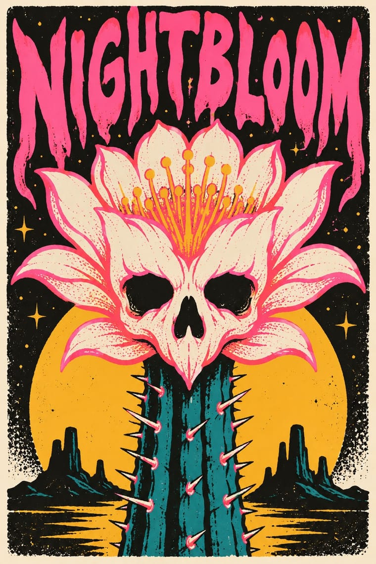
Londrina Solid; Screenprinted Gig used Hand-drawn display lettering by the poster artist, drawn into the image and Condensed sans-serif and wood-type-style capitals for the band, venue and date line
Text · Polish Poster School
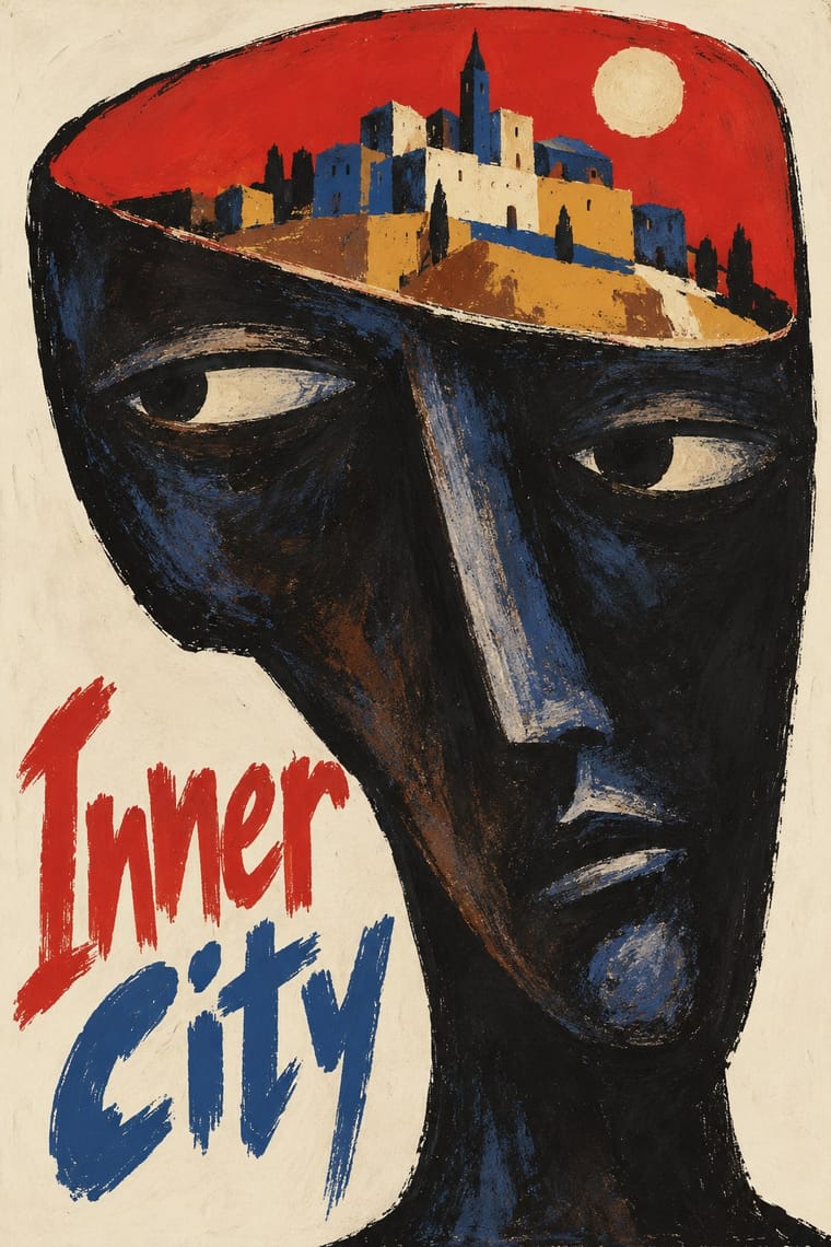
A painterly, metaphorical poster culture that flourished in communist Poland, chiefly for film, theatre, opera and circus. Working for state publishers, free of commercial pressure but under censorship, designers such as Henryk Tomaszewski, Jan Lenica and Roman Cieślewicz replaced star photographs with a single witty or unsettling visual idea, painted or collaged by hand and lettered in the artist's own handwriting.
Archivo; Polish Poster School used Henryk Tomaszewski's casual handwritten capitals and Brush- and crayon-drawn title lettering
03
The colours
The ground and leading colours come from Screenprinted Gig, with a counter-accent from Polish Poster School. The ink reads on the ground at 4.5:1 or more.
Polish Poster School Screenprinted Gig & Alt-Movie Poster
-
#1d1c1aground · 36% -
#f1ead8ink · 14% -
#f2b134accent · 18% -
#d4352baccent · 14% -
#ff4f9aaccent · 10% -
#2a8a8caccent · 8%
As CSS
:root {
  --ground: #1d1c1a;
  --ink: #f1ead8;
  --accent-1: #f2b134;
  --accent-2: #d4352b;
  --accent-3: #ff4f9a;
  --accent-4: #2a8a8c;
  --font-display: "Londrina Solid", cursive;
  --font-text: "Archivo", sans-serif;
}
Use it with care
Screenprinted Gig & Alt-Movie Poster: Film characters, logos and band names belong to their owners: Mondo's Star Wars and Marvel posters were made under licence from Lucasfilm and Disney, so clear the rights before printing a fan 'alt poster'; gig posters are the living trade of named independent printmakers, so commission or credit them rather than generating look-alikes of a recognisable artist's hand; and when you borrow the scene's sweet-and-sinister mix, keep the sinister half to monsters, skulls and noir rather than hate symbols or real atrocities: Kozik's own art drew on the iconography of Franco's fascist regime, under which he spent his earliest years in Spain, and that is not a costume to reuse.
04
The two styles
05
More combinations
With Polish Poster School
- International Typographic Style Contrasts · Painterly ambiguity versus objective grid and photography; borrow one hand-painted image to warm a Swiss-style cultural series.
- Socialist Realist Propaganda Poster Contrasts · The school defined itself against official heroic realism; use the pairing to show metaphor outperforming literal propaganda.
- Iranian Modernist Graphic Design Pairs well · Iranian designers absorbed the Polish metaphor poster; combine one surreal image with calligraphic lettering for cultural posters.
- Push Pin Style Pairs well · Both prize the illustrator-designer's hand and wit; pair Polish metaphor with Push Pin lettering for theatrical, idea-led posters.
- Polish Cold War Neon (PRL Neonisation) Pairs well · Some of the same artists drew posters and neons; take the poster's single witty idea and hand-drawn title and translate it into one line of light for a night version of a campaign.
- Polish Information Picture Book (Dwie Siostry) Contrasts · The poster designer and teacher Henryk Tomaszewski is credited with a role in the revival, but the poster school puts one painted, metaphorical image on a poster, while the picture books refuse paint and fill a spread with a hundred small labelled facts. Choose between a single idea that provokes and a dense page that informs.
- Turkish Modernist Poster & Graphic Design Contrasts · The same conceptual-poster network: Turkish designers showed at the Warsaw Poster Biennale from 1966 and Ertel's posters entered the Wilanów archive in 1968. The Polish school paints, collages and distorts its single idea; the Turkish posters cut it into flat shapes in two or three clean inks. Choose Warsaw for unease, Istanbul for a crisp visual pun.
- West German Conceptual Film & Culture Poster (Hillmann and Rambow) Contrasts · Its contemporary in art-film posters: the Polish school paints the metaphor and letters the title by hand in loose brushwork; take the Kassel route when the same single idea should come from a cropped photograph or a hard silhouette with set grotesque type.
With Screenprinted Gig
- Pop Art Graphics Pairs well · Shepard Fairey called Kozik 'the punk rock Warhol'; take Pop's appropriated cartoons and halftones and give them a gig poster's single idea and hand-lettered title.
- Psychedelic Poster Pairs well · The 1960s Fillmore and Avalon posters are its ancestor; borrow one swelling, shape-filling title from them, but keep the band, date and venue line readable.
- Australian Poster Collective Screenprints Contrasts · Both hand-pull flat, hand-lettered screenprints from the same psychedelic root and both reach for fluoro inks; the Australian collectives printed for unions, marches and community causes (and some bands), often from photo stencils, and pasted them up at night, while the gig and alt-movie poster prints for one show, one film and a collector's wall, trading agitation for wit and nostalgia.
- American Mid-Century Modernism Pairs well · Saul Bass's film posters are a favourite model of the alternative movie poster (Film Comment found the Bass homages 'far too plentiful' in 2014); borrow his one cut-paper symbol that holds the whole story.
- WPA Silkscreen Posters Pairs well · Firewatch, the game Olly Moss art-directed, takes its look from National Park posters, and Killscreen (2014) likened its trailer to the Federal Art Project's 1930s national-park posters; give a fannish subject that calm public-service look and the wit shows.
- Risograph & Indie Print Culture Contrasts · Riso gives translucent soy inks and grain on small sheets; choose the screenprint for heavier ink, opaque where it must cover, on a large sheet that collectors frame, and riso for cheap, quick runs.
- Bandung Distro Graphics Pairs well · Both screenprint scene-made graphics for bands; distro moves the print from paper onto cloth.
- Spotify Duotone Identity Pairs well · Add hand-lettered, flat-ink poster drawing to recall the gig-flier roots of the look.