Style combination · Pairs well
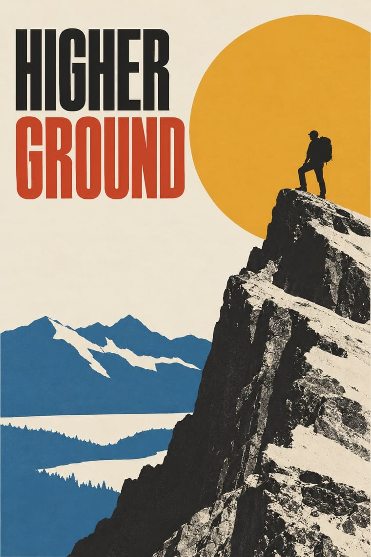
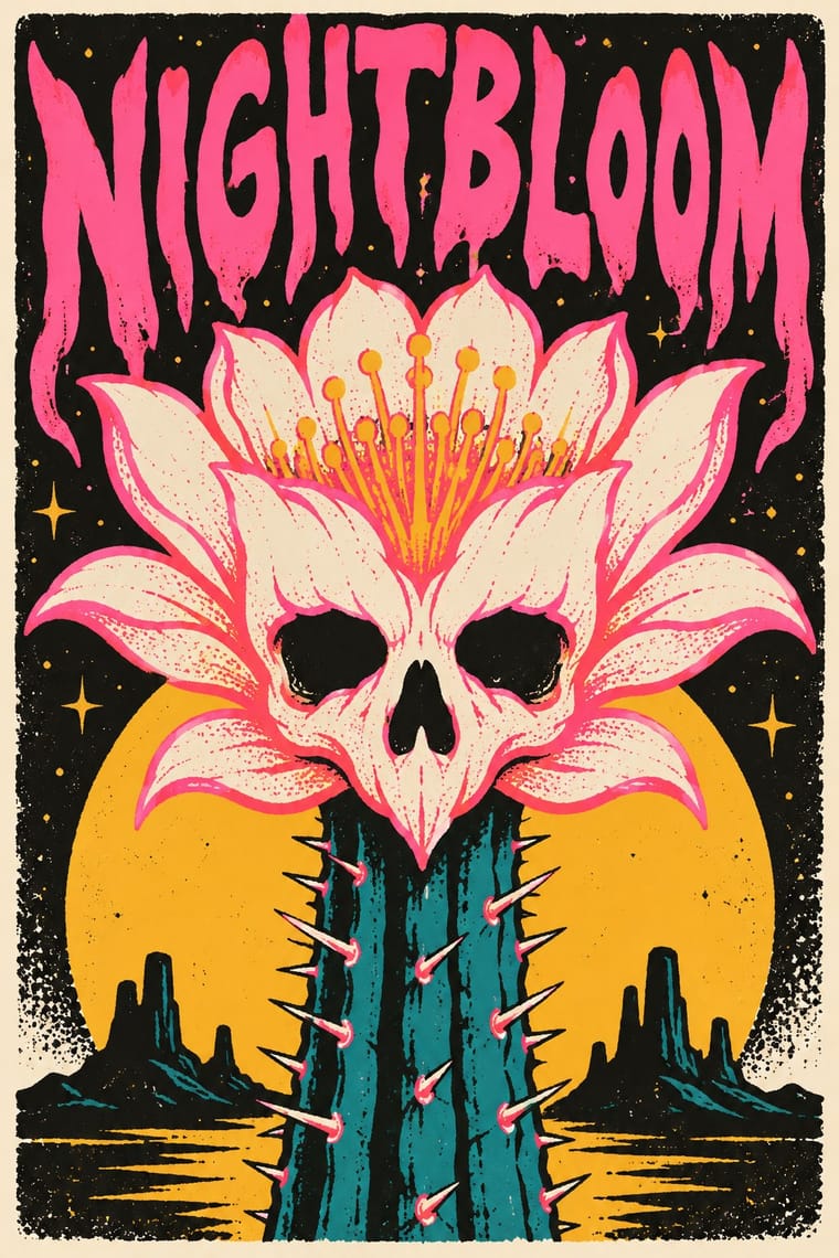
American Mid-Century Modernism × Screenprinted Gig
Saul Bass's film posters are a favourite model of the alternative movie poster (Film Comment found the Bass homages 'far too plentiful' in 2014); borrow his one cut-paper symbol that holds the whole story.
Mix them and make something American Mid-Century Modernism Screenprinted Gig
01
What each style brings
Each part of the design comes from the style with the stronger say in it, and each style gives at least two.
American Mid-Century Modernism Screenprinted Gig & Alt-Movie Poster
- Type from Screenprinted Gig
-
American Mid-Century Modernism avoids ornamented display: this is where the two pull against each other.
- Colour from American Mid-Century Modernism
- Form from Screenprinted Gig
- Composition from American Mid-Century Modernism
- Surface from Screenprinted Gig
02
The type
Open fonts standing in for each style’s own type, which is often hand-drawn or commercial.
Display · Screenprinted Gig
Hello
Londrina Solid; Screenprinted Gig used Hand-drawn display lettering by the poster artist, drawn into the image and Condensed sans-serif and wood-type-style capitals for the band, venue and date line
Text · American Mid-Century Modernism
The American synthesis of European avant-garde form with wit, pragmatism and commercial clients, led by Paul Rand, Alvin Lustig, Lester Beall, Bradbury Thompson and Saul Bass. Asymmetric layouts, cut-paper and collaged shapes, photomontage, playful hand-drawn marks and a few bright flat colours turned book jackets, magazines, advertising, film titles and corporate work into idea-driven visual puns.
Jost; American Mid-Century Modernism used Futura and Bodoni
03
The colours
The ground and leading colours come from American Mid-Century Modernism, with a counter-accent from Screenprinted Gig. The ink reads on the ground at 4.5:1 or more.
American Mid-Century Modernism Screenprinted Gig & Alt-Movie Poster
-
#f2ede1ground · 36% -
#1a1a1aink · 14% -
#e2a83aaccent · 18% -
#d6452faccent · 14% -
#2f5f8aaccent · 10% -
#5c7a3eaccent · 8%
As CSS
:root {
  --ground: #f2ede1;
  --ink: #1a1a1a;
  --accent-1: #e2a83a;
  --accent-2: #d6452f;
  --accent-3: #2f5f8a;
  --accent-4: #5c7a3e;
  --font-display: "Londrina Solid", cursive;
  --font-text: "Jost", sans-serif;
}
Use it with care
Screenprinted Gig & Alt-Movie Poster: Film characters, logos and band names belong to their owners: Mondo's Star Wars and Marvel posters were made under licence from Lucasfilm and Disney, so clear the rights before printing a fan 'alt poster'; gig posters are the living trade of named independent printmakers, so commission or credit them rather than generating look-alikes of a recognisable artist's hand; and when you borrow the scene's sweet-and-sinister mix, keep the sinister half to monsters, skulls and noir rather than hate symbols or real atrocities: Kozik's own art drew on the iconography of Franco's fascist regime, under which he spent his earliest years in Spain, and that is not a costume to reuse.
04
The two styles
05
More combinations
With American Mid-Century Modernism
- Victorian Letterpress & Wood Type Contrasts · Many-faced Victorian crowding versus one idea in open space is a clear demonstration of modernist economy.
- Googie & Atomic Age Pairs well · Both share post-war optimism; combine biomorphic cut shapes with Googie starbursts for retro mid-century branding.
- International Typographic Style Pairs well · Loosen a Swiss grid with Rand-style cut-paper shapes and a visual pun for modernism with a sense of humour.
- Vicente Rojo & Mexican Editorial Modernism Contrasts · Both made idea-led covers in the same decades, but American modernists composed asymmetric cut-paper shapes and hand-drawn marks in bright flat colours, while Rojo, who found the US and French advertising manuals he could get in Mexico not to his liking, framed one treated photograph or found vignette on white with a fine rule and Bodoni, Baskerville or Futura, ordering the text with printer's ornaments. Choose Rojo when the type should serve the reading rather than play the joke.
- UPA & Cartoon Modern Pairs well · Its print parent: Alvin Lustig drew UPA's logo. Both use flat colour, simple shapes and visual wit. Add UPA's caricatured characters and stripped sets to a Rand- or Lustig-style layout when an idea needs a cast of people rather than a single symbol.
- Brodovitch Editorial Design (Harper's Bazaar) Contrasts · Rand and Lustig build flat geometric pictograms; Brodovitch builds sequences of grainy photographs.
- Saul and Elaine Bass Conceptual Film Graphics Pairs well · Its print parent, which already counts Bass among its makers: take Rand's or Lustig's cut-paper wit on the page, and the Bass branch when the single idea has to move, assemble in time and set a mood before a story begins.
- Bengali Modernist Book Cover (Prachchhad) Pairs well · Combine mid-century flat cut-paper shapes and asymmetry with hand-drawn Bengali lettering for a literary jacket that works in two scripts.
With Screenprinted Gig
- Pop Art Graphics Pairs well · Shepard Fairey called Kozik 'the punk rock Warhol'; take Pop's appropriated cartoons and halftones and give them a gig poster's single idea and hand-lettered title.
- Psychedelic Poster Pairs well · The 1960s Fillmore and Avalon posters are its ancestor; borrow one swelling, shape-filling title from them, but keep the band, date and venue line readable.
- Polish Poster School Pairs well · Both swap the star's photograph for one idea; add the Polish school's painted ambiguity to a flat screenprint when a film poster needs to unsettle rather than wink.
- Australian Poster Collective Screenprints Contrasts · Both hand-pull flat, hand-lettered screenprints from the same psychedelic root and both reach for fluoro inks; the Australian collectives printed for unions, marches and community causes (and some bands), often from photo stencils, and pasted them up at night, while the gig and alt-movie poster prints for one show, one film and a collector's wall, trading agitation for wit and nostalgia.
- WPA Silkscreen Posters Pairs well · Firewatch, the game Olly Moss art-directed, takes its look from National Park posters, and Killscreen (2014) likened its trailer to the Federal Art Project's 1930s national-park posters; give a fannish subject that calm public-service look and the wit shows.
- Risograph & Indie Print Culture Contrasts · Riso gives translucent soy inks and grain on small sheets; choose the screenprint for heavier ink, opaque where it must cover, on a large sheet that collectors frame, and riso for cheap, quick runs.
- Bandung Distro Graphics Pairs well · Both screenprint scene-made graphics for bands; distro moves the print from paper onto cloth.
- Spotify Duotone Identity Pairs well · Add hand-lettered, flat-ink poster drawing to recall the gig-flier roots of the look.