Style combination · Pairs well
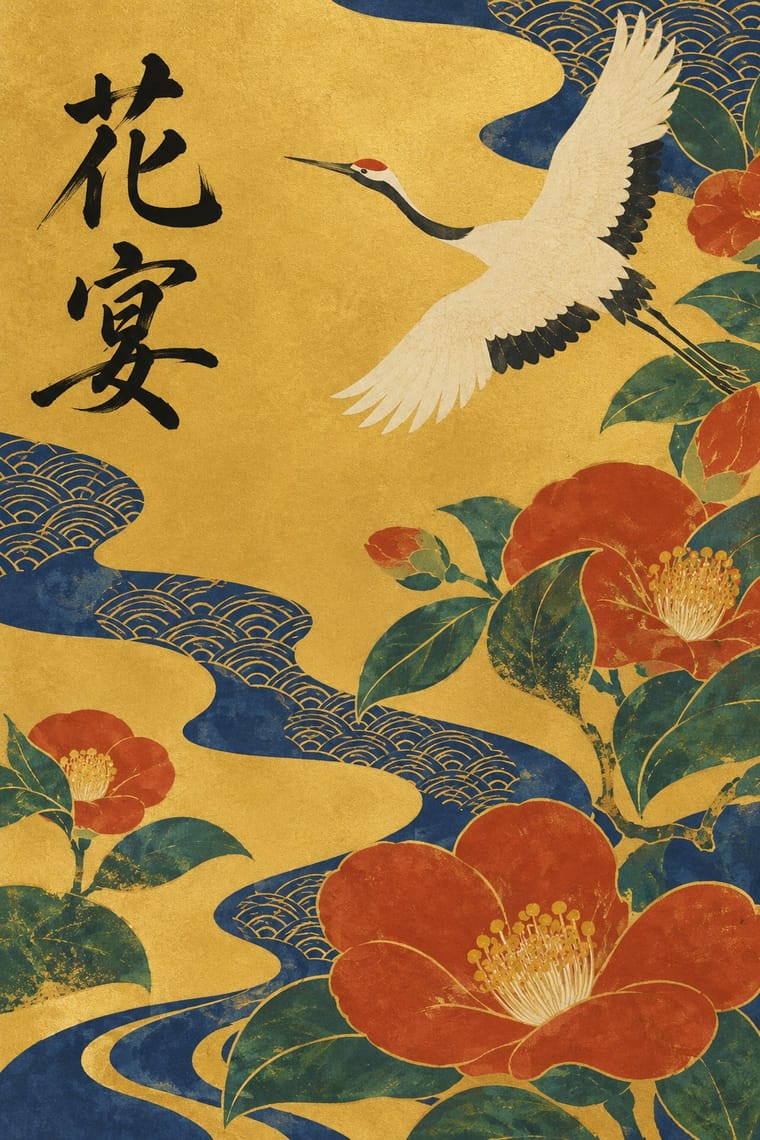
Rinpa × Ten Bamboo Studio Colour Woodblock
Kōetsu's poems written over printed and painted papers are a Japanese cousin of the decorated letter paper: pair a faint printed motif with brushed text that runs over it.
Mix them and make something Rinpa Ten Bamboo Studio Colour Woodblock
01
What each style brings
Each part of the design comes from the style with the stronger say in it, and each style gives at least two.
Rinpa & Saga-bon Ten Bamboo Studio Colour Woodblock (Douban & Gonghua)
- Type from Rinpa
- Form from Rinpa
- Composition from Rinpa
- Surface from Ten Bamboo Studio Colour Woodblock
02
The type
Open fonts standing in for each style’s own type, which is often hand-drawn or commercial.
Display · Rinpa
Velvet
Shippori Mincho, standing in for Saga-bon wooden movable type: flowing hiragana mixed with kanji, cut mostly as single characters but also as linked sorts of two, three and four characters, after a hand in Kōetsu's manner
Text · Rinpa
A Kyoto school of decorative design that revived the poetry and court painting of the Heian period, begun around 1600 by the calligrapher Hon'ami Kōetsu and the painter Tawaraya Sōtatsu and carried on less by teaching than by admiration across generations: Ogata Kōrin, Sakai Hōitsu, Kamisaka Sekka. A few plants, waves or birds are enlarged, simplified, cropped and repeated across open gold or silver grounds, colour is pooled wet into wet (tarashikomi), poems are brushed over decorated paper, and the same motifs pass to screens, fans, lacquer, kimono and the movable-type Saga-bon books.
Shippori Mincho; Rinpa used Kōetsu's brush hand and Saga-bon wooden movable type
03
The colours
The ground and leading colours come from Ten Bamboo Studio Colour Woodblock, with a counter-accent from Rinpa. The ink reads on the ground at 4.5:1 or more.
Rinpa & Saga-bon Ten Bamboo Studio Colour Woodblock (Douban & Gonghua)
-
#e9e0ccground · 36% -
#403e3aink · 14% -
#b8352daccent · 18% -
#d27a7faccent · 14% -
#1f3f7aaccent · 10% -
#5f7986accent · 8%
As CSS
:root {
  --ground: #e9e0cc;
  --ink: #403e3a;
  --accent-1: #b8352d;
  --accent-2: #d27a7f;
  --accent-3: #1f3f7a;
  --accent-4: #5f7986;
  --font-display: "Shippori Mincho", serif;
  --font-text: "Shippori Mincho", serif;
}
Use it with care
Rinpa & Saga-bon: Poems on Rinpa works and Saga-bon pages are real Japanese texts: have any kana or kanji written or set and checked by a fluent reader, and never fill a design with pseudo-calligraphy as texture. Do not present a generated gold screen as a historical work or as a copy of a named National Treasure. A Kōrin-style plum or wave can be crest-like, but keep it free of any real family's, shrine's or temple's mon.
Ten Bamboo Studio Colour Woodblock (Douban & Gonghua): Woodblock printing in watercolour (muban shuiyin) of this kind is still practised by studios such as Duoyunxuan in Shanghai and Rong Bao Zhai in Beijing and is on China's national list of intangible cultural heritage (木版水印技艺, VIII-77: Rong Bao Zhai 2006, Duoyunxuan 2008 and the Hangzhou Shizhuzhai Art Museum 2014): commission or credit their carvers and printers rather than passing off a digital imitation as a hand-printed edition, and never present a generated image as a leaf of the 1633 Collection, the 1644 Letter Papers or the Mustard Seed Garden manual. Have every inscription written or checked by a fluent reader, because image models invent pseudo-characters, and never make up a seal bearing a real painter's, collector's or studio's name.
04
The two styles
05
More combinations
With Rinpa
- Kamon (Japanese Family Crests) Pairs well · Kōrin patterns reduce a plum or a wave to an emblem much as a mon does; pair a crest-like Rinpa motif with a large open ground for packaging, keeping it free of any real family's crest.
- Art Nouveau Pairs well · Kamisaka Sekka was sent to Glasgow in 1901 and came back influenced by Art Nouveau, which he joined to Rinpa subjects; pair Rinpa's cropped irises and waves with Art Nouveau's floral lettering for a botanical label or poster.
- Ma & Wabi-sabi Aesthetics Contrasts · Both come from Kyoto's tea culture (Kōetsu also made Raku tea bowls), but wabi-sabi wants rough clay and empty paper where Rinpa wants gold leaf and malachite; one bare field can serve either, so choose the material that fills it.
- Japanese Postwar Modernism Pairs well · Tanaka Ikkō drew many 1960s–70s posters from Rinpa and has been called a 20th-century Rinpa artist, and in 2015 ten Japanese graphic designers made Rinpa posters, Hara Kenya's on real gold leaf: add a gold ground and a single cropped seasonal motif to a modernist grid for warmth and seasonality.
- Finnish Bold Print (Marimekko Modernism) Pairs well · Both enlarge a plant motif, crop it at the edge and repeat it across cloth; take Rinpa's metallic ground and pooled colour into a bold printed textile.
- Song–Ming Woodblock Book Typography (Songti / Mincho) Contrasts · The Ming/Mincho book letter is upright, separate and set square in a ruled grid; Saga-bon type is flowing kana linked across sorts on decorated paper. Use Mincho for running text and a Saga-bon-like hand for titles and poems.
- Vienna Secession Contrasts · Both set flat figures and pattern on gold, but the Secession locks them into frames and grids while Rinpa leaves the gold open and lets one motif drift across it; decide whether the gold should be a frame or a field.
- Ukiyo-e Woodblock Prints Contrasts · Ukiyo-e carves a keyline, prints in editions for the city and depicts actors and courtesans; Rinpa paints pooled colour on gold for a few patrons and depicts plants, waves and birds. Choose between the street print and the gilded screen before settling a Japanese look.
With Ten Bamboo Studio Colour Woodblock
- Song–Ming Woodblock Book Typography (Songti / Mincho) Pairs well · The same Nanjing book trade cut both: put a ruled Song-style text page opposite a graded colour leaf, as an album or a book with plates.
- Hong Kong East–West Graphic Modernism Pairs well · From the 1980s Hong Kong designers such as Kan Tai-keung staged ink washes and brush strokes in wide modernist white space; a single graded bamboo or plum spray on a clean field works the same way on packaging or a poster.
- Ukiyo-e Woodblock Prints Contrasts · Japanese colour prints fill flat colours into a carved black key line; the Ten Bamboo leaf drops the key line and grades each colour inside its block. The 1633 manual was reprinted in Japan and foreshadowed nishiki-e, yet the choice is between a graphic outline and a print that passes for a wash painting.
- Nianhua & Chinese Folk Print Contrasts · Both are Chinese colour woodblocks, but New Year prints are outlined, saturated, symmetrical and crowded with auspicious figures for every household, while the literati leaf is pale, sparse and made for the scholar's desk.
- Ma & Wabi-sabi Aesthetics Pairs well · Both make the empty ground do the work; borrow wabi-sabi's earthy, rough materials to give a Ten Bamboo-style motif a humbler surface, or its quiet asymmetry to place it.
- Contemporary Chinese Book Design ('Most Beautiful Books of China') Pairs well · The late-Ming letter papers pressed uninked blocks into paper (gonghua); use the same blind relief for a title or motif that shows only in raking light, as the colourless debossed title of the 2018 award book Ti'ang: Bai Ming de guodu does.