Style combination · Pairs well
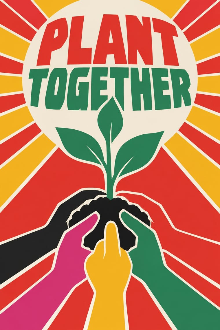
Cuban Revolutionary Poster × Vietnamese Propaganda Poster
OSPAAAL made solidarity posters for Vietnam in the same flat-colour, single-image mode; combine them for internationalist campaigns.
Mix them and make something Cuban Revolutionary Poster Vietnamese Propaganda Poster
01
What each style brings
Each part of the design comes from the style with the stronger say in it, and each style gives at least two.
Cuban Revolutionary Poster (OSPAAAL & ICAIC) Vietnamese Propaganda Poster (Tranh cổ động)
- Type from Vietnamese Propaganda Poster
- Colour from Vietnamese Propaganda Poster
- Form from Cuban Revolutionary Poster
- Composition from Cuban Revolutionary Poster
- Surface from Vietnamese Propaganda Poster
02
The type
Open fonts standing in for each style’s own type, which is often hand-drawn or commercial.
Display · Vietnamese Propaganda Poster
Act
Anton, standing in for Hand-painted Quốc ngữ condensed sans capitals with stacked diacritics
Text · Cuban Revolutionary Poster
The poster culture of revolutionary Cuba, produced for the film institute ICAIC and the solidarity organisation OSPAAAL. With no commercial advertising and scarce materials, designers made bold silkscreen and offset posters that combined Pop and psychedelic colour, op-art pattern, flat silhouettes and single conceptual images, for cinema and for internationalist causes from Vietnam to Africa.
Archivo; Cuban Revolutionary Poster used Hand-cut silkscreen display lettering and Neo-grotesque sans captions repeated in Spanish, English, French and Arabic
03
The colours
The ground and leading colours come from Vietnamese Propaganda Poster, with a counter-accent from Cuban Revolutionary Poster. The ink reads on the ground at 4.5:1 or more.
Cuban Revolutionary Poster (OSPAAAL & ICAIC) Vietnamese Propaganda Poster (Tranh cổ động)
-
#efe3c6ground · 36% -
#171717ink · 14% -
#f3c623accent · 18% -
#d22a21accent · 14% -
#3b7a3eaccent · 10% -
#d6337aaccent · 8%
As CSS
:root {
  --ground: #efe3c6;
  --ink: #171717;
  --accent-1: #f3c623;
  --accent-2: #d22a21;
  --accent-3: #3b7a3e;
  --accent-4: #d6337a;
  --font-display: "Anton", sans-serif;
  --font-text: "Archivo", sans-serif;
}
Use it with care
Vietnamese Propaganda Poster (Tranh cổ động): These are state propaganda of a one-party government that still commissions them, and wartime sheets celebrate shooting down American aircraft and defeating enemy soldiers; present them as historical sources with context, not as kitsch decor. Many posters sold to tourists are recent repaintings or reproductions, so date and attribute carefully, and keep Vietnamese diacritics intact in any slogan.
04
The two styles
05
More combinations
With Cuban Revolutionary Poster
- Socialist Realist Propaganda Poster Contrasts · Cuba largely avoided Soviet painted realism; set a flat silhouette against a heroic painting to show abstraction carrying politics.
- Corporate Identity Modernism Contrasts · Militant, colourful single-image posters versus neutral corporate systems; use the Cuban mode where a cause needs urgency.
- Pop Art Graphics Pairs well · Pair Pop's flat, brand-like imagery with Cuban single-idea silhouettes for bold campaign posters.
- Gráfica del 68 (Mexican Student Movement Graphics) Contrasts · OSPAAAL and ICAIC posters were planned, many-coloured and made to last, while the 68 brigades printed one ink for the next march; choose Cuba for a solidarity campaign, 68 for an emergency.
- Saul and Elaine Bass Conceptual Film Graphics Contrasts · ICAIC's film posters also read a film through one silhouette or pun, but in saturated, clashing screenprint colour for a revolutionary public; Bass keeps to one or two flat colours and black, and the symbol's real home is the moving title.
- Pop Achorado (Peruvian Agrarian Reform Posters) Pairs well · Both are state poster programmes that took up pop and op colour; give an OSPAAAL-style single emblem Ruiz Durand's comic contour and enlarged dot ground for a campaign that must read from across a village square.
- Puerto Rican Silkscreen Poster (DIVEDCO & ICP) Pairs well · Both are state-backed Caribbean silkscreen cultures for cinema and the arts, and Puerto Rico's began more than a decade before ICAIC's workshop; combine ICAIC's single conceptual image with Homar's hand-drawn Spanish lettering built into it.
- Atelier Populaire (May '68 Screenprint Poster) Contrasts · Same decade, opposite means: ICAIC's silkscreened film posters and OSPAAAL's mostly offset solidarity posters were polished, many-coloured and made to last, while the Atelier's one anonymous ink was pulled overnight for the next morning's wall; decide which of the two the brief needs.
With Vietnamese Propaganda Poster
- Plakatstil / Sachplakat Pairs well · Both reduce the message to one flat figure or object and hand-drawn words; use Plakatstil's plain ground to calm a busy red poster.
- Risograph & Indie Print Culture Pairs well · Two or three flat inks, stencil texture and copy variation translate directly to Riso for contemporary prints in this idiom.
- Socialist Realist Propaganda Poster Contrasts · Its parent models figures in gradients and depth; flatten the same heroic subject into two tones to see what the Vietnamese poster gains in punch.
- Đông Hồ & Hàng Trống Folk Prints Pairs well · Give Đông Hồ's plump figures and earth palette hand-painted Quốc ngữ capitals from the poster tradition for a Vietnamese campaign that feels festive rather than martial.