Style combination · Contrasts
Milanese Industrial Modernism × Zagreb Modernist Graphics
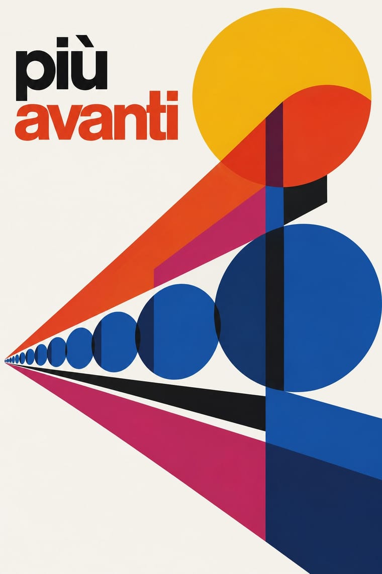
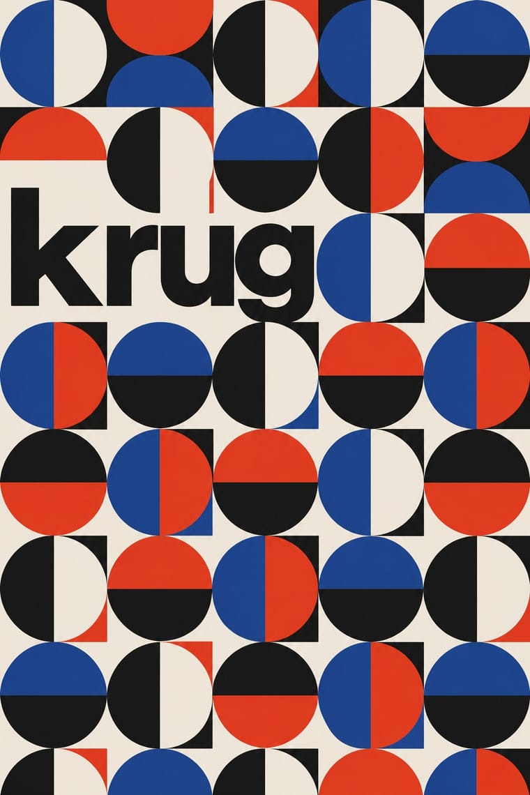
Milan's industrial modernism also builds posters from primitives and numerals, but prints offset for corporate patrons, overlaps transparent colour planes on generous white ground and loosens them with photomontage; Zagreb screenprints a few opaque inks for a gallery and a theatre and lets one multiplied unit or letter group fill the sheet against a small lowercase title band.
Mix them and make something Milanese Industrial Modernism Zagreb Modernist Graphics
01
What each style brings
Each part of the design comes from the style with the stronger say in it, and each style gives at least two.
Milanese Industrial Modernism (Olivetti, Pirelli, Studio Boggeri) Zagreb Modernist Graphics (EXAT 51 to Teatar &TD)
- Type from Zagreb Modernist Graphics
- Colour from Zagreb Modernist Graphics
- Form from Zagreb Modernist Graphics
- Composition from Milanese Industrial Modernism
- Surface from Milanese Industrial Modernism
02
The type
Open fonts standing in for each style’s own type, which is often hand-drawn or commercial.
Display · Zagreb Modernist Graphics
Yay!
Inter Tight, standing in for Lowercase neo-grotesque sans for titles and credits on Picelj's New Tendencies posters ('nove tendencije 2', 1963; 'nova tendencija 3', 1965; the five-language programme of 'tendencije 4', 1969)
Text · Milanese Industrial Modernism
The Milan-centred school that married Bauhaus- and Swiss-trained discipline with Italian painterly wit for enlightened industrial patrons such as Olivetti, Pirelli and La Rinascente. Studio Boggeri, Giovanni Pintori, Max Huber and Bob Noorda built posters, ads and signage from geometric primitives, numerals, transparent colour planes and photomontage on white grounds, held together by a house sensibility rather than a rulebook.
Inter; Milanese Industrial Modernism used Akzidenz-Grotesk and Semplicità
03
The colours
The ground and leading colours come from Zagreb Modernist Graphics, with a counter-accent from Milanese Industrial Modernism. The ink reads on the ground at 4.5:1 or more.
Milanese Industrial Modernism (Olivetti, Pirelli, Studio Boggeri) Zagreb Modernist Graphics (EXAT 51 to Teatar &TD)
-
#f1ede4ground · 36% -
#131313ink · 14% -
#f0c419accent · 18% -
#e2402aaccent · 14% -
#2a4a9caccent · 10% -
#4a2c86accent · 8%
As CSS
:root {
  --ground: #f1ede4;
  --ink: #131313;
  --accent-1: #f0c419;
  --accent-2: #e2402a;
  --accent-3: #2a4a9c;
  --accent-4: #4a2c86;
  --font-display: "Inter Tight", sans-serif;
  --font-text: "Inter", sans-serif;
}
Use it with care
Zagreb Modernist Graphics (EXAT 51 to Teatar &TD): Picelj (died 2011), Arsovski (died 2020) and Bućan (died 2023) are recent and their posters remain in copyright, Arsovski's Teatar &TD logo is still in use, and Boris Ljubičić's 1979 circle symbol is the permanent emblem of the International Committee of the Mediterranean Games, so borrow the method (a multiplied unit, a lowercase credit line, a rebus title) rather than reproducing a particular poster or mark. Do not dress the style in red stars or party slogans as period decor: these designers worked for galleries and theatres in socialist Yugoslavia and deliberately avoided propaganda imagery.
04
The two styles
05
More combinations
With Milanese Industrial Modernism
- Corporate Identity Modernism Contrasts · American corporate identity policed one mark through a manual, while Milan let artists vary the language; compare the two when deciding how strict a brand system should be.
- International Typographic Style Pairs well · Start from a Swiss grid and grotesque, then add Pintori-style colour metaphors to warm a corporate system without losing its order.
- Memphis Design Contrasts · Milan's own later rebellion against functional wit; set Memphis's ornamental irony against this clean industrial optimism for a deliberate generational clash.
- Generative & Dynamic Identities Pairs well · Pintori's cascades of numerals and dots are proto-generative; code them as rules to drive a contemporary variable identity.
- Giallo Mondadori Covers (I Libri Gialli) Contrasts · The same city in the same decades: Olivetti's and Pirelli's asymmetric, abstract, white-ground modernism against the mostly centred, figurative yellow of the newsstand thriller, Milan's two faces of mass print.
With Zagreb Modernist Graphics
- Total Design & Dutch Functionalism Contrasts · Both make an institution recognisable by its letters and grids, but Total Design applies one impersonal programme across clients, while on Picelj's gallery posters the unit changes with every artist shown and Arsovski breaks the order with collage, pop photographs and rebuses.
- Op Art Graphics Pairs well · The New Tendencies shows in Zagreb were one of op art's sources; take op's vibrating line fields and hold them inside Picelj's square module and small lowercase credit line for a gallery poster that stays systematic.
- Zagreb School of Animated Film Pairs well · The same city and years, with EXAT's Vlado Kristl and Aleksandar Srnec working on Zagreb Film cartoons; set a flat, satirical Zagreb-school figure against a grid of repeated units or letters for a festival poster.
- Brazilian Concrete Design Contrasts · The nearest genome: São Paulo and Zagreb both turned constructive geometry and serial units into posters from 1951. Brazilian concrete design prints offset for industry and the press, sets a few geometric elements in tension with a white ground and stays strictly non-figurative; Zagreb screenprints for a gallery and a student theatre, runs one multiplied unit across the sheet, sometimes on metallic paper, against a small band of lowercase grotesque, and with Arsovski breaks the system with photo collage, pop quotation and rebus titles.
- Polish Poster School Contrasts · Its socialist-era neighbour solved theatre and film posters with one painted, hand-lettered metaphor; Zagreb solves them with set type, repeated geometry and photographic collage, so compare the two to choose between the painter's hand and the typographer's system.
- NSK Retro-Avant-Garde Contrasts · A later Yugoslav answer to power: Ljubljana's retro-avant-garde of the 1980s lifts socialist, Nazi and religious emblems whole and joins them in solemn heraldry, while Zagreb's designers of the 1950s–70s kept such emblems out and built their posters from abstract units and letters; choose between impersonating power through its symbols and a sign system with none.
- Push Pin Style Pairs well · Critics compare Arsovski's 1960s posters to Push Pin's: borrow Push Pin's period-pastiche lettering and add Arsovski's photo collage and rebus titles for a witty cultural poster.