Style combination · Contrasts
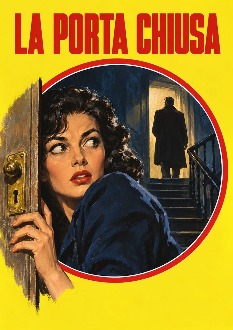
Giallo Mondadori Covers × Milanese Industrial Modernism
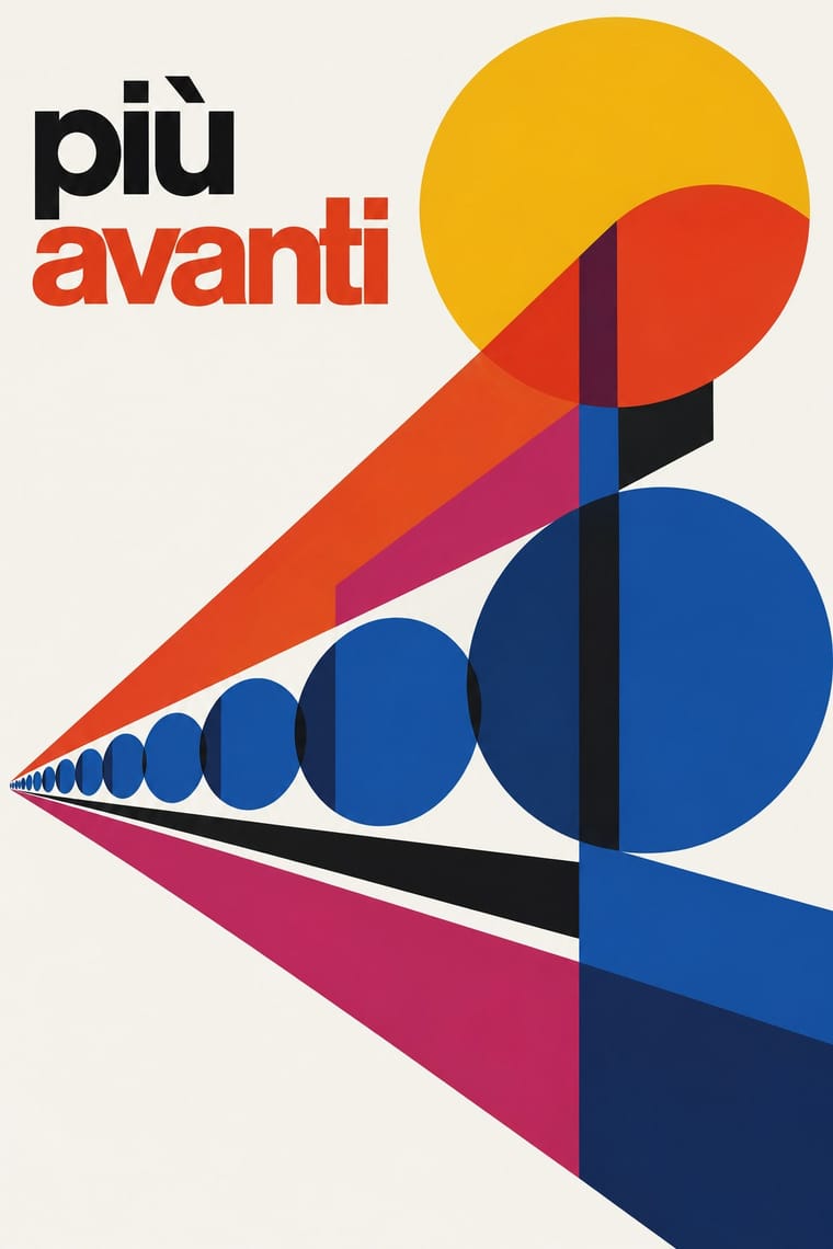
The same city in the same decades: Olivetti's and Pirelli's asymmetric, abstract, white-ground modernism against the mostly centred, figurative yellow of the newsstand thriller, Milan's two faces of mass print.
Mix them and make something Giallo Mondadori Covers Milanese Industrial Modernism
01
What each style brings
Each part of the design comes from the style with the stronger say in it, and each style gives at least two.
Giallo Mondadori Covers (I Libri Gialli) Milanese Industrial Modernism (Olivetti, Pirelli, Studio Boggeri)
- Type from Giallo Mondadori Covers
- Colour from Giallo Mondadori Covers
- Form from Milanese Industrial Modernism
-
Giallo Mondadori Covers avoids non-representational: this is where the two pull against each other, which is the point of the contrast.
- Composition from Milanese Industrial Modernism
- Surface from Giallo Mondadori Covers
02
The type
Open fonts standing in for each style’s own type, which is often hand-drawn or commercial.
Display · Giallo Mondadori Covers
Pop
Anton, standing in for Condensed display capitals for title and author on the postwar weekly, under a masthead of spaced sans capitals over a rule (I GIALLI MONDADORI / IL DELITTO MI HA VINTO / di FRANCO ENNA, no. 385, 1956), then heavy condensed title capitals across the full width beside a red corner block lettered IL GIALLO MONDADORI in white sans capitals (COLPO A FREDDO, no. 600, 1960)
Text · Milanese Industrial Modernism
The Milan-centred school that married Bauhaus- and Swiss-trained discipline with Italian painterly wit for enlightened industrial patrons such as Olivetti, Pirelli and La Rinascente. Studio Boggeri, Giovanni Pintori, Max Huber and Bob Noorda built posters, ads and signage from geometric primitives, numerals, transparent colour planes and photomontage on white grounds, held together by a house sensibility rather than a rulebook.
Inter; Milanese Industrial Modernism used Akzidenz-Grotesk and Semplicità
03
The colours
The ground and leading colours come from Giallo Mondadori Covers, with a counter-accent from Milanese Industrial Modernism. The ink reads on the ground at 4.5:1 or more.
Giallo Mondadori Covers (I Libri Gialli) Milanese Industrial Modernism (Olivetti, Pirelli, Studio Boggeri)
-
#f5f1e4ground · 36% -
#151515ink · 14% -
#d42a26accent · 18% -
#f0b41caccent · 14% -
#d9906faccent · 10% -
#1b2c4faccent · 8%
As CSS
:root {
  --ground: #f5f1e4;
  --ink: #151515;
  --accent-1: #d42a26;
  --accent-2: #f0b41c;
  --accent-3: #d9906f;
  --accent-4: #1b2c4f;
  --font-display: "Anton", sans-serif;
  --font-text: "Inter", sans-serif;
}
Use it with care
Giallo Mondadori Covers (I Libri Gialli): Il Giallo Mondadori, its masthead and the Mondadori emblem belong to Arnoldo Mondadori Editore, which still publishes the series, and the cover paintings by Carlo Jacono and others remain in copyright: paint your own scene and letter your own title, do not combine a yellow ground, a red-rimmed circle and a Mondadori-style masthead so that a design passes for an issue of the series, and never present a generated cover as a vintage giallo. Do not default to the pin-up and sexualised-victim clichés some covers use (the woman in lingerie on no. 385, 1956) when borrowing the look.
04
The two styles
05
More combinations
With Giallo Mondadori Covers
- Penguin Paperback Design (Three Bands to the Marber Grid) Contrasts · Penguin coded crime with green bands and type only; Mondadori coded it with yellow and a painted window. Borrow Penguin's fixed type positions to tidy a giallo template, or a painted window to warm a banded one.
- Egyptian Painted Film Poster Pairs well · Both paint a lurid, cinematic moment of crime or melodrama for a mass public; the poster's calligraphic logotype and floating heads can loosen the giallo's sober capitals.
- Fotoromanzo (Italian Photo-Romance) Contrasts · Both sold weekly at Italian kiosks, but the photo-romance told melodrama in staged photographs and ruled grids, the giallo in one painted window; set them side by side to contrast photographic and painted suspense.
- Bonelli Fumetto (Italian Popular Adventure Comics) Pairs well · Milan's other newsstand serial: Bonelli's constant masthead and single dramatic cover scene sit well beside the yellow-and-circle trade dress in a set of popular-fiction covers.
With Milanese Industrial Modernism
- Corporate Identity Modernism Contrasts · American corporate identity policed one mark through a manual, while Milan let artists vary the language; compare the two when deciding how strict a brand system should be.
- International Typographic Style Pairs well · Start from a Swiss grid and grotesque, then add Pintori-style colour metaphors to warm a corporate system without losing its order.
- Memphis Design Contrasts · Milan's own later rebellion against functional wit; set Memphis's ornamental irony against this clean industrial optimism for a deliberate generational clash.
- Generative & Dynamic Identities Pairs well · Pintori's cascades of numerals and dots are proto-generative; code them as rules to drive a contemporary variable identity.
- Zagreb Modernist Graphics (EXAT 51 to Teatar &TD) Contrasts · Milan's industrial modernism also builds posters from primitives and numerals, but prints offset for corporate patrons, overlaps transparent colour planes on generous white ground and loosens them with photomontage; Zagreb screenprints a few opaque inks for a gallery and a theatre and lets one multiplied unit or letter group fill the sheet against a small lowercase title band.