Style combination · Pairs well
Kamon × Kinngait Inuit Printmaking
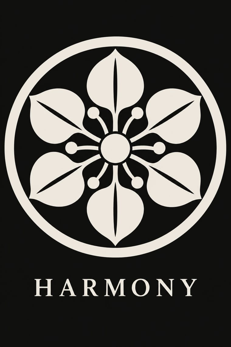
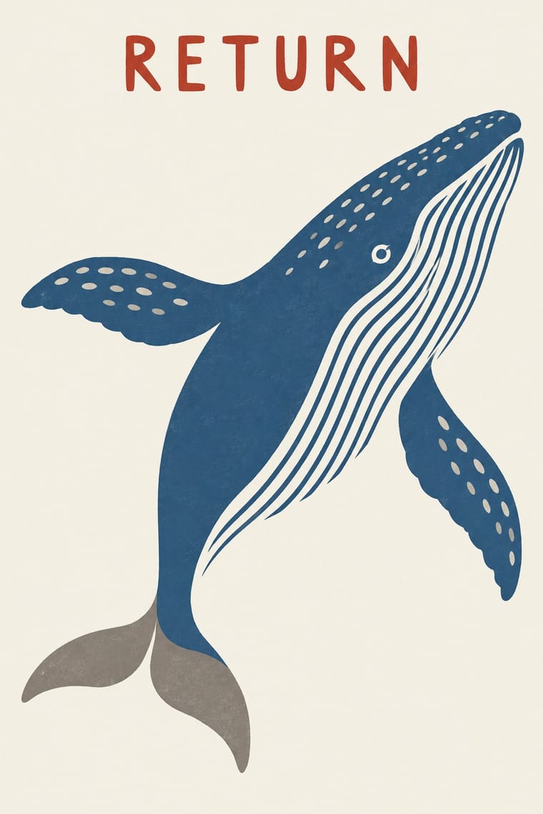
Both set one emblem small and alone on a plain ground; kamon builds it from compass arcs in one colour, Kinngait cuts it freehand and fades its colour, so take kamon's geometry when the mark must survive any size and Kinngait's softness when it should feel drawn.
Mix them and make something Kamon Kinngait Inuit Printmaking
01
What each style brings
Each part of the design comes from the style with the stronger say in it, and each style gives at least two.
Kamon (Japanese Family Crests) Kinngait (Cape Dorset) Inuit Printmaking
- Type from Kamon
-
- Colour from Kamon
- Form from Kamon
- Composition from Kinngait Inuit Printmaking
- Surface from Kinngait Inuit Printmaking
02
The type
Open fonts standing in for each style’s own type, which is often hand-drawn or commercial.
Display · Kamon
Calm
Shippori Mincho, standing in for Brush-written kaisho (regular-script) kanji for shop names and family names on curtains and lanterns
Text · Kinngait Inuit Printmaking
Prints from the Inuit co-operative studio at Kinngait (Cape Dorset), Nunavut, with a catalogued collection every year since 1959. Inuit artists draw; Inuit printmakers cut the drawing in stone or a stencil and print it by hand in editions of thirty (1959) and then fifty. A single figure, most often a bird or animal, floats as a flat silhouette in one to three inks on unprinted paper, and stencil daubing grades the colour inside it. This is the classic idiom; lithographs and etchings followed from the 1970s, and Annie Pootoogook, Shuvinai Ashoona and others have drawn contemporary Inuit life.
Caveat; Kinngait Inuit Printmaking used From the mid-1970s, the artist's pencil signature beneath the image, beside the title and an edition number such as 43/50 and Small carved chops of artist and printer, often cut from linoleum floor tile, stacked with the studio's mark in a vertical column in the margin of the stonecuts and stencils, as reproduced in the 1959 and 1960 catalogues
03
The colours
The ground and leading colours come from Kamon, with a counter-accent from Kinngait Inuit Printmaking. The ink reads on the ground at 4.5:1 or more.
Kamon (Japanese Family Crests) Kinngait (Cape Dorset) Inuit Printmaking
-
#f3efe6ground · 36% -
#121212ink · 14% -
#b38f3daccent · 18% -
#b5352caccent · 14% -
#2c5a8caccent · 10% -
#1d2b47accent · 8%
As CSS
:root {
  --ground: #f3efe6;
  --ink: #121212;
  --accent-1: #b38f3d;
  --accent-2: #b5352c;
  --accent-3: #2c5a8c;
  --accent-4: #1d2b47;
  --font-display: "Shippori Mincho", serif;
  --font-text: "Caveat", cursive;
}
Use it with care
Kamon (Japanese Family Crests): Mon are inherited marks of particular families, shrines, temples and institutions. Only the imperial chrysanthemum is named in Japanese law: the Trademark Act (art. 4(1)(i)) bars registering it or anything like it. The government's paulownia, though the official emblem of the Prime Minister and Cabinet, was never given the same legal restrictions, while famous crests registered as trademarks, such as Mitsubishi's three diamonds, are protected as marks. Do not use the chrysanthemum, the government paulownia, or any identifiable family's, shrine's or temple's crest as decoration or as a brand. Imperial emblems can also recall Japan's wartime empire for audiences in Korea and China. The manji (卍), a standard crest (the Hachisuka clan; the temple crest of Sensō-ji), is read in the West as the Nazi swastika: avoid it outside a Japanese context that explains it. Draw new crests by the tradition's rules instead of borrowing real ones, and commission or credit working monsho uwaeshi, who still draw and paint crests by hand.
Kinngait (Cape Dorset) Inuit Printmaking: Kinngait printmaking is the living, collectively run art of an Inuit community, and its images belong to named Inuit artists and printmakers whose copyright the West Baffin Eskimo Co-operative manages as their agent: license or commission work through the co-operative or Dorset Fine Arts rather than tracing a print. Borrow the system (a lone silhouette floating on open paper, one to three inks, stencil-graded colour, stone-cut edges), not a particular artist's owl, sun or hand. Do not invent Inuit spirit beings, shamans, the sea goddess or hunting rites as decoration; picture the subject the brief supplies. Never add a syllabic signature, artist's or printer's chops, the studio's mark, an edition number or the igloo authenticity symbol to generated work, and never present it as a Kinngait or Inuit print. Say 'Inuit', not 'Eskimo', except in historical names such as the co-operative's, and do not let Kinngait stand for all Inuit art: other communities, such as Qamani'tuaq (Baker Lake), have their own print studios and styles.
04
The two styles
05
More combinations
With Kamon
- Ukiyo-e Woodblock Prints Pairs well · Kabuki actors had their own mon, and actor prints show them on the costume, as on the sleeve of Ichikawa Yaozō III in a print of 1796; pair a flat crest with ukiyo-e figures to identify characters without captions.
- Islamic Geometric & Calligraphic Tradition Contrasts · Both are built with compass and straight edge, but girih tiles the whole surface without end while a mon closes one motif inside a ring; borrow the tessellation for a ground and the crest for the single sign on it.
- Corporate Identity Modernism Pairs well · A mon already behaves like a corporate mark (one colour, scalable, placed in fixed positions), as Mitsubishi's three diamonds show; use crest construction rules to build a logo family with codified variants for subsidiaries.
- Ma & Wabi-sabi Aesthetics Contrasts · Both set a single sign in emptiness, but wabi-sabi wants it off-centre, irregular and brush-marked while a mon is exact, symmetric and compass-drawn; set a crest's geometry against wabi-sabi's rough, quiet grounds when packaging or interiors need that tension.
- Japanese Postwar Modernism Pairs well · Postwar Japanese designers drew on kamon for their single emblematic symbols; pair a compass-drawn crest with a grotesque or Gothic caption on an empty field for an identity that is plainly modern but rooted.
- Northwest Coast Formline Design Contrasts · Both are hereditary crest systems, but formline fills a red-and-black field with split, swelling creatures while a mon is a tiny symmetric silhouette in emptiness; compare them to decide between abundance and reduction.
- Japonisme Pairs well · Through Japonisme, mon fed late-19th-century Western pattern design, Louis Vuitton's monogram among them; borrow a crest's compass-built flat silhouette for a Western repeat or monogram, drawn new rather than copied from a real family.
- European Heraldry Contrasts · Both mark kinship with hereditary emblems varied in small codified ways, but a mon is a one-colour silhouette drawn round a centre, while a coat of arms is a shield of contrasting tinctures read by the rule of tincture.
With Kinngait Inuit Printmaking
- Rorke's Drift Linocut Contrasts · Two mid-century workshops where a community with no printmaking tradition began cutting blocks with an outside teacher: Rorke's Drift crowds a black-and-white story into banded scenes, Kinngait usually isolates one figure in colour on open paper; choose by whether the image should narrate or present.
- Ukiyo-e Woodblock Prints Contrasts · Houston studied with the sōsaku-hanga printmaker Un'ichi Hiratsuka in 1958–59, and Kinngait shares ukiyo-e's hand-rubbed relief, Japanese paper, margin seals and a split between designer, cutter and printer (which sōsaku hanga itself rejected); but ukiyo-e fills a cropped scene inside a carved keyline with cartouche text, while Kinngait usually floats a few silhouettes on open paper, so use ukiyo-e for a full scene and Kinngait for a lone presence.
- Kalighat Pat & Battala Bazaar Prints Contrasts · Both isolate a stylised figure on pale paper with little else; Kalighat paints it with a loaded brush and a sweeping outline for a bazaar market, Kinngait cuts it in stone or daubs it through a stencil, so take Kalighat for a painted, satirical line and Kinngait for a still, printed silhouette.
- Chinese Paper-Cut (Jianzhi) Contrasts · Both are flat silhouettes with notches and cut patterns inside; paper-cut folds the sheet for exact mirror symmetry and fills the shape with lace, while Kinngait draws freehand, keeps a few incised marks and lets stencil colour grade inside the shape, often darkest at its tips.
- Northwest Coast Formline Design Contrasts · Both are Indigenous North American arts with their own protocols, but formline compresses a crest being until it fills its field, while Kinngait leaves open paper around a free silhouette; never blend the two into a generic 'Native' look.
- Torres Strait Islander Linocut Contrasts · Both are Indigenous community print studios whose cut marks pattern the inside of a figure, but Kinngait floats one flat silhouette in one to three inks on unprinted paper, while Torres Strait linocut packs a black field with incised pattern from edge to edge; choose Kinngait for a single quiet figure, Torres Strait for a dense cosmos, and keep Inuit and Torres Strait Islander imagery apart.