Style combination · Contrasts
Kinngait Inuit Printmaking × Torres Strait Islander Linocut
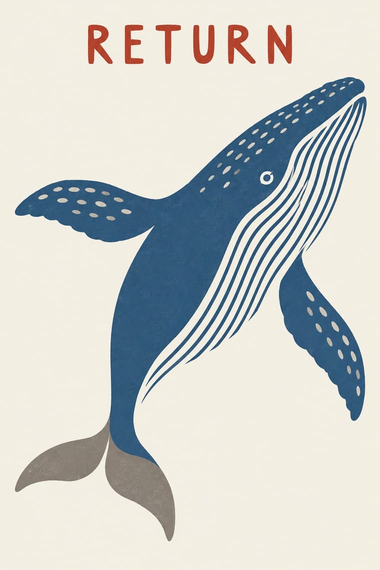
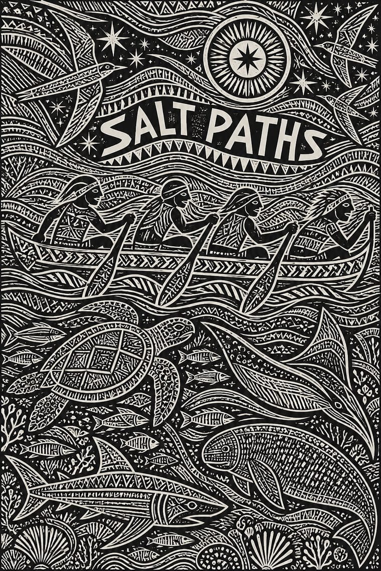
Both are Indigenous community print studios whose cut marks pattern the inside of a figure, but Kinngait floats one flat silhouette in one to three inks on unprinted paper, while Torres Strait linocut packs a black field with incised pattern from edge to edge; choose Kinngait for a single quiet figure, Torres Strait for a dense cosmos, and keep Inuit and Torres Strait Islander imagery apart.
Mix them and make something Kinngait Inuit Printmaking Torres Strait Islander Linocut
01
What each style brings
Each part of the design comes from the style with the stronger say in it, and each style gives at least two.
Kinngait (Cape Dorset) Inuit Printmaking Torres Strait Islander Linocut
- Type from Kinngait Inuit Printmaking
-
- Colour from Kinngait Inuit Printmaking
- Form from Torres Strait Islander Linocut
-
Kinngait Inuit Printmaking avoids abundant decoration: this is where the two pull against each other, which is the point of the contrast.
- Composition from Kinngait Inuit Printmaking
-
Torres Strait Islander Linocut avoids generous white space: this is where the two pull against each other, which is the point of the contrast.
- Surface from Torres Strait Islander Linocut
02
The type
Open fonts standing in for each style’s own type, which is often hand-drawn or commercial.
Display · Kinngait Inuit Printmaking
Fiesta
Caveat, standing in for From the mid-1970s, the artist's pencil signature beneath the image, beside the title and an edition number such as 43/50; up to and sometimes including 1974 the artist's carved chop stood in for the signature (Dorset Fine Arts, Stonecut: Chops). Kenojuak's syllabic signature, ᑭᓄᐊᔪᐊ, on a colour trial proof of The Enchanted Owl was added later (First Arts)
Text · Kinngait Inuit Printmaking
Prints from the Inuit co-operative studio at Kinngait (Cape Dorset), Nunavut, with a catalogued collection every year since 1959. Inuit artists draw; Inuit printmakers cut the drawing in stone or a stencil and print it by hand in editions of thirty (1959) and then fifty. A single figure, most often a bird or animal, floats as a flat silhouette in one to three inks on unprinted paper, and stencil daubing grades the colour inside it. This is the classic idiom; lithographs and etchings followed from the 1970s, and Annie Pootoogook, Shuvinai Ashoona and others have drawn contemporary Inuit life.
Caveat; Kinngait Inuit Printmaking used From the mid-1970s, the artist's pencil signature beneath the image, beside the title and an edition number such as 43/50 and Small carved chops of artist and printer, often cut from linoleum floor tile, stacked with the studio's mark in a vertical column in the margin of the stonecuts and stencils, as reproduced in the 1959 and 1960 catalogues
03
The colours
The ground and leading colours come from Kinngait Inuit Printmaking, with a counter-accent from Torres Strait Islander Linocut. The ink reads on the ground at 4.5:1 or more.
Kinngait (Cape Dorset) Inuit Printmaking Torres Strait Islander Linocut
-
#f3efe3ground · 36% -
#1b1a17ink · 14% -
#b5352caccent · 18% -
#2c5a8caccent · 14% -
#2f6a5aaccent · 10% -
#8f8a80accent · 8%
As CSS
:root {
  --ground: #f3efe3;
  --ink: #1b1a17;
  --accent-1: #b5352c;
  --accent-2: #2c5a8c;
  --accent-3: #2f6a5a;
  --accent-4: #8f8a80;
  --font-display: "Caveat", cursive;
  --font-text: "Caveat", cursive;
}
Use it with care
Kinngait (Cape Dorset) Inuit Printmaking: Kinngait printmaking is the living, collectively run art of an Inuit community, and its images belong to named Inuit artists and printmakers whose copyright the West Baffin Eskimo Co-operative manages as their agent: license or commission work through the co-operative or Dorset Fine Arts rather than tracing a print. Borrow the system (a lone silhouette floating on open paper, one to three inks, stencil-graded colour, stone-cut edges), not a particular artist's owl, sun or hand. Do not invent Inuit spirit beings, shamans, the sea goddess or hunting rites as decoration; picture the subject the brief supplies. Never add a syllabic signature, artist's or printer's chops, the studio's mark, an edition number or the igloo authenticity symbol to generated work, and never present it as a Kinngait or Inuit print. Say 'Inuit', not 'Eskimo', except in historical names such as the co-operative's, and do not let Kinngait stand for all Inuit art: other communities, such as Qamani'tuaq (Baker Lake), have their own print studios and styles.
Torres Strait Islander Linocut: These prints are the work of named Torres Strait Islander artists, most of them living and in copyright, and their stories, totems, constellations and minaral patterns belong to particular families, clans and islands of Zenadth Kes; Mariw Minaral, the title of Alick Tipoti's 2020–2023 exhibition, means spiritual patterns, and the hidden images within his patterns are secrets that protect sacred cultural information. Torres Strait Islanders are a distinct people from Aboriginal Australians: even the V&A files Nona's print under 'Australian Aboriginal' style, so do not label the work Aboriginal, 'tribal' or generically Pacific, or blend it with dot painting or other Oceanian traditions. Commission or license work from Islander artists and their art centres, such as Moa Arts (Ngalmun Lagau Minaral) on Mua, and follow Creative Australia's Protocols for using First Nations Cultural and Intellectual Property in the Arts. Borrow only the general method of a densely carved black relief, never a particular print, an artist's figures, a legend or a constellation story; never invent Zenadth Kes legends, masks, headdresses or minaral as decoration, never add an artist's signature, and never present a generated image as a Torres Strait Islander print.
04
The two styles
05
More combinations
With Kinngait Inuit Printmaking
- Rorke's Drift Linocut Contrasts · Two mid-century workshops where a community with no printmaking tradition began cutting blocks with an outside teacher: Rorke's Drift crowds a black-and-white story into banded scenes, Kinngait usually isolates one figure in colour on open paper; choose by whether the image should narrate or present.
- Ukiyo-e Woodblock Prints Contrasts · Houston studied with the sōsaku-hanga printmaker Un'ichi Hiratsuka in 1958–59, and Kinngait shares ukiyo-e's hand-rubbed relief, Japanese paper, margin seals and a split between designer, cutter and printer (which sōsaku hanga itself rejected); but ukiyo-e fills a cropped scene inside a carved keyline with cartouche text, while Kinngait usually floats a few silhouettes on open paper, so use ukiyo-e for a full scene and Kinngait for a lone presence.
- Kamon (Japanese Family Crests) Pairs well · Both set one emblem small and alone on a plain ground; kamon builds it from compass arcs in one colour, Kinngait cuts it freehand and fades its colour, so take kamon's geometry when the mark must survive any size and Kinngait's softness when it should feel drawn.
- Kalighat Pat & Battala Bazaar Prints Contrasts · Both isolate a stylised figure on pale paper with little else; Kalighat paints it with a loaded brush and a sweeping outline for a bazaar market, Kinngait cuts it in stone or daubs it through a stencil, so take Kalighat for a painted, satirical line and Kinngait for a still, printed silhouette.
- Chinese Paper-Cut (Jianzhi) Contrasts · Both are flat silhouettes with notches and cut patterns inside; paper-cut folds the sheet for exact mirror symmetry and fills the shape with lace, while Kinngait draws freehand, keeps a few incised marks and lets stencil colour grade inside the shape, often darkest at its tips.
- Northwest Coast Formline Design Contrasts · Both are Indigenous North American arts with their own protocols, but formline compresses a crest being until it fills its field, while Kinngait leaves open paper around a free silhouette; never blend the two into a generic 'Native' look.
With Torres Strait Islander Linocut
- Northwest Coast Formline Design Contrasts · Both translate carved crest and totemic art into prints, but formline builds beings from swelling ovoids and U-forms in flat red and black, while Torres Strait linocut builds them from fields of fine hatching; study the difference and never blend two nations' visual languages.
- Minimalist Graphic Design Pairs well · Set a print commissioned or licensed from an Islander artist on a quiet layout of generous white space and one restrained sans, so the carved density carries the page alone.
- Rorke's Drift Linocut Contrasts · Both pack a black linocut to the edges and grew from a teaching studio, but Rorke's Drift stacks Bible and history scenes in horizontal bands, while Torres Strait prints let sea beings and stars interlock in one field of minaral; pick bands to narrate in order, the open field to show a cosmos.
- Kōwhaiwhai & Toi Māori Design Contrasts · Another Oceanian pattern tradition, but kōwhaiwhai paints symmetrical koru scrolls in red, black and white along rafters, while Torres Strait linocut carves hatching around narrative figures; never treat Māori and Torres Strait design as one 'Pacific' style.
- Op Art Graphics Contrasts · Both make fine repeated lines vibrate, but op art's pattern is pure optics with no subject, while minaral names and surrounds beings in a story; use op art when a shimmering line field must carry no cultural meaning.
- Taller de Gráfica Popular Contrasts · Same medium, opposite intent: TGP gouges expressive, social-realist marks under a slogan to agitate, while Torres Strait linocut carves ornamental, pattern-saturated figures of ancestral stories with no headline at all.