Style combination · Contrasts
Escuela Bruguera × Mexican Historieta
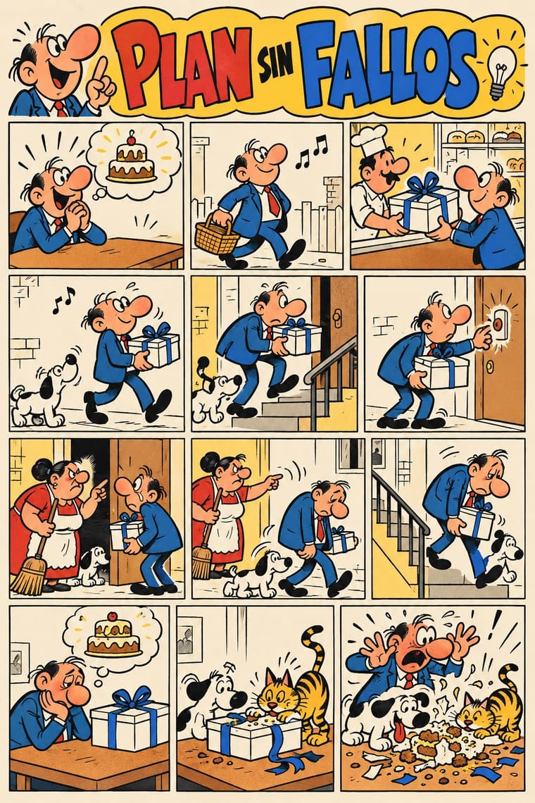
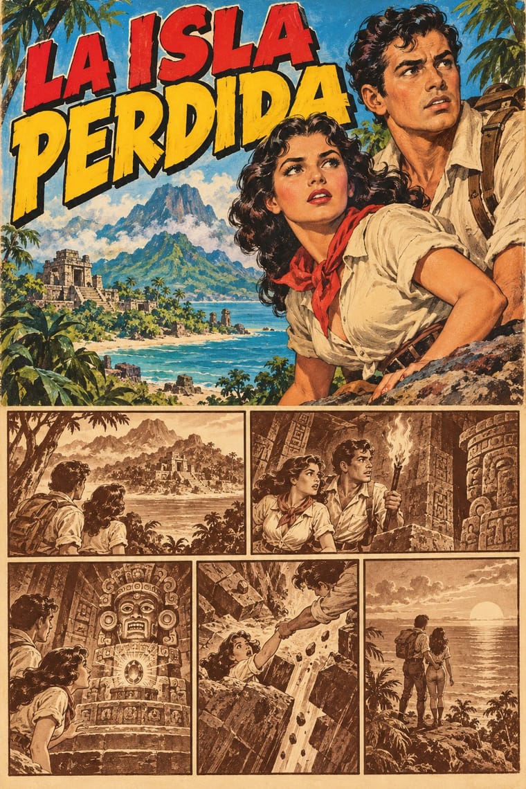
Two Spanish-language humour lines of the same decades: Bruguera's tebeos are flat-coloured slapstick for children, while the Sensacionales caricature adult barrio and market types in crowded, fully painted scenes with sex and double meanings.
Mix them and make something Escuela Bruguera Mexican Historieta
01
What each style brings
Each part of the design comes from the style with the stronger say in it, and each style gives at least two.
Escuela Bruguera (Spanish Humour Comics) Mexican Historieta (Pepines to Sensacionales)
- Type from Mexican Historieta
- Colour from Escuela Bruguera
- Form from Escuela Bruguera
- Composition from Escuela Bruguera
- Surface from Mexican Historieta
02
The type
Open fonts standing in for each style’s own type, which is often hand-drawn or commercial.
Display · Mexican Historieta
Wow
Londrina Solid, standing in for Hand-lettered balloon and caption text written by a letterer on each page (El Libro Vaquero still had its balloons lettered by hand in 2012)
Text · Escuela Bruguera
The house style of Editorial Bruguera's humour cartoonists in Barcelona from 1947 to 1986, named the 'Escuela Bruguera' by Terenci Moix in 1968. Grotesque caricatures of everyday Spanish types (a starving tramp, warring spinster sisters, two bungling agents) act out one-page gags in tiers of small panels against barely sketched urban settings, with onomatopoeia and motion symbols, and the gag ends in a blow. Halfway between children's fun and satire of manners, it mirrored postwar hunger and petty tyranny under Franco's censors, who made it soften after the 1955 decree on children's press.
Archivo; Escuela Bruguera used Hand-lettered pen dialogue in balloons and captions and Typed balloon text from the 1960s
03
The colours
The ground and leading colours come from Escuela Bruguera, with a counter-accent from Mexican Historieta. The ink reads on the ground at 4.5:1 or more.
Escuela Bruguera (Spanish Humour Comics) Mexican Historieta (Pepines to Sensacionales)
-
#f5eedbground · 36% -
#1b1a19ink · 14% -
#f3c13aaccent · 18% -
#d63a2faccent · 14% -
#2f6db5accent · 10% -
#f2b08caccent · 8%
As CSS
:root {
  --ground: #f5eedb;
  --ink: #1b1a19;
  --accent-1: #f3c13a;
  --accent-2: #d63a2f;
  --accent-3: #2f6db5;
  --accent-4: #f2b08c;
  --font-display: "Londrina Solid", cursive;
  --font-text: "Archivo", sans-serif;
}
Use it with care
Escuela Bruguera (Spanish Humour Comics): Mortadelo y Filemón, Zipi y Zape, Carpanta, Superlópez and the other Bruguera characters are still published and adapted by Ediciones B, part of Penguin Random House since 2017 (Bruguera registered characters in its own name, as it did Superlópez, taking them from their authors): draw your own types, mastheads and gags in the shared idiom, never ask an image model for these characters or for a named cartoonist's hand, and do not present a generated page as a vintage tebeo. The humour runs on stock types, violence and humiliation (the spinster hunting a husband, the beaten child): aim the satire at pretension and power, not at people's bodies, sex, class or origin.
Mexican Historieta (Pepines to Sensacionales): Memín Pinguín is drawn in the 'darky' iconography of blackface, and his mother as a 'mammy' caricature; his 2005 Mexican stamps were criticised by the White House press secretary ('racial stereotypes are offensive no matter what their origin'), Jesse Jackson and the Hispanic civil-rights groups LULAC and NCLR, so do not copy his features or use racial caricature of any kind, and give every character the same anatomy and drawing care. Kalimán is an Orientalist figure, a turbaned 'prince of India' and mystic: do not take him as a model for exoticised 'Oriental' types. The Sensacionales and the Libro Vaquero covers sell women's bodies to male readers and are often called machista: draw adults with dignity and consent and leave out the stock 'easy woman'. Memín, Kalimán, La Familia Burrón, Lágrimas, Risas y Amor and El Libro Vaquero are still owned by their publishers and heirs: draw your own characters and mastheads, never ask an image model for these characters or a named artist's hand, and never present a generated page or cover as a vintage historieta.
04
The two styles
05
More combinations
With Escuela Bruguera
- American Four-Colour Comic Book (Golden to Bronze Age) Contrasts · Jan's Superlópez began as a parody of Superman: take the comic book's heroic anatomy, foreshortening and cosmic stakes and deflate them into a clerk's one-page gag about office trouble, with a humiliating last panel.
- ROSTA Windows Contrasts · Both tell satire in sequences of crude, flat-colour stock figures with hand lettering; ROSTA hand-stencilled numbered news frames with rhymed captions for shop windows as open agitation, while Bruguera printed balloon gags in children's weeklies that end on a blow and keep the satire under the fun.
- Ligne Claire (Franco-Belgian Clear Line) Contrasts · Both are mid-century European weekly-magazine comics in outlined drawing and flat colour; ligne claire sets caricatured heroes in researched, evenly drawn decor, while the Bruguera gag strip swells its losers into grotesque caricature against barely sketched backgrounds and ends on a blow. Ibáñez's El sulfato atómico (1969) did borrow Franco-Belgian detail, chiefly from Franquin.
- UPA & Cartoon Modern Pairs well · Both caricature ordinary postwar people for laughs; borrow UPA's flat colour fields and sparse, stylised staging for a Bruguera-type gag on a poster or in animation, while keeping the grotesque faces, the onomatopoeia and the final blow.
- Spanish Civil War Poster Contrasts · Barcelona's wartime posters agitated openly in large single images; a decade later in the same city, Bruguera's cartoonists put postwar hunger and petty tyranny into children's gags under Franco's censors, who made them soften after the 1955 decree. Choose the poster for an open call, the gag strip for satire kept under the fun.
- Turkish Weekly Humour Magazines (Gırgır to Uykusuz) Contrasts · Both are weekly humour magazines from a stable of cartoonists, with grotesque caricature in hand-lettered panels. Bruguera kept its satire of manners under children's slapstick for Franco's censors; the Turkish weeklies put named politicians on the cover every week and took the lawsuits that followed.
- La Movida Madrileña Graphics Contrasts · Both are Spanish comics: Bruguera's Barcelona weeklies caricatured postwar losers in regular gag panels for children under Franco's censors, while Madriz and the Movida fanzines gave adults experimental, drug- and sex-aware strips, some of which barely told a story, paid for by Madrid's city council.
- Underground Comix Contrasts · Both draw rubbery big-footed caricatures, but Bruguera's are coloured, family-friendly gags; the undergrounds use the same cartoon body for adult taboo.
With Mexican Historieta
- American Four-Colour Comic Book (Golden to Bronze Age) Contrasts · Paquín and Pepín began with American syndicated strips and Novaro brought in the American comic-book format in 1949, but the Mexican historieta keeps one sepia or green ink and tonal wash where the American book has four flat colours over Ben-Day dots, and melodrama where it has superheroes.
- Mexican Calendar Chromo (Cromos calendáricos) Pairs well · Both are mid-century Mexican mass pictures painted for the street and the home; borrow the chromo's glowing painted pin-up and romantic scene for a historieta cover, and keep the outlined masthead and the boxed cover line.
- Argentine Adventure Historieta (Oesterheld–Breccia) Contrasts · Both are Latin American newsstand comics of the mid-century with colour kept for the cover; the Argentine adventure historieta builds its pages from solid black brush ink and side light around an auteur's hand, while the Mexican historieta models its figures in tonal wash, prints them in one brown or green ink and tells anonymous, industrial melodrama.
- Fotoromanzo (Italian Photo-Romance) Contrasts · Both sold sentimental melodrama in sequential panels to a mass, largely female and working-class readership; the fotoromanzo photographs actors, while the historieta draws its lovers in wash, and José G. Cruz's photomontage melodramas and the first, photonovel issues of Lágrimas, Risas y Amor sit between the two.
- Filipino Komiks Contrasts · The nearest cousin: another mass anthology of romantic serials with painted covers. Komiks model their figures in hatched and feathered black brush line; choose the Mexican historieta for tonal wash in sepia ink and for the pocket digest with its crowded painted cover.