Style combination · Contrasts
Corporate Memphis × Zagreb School of Animated Film
Both draw flat, distorted figures, but Corporate Memphis is smooth, faceless and earnest on a clean field; Zagreb caricatures faces, roughens the ground and turns the figure into a satirical small man.
Mix them and make something Corporate Memphis Zagreb School of Animated Film
01
What each style brings
Each part of the design comes from the style with the stronger say in it, and each style gives at least two.
Corporate Memphis Zagreb School of Animated Film
- Type from Corporate Memphis
- Colour from Corporate Memphis
- Form from Corporate Memphis
- Composition from Zagreb School of Animated Film
- Surface from Zagreb School of Animated Film
02
The type
Open fonts standing in for each style’s own type, which is often hand-drawn or commercial.
Text · Zagreb School of Animated Film
The modernist animation of Zagreb Film's Studio for Animated Film, grown from reduced-animation advertisements of 1954-1955 and named the 'Zagreb school' by Georges Sadoul and André Martin after Cannes 1958. Breaking with Disney's full animation, caricaturists and painters, after UPA, Klee and the Suprematists, reduced characters to flat geometric caricatures with wiry limbs and cut the set to empty or textured painted fields, rows of identical figures and a few objects. Limited movement carried satirical, often dark fables of the 'small man' in mass society.
Jost; Zagreb School of Animated Film used Hand-drawn title lettering and Drawn monogram initial
03
The colours
The ground and leading colours come from Corporate Memphis, with a counter-accent from Zagreb School of Animated Film. The ink reads on the ground at 4.5:1 or more.
Corporate Memphis Zagreb School of Animated Film
-
#ffffffground · 36% -
#2f2e41ink · 14% -
#ffc857accent · 18% -
#6c63ffaccent · 14% -
#cc2a2eaccent · 10% -
#ff7f6eaccent · 8%
As CSS
:root {
  --ground: #ffffff;
  --ink: #2f2e41;
  --accent-1: #ffc857;
  --accent-2: #6c63ff;
  --accent-3: #cc2a2e;
  --accent-4: #ff7f6e;
  --font-display: "Hanken Grotesk", sans-serif;
  --font-text: "Jost", sans-serif;
}
Use it with care
Zagreb School of Animated Film: The films and their characters remain in copyright and are distributed by Zagreb Film, whose logo is a horse: borrow the method (a flat caricature, an empty or textured field, a row of identical men), never a particular character, film or the horse logo, and never present a generated image as a Zagreb Film work. Made in a state-funded studio of socialist Yugoslavia, these films were, as historians read them, neither dissident nor propaganda: do not recast them as either, and do not dress a design in red stars, party slogans or leader portraits as period decor.
04
The two styles
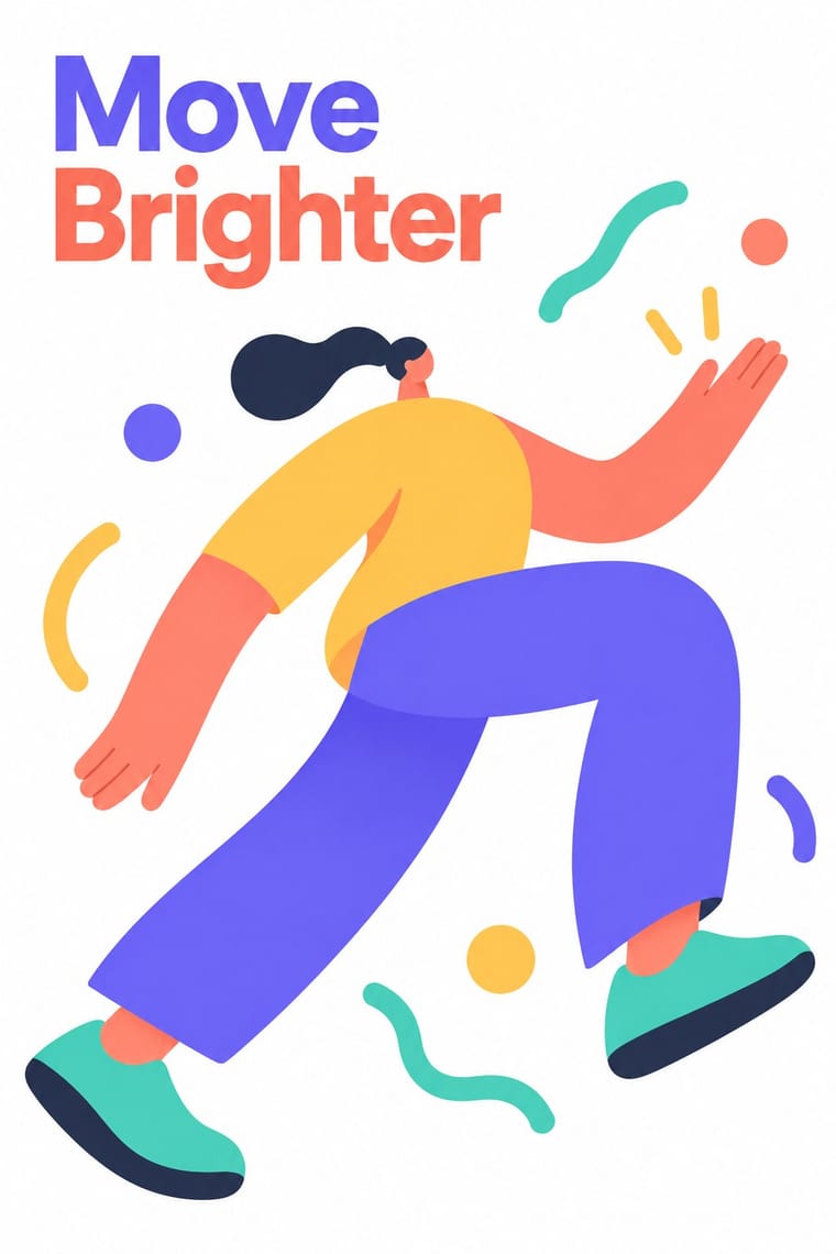
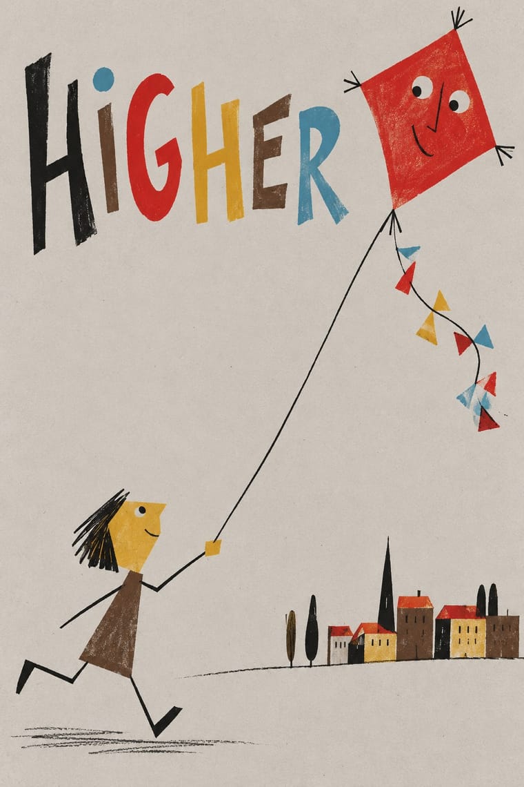
05
More combinations
With Corporate Memphis
- Polish Poster School Contrasts · Polish poster metaphor and painterly ambiguity show how much illustration can say once it stops being generic.
- Risograph & Indie Print Culture Pairs well · Add riso grain and two spot inks to the figures to escape the over-familiar SaaS sheen and give them printed warmth.
- DTC 'Blanding' / Millennial Minimalism Pairs well · Its photo-led start-up sibling: pair Corporate Memphis figures with blanding's pastel ground and geometric sans when a brand needs both people and product.
- Brutalist Web Design Contrasts · Brutalism's raw honesty is the opposite of this friendly gloss; reach for it when a brand needs credibility over cheer.
- Memphis Design Contrasts · The original's real colour clash, irony and Sottsass or Du Pasquier patterns are the foil to generic confetti blobs; borrow one genuine Memphis pattern to give the illustration an edge.
- Rubber-Hose Revival (Cartoon Mascot Graphics) Contrasts · Both draw stretched figures in flat colour, but the revival gives each brand its own outlined, nostalgic mascot where Corporate Memphis uses interchangeable faceless people.
- CalArts Style (Rounded Cartoon Character Design) Pairs well · Both use flat fills and simplified figures; borrow its pastel UI-illustration palette, but keep faces and expressions, which Corporate Memphis drops.
- Data Humanism Contrasts · Both aim to feel warm and human, but Corporate Memphis draws generic faceless figures for mood, while data humanism draws the specific data of specific people. Replace stock warmth with a drawing of real data when a brand needs sincerity.
With Zagreb School of Animated Film
- UPA & Cartoon Modern Contrasts · The nearest genome and its American parent: Zagreb's founders learned from UPA's flat caricatures, stripped sets and limited movement. But UPA lays its colour on one clean, flat field and pokes gentle fun at American folkways, while Zagreb sets its figures on tinted, often muted grounds of sponged, washed or canvas-textured paint, collages cut-out planes and photographs (even filmed children, in Igra), lines identical men up in rows against one small man, and turns the gag into an absurd, often dark fable of mass society.
- Polish Poster School Pairs well · Both built one absurd visual idea under state patronage in the same years; pair a Polish-style painted, hand-lettered metaphor with Zagreb's flat caricatures and empty fields for a film or festival poster.
- Risograph & Indie Print Culture Pairs well · Riso's flat spot inks and speckled texture reproduce Zagreb's flat cut-out figures over a textured ground, which suits small-run posters, zines and picture books.
- Thaw Modernism (Soviet and Czechoslovak) Contrasts · Its Soviet and Czechoslovak contemporary shares the flat figures, the reduced set and work for animation, but prints clear pastels on a light ground in a mood of civic, Sputnik-age optimism. Zagreb sets its figures on tinted, often textured grounds and aims satire at technology, war and bureaucracy.
- Flash Vector Cartoon (Newgrounds-Era Web Animation) Contrasts · Textured, earthy, modernist art-house shorts against the even strokes, gradients and portal irreverence of Flash.
- Chinese National-Style Animation (Shanghai Animation Film Studio) Contrasts · Its contemporary among state-funded animation schools: both broke with Disney's full animation and staged short fables in flat figures and empty fields. Zagreb reduces its small men to geometric caricature for ironic satire of mass society; Shanghai takes its figures from ink painting, opera, paper-cut and murals and tells gentle fables and myths.
- Zagreb Modernist Graphics (EXAT 51 to Teatar &TD) Pairs well · The same city and years, with EXAT's Vlado Kristl and Aleksandar Srnec working on Zagreb Film cartoons; set a flat, satirical Zagreb-school figure against a grid of repeated units or letters for a festival poster.