Style combination · Pairs well
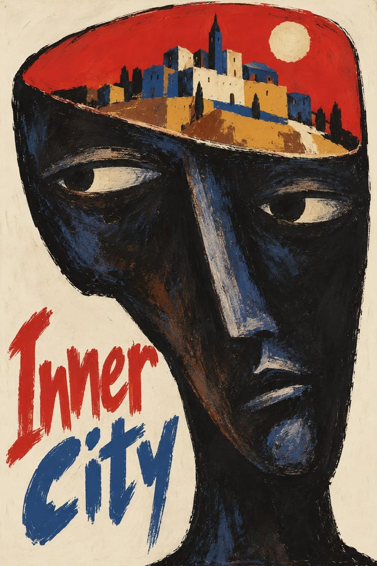
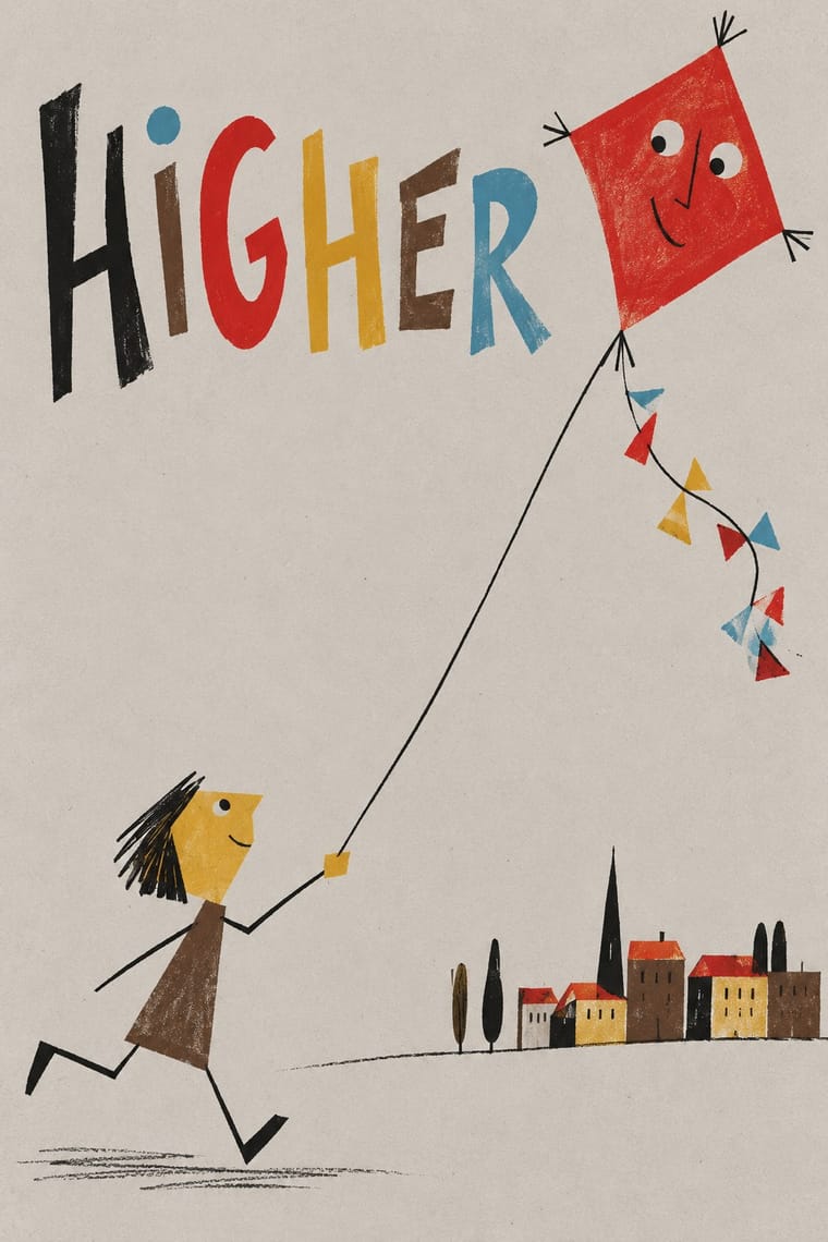
Polish Poster School × Zagreb School of Animated Film
Both built one absurd visual idea under state patronage in the same years; pair a Polish-style painted, hand-lettered metaphor with Zagreb's flat caricatures and empty fields for a film or festival poster.
Mix them and make something Polish Poster School Zagreb School of Animated Film
01
What each style brings
Each part of the design comes from the style with the stronger say in it, and each style gives at least two.
Polish Poster School Zagreb School of Animated Film
- Type from Polish Poster School
- Colour from Zagreb School of Animated Film
- Form from Zagreb School of Animated Film
- Composition from Polish Poster School
- Surface from Polish Poster School
02
The type
Open fonts standing in for each style’s own type, which is often hand-drawn or commercial.
Display · Polish Poster School
Fine
Londrina Solid; Polish Poster School used Henryk Tomaszewski's casual handwritten capitals and Brush- and crayon-drawn title lettering
Text · Zagreb School of Animated Film
The modernist animation of Zagreb Film's Studio for Animated Film, grown from reduced-animation advertisements of 1954-1955 and named the 'Zagreb school' by Georges Sadoul and André Martin after Cannes 1958. Breaking with Disney's full animation, caricaturists and painters, after UPA, Klee and the Suprematists, reduced characters to flat geometric caricatures with wiry limbs and cut the set to empty or textured painted fields, rows of identical figures and a few objects. Limited movement carried satirical, often dark fables of the 'small man' in mass society.
Jost; Zagreb School of Animated Film used Hand-drawn title lettering and Drawn monogram initial
03
The colours
The ground and leading colours come from Zagreb School of Animated Film, with a counter-accent from Polish Poster School. The ink reads on the ground at 4.5:1 or more.
Polish Poster School Zagreb School of Animated Film
-
#c4c0bbground · 36% -
#1c1b1bink · 14% -
#cc2a2eaccent · 18% -
#55a9c4accent · 14% -
#d6a23aaccent · 10% -
#5a4535accent · 8%
As CSS
:root {
  --ground: #c4c0bb;
  --ink: #1c1b1b;
  --accent-1: #cc2a2e;
  --accent-2: #55a9c4;
  --accent-3: #d6a23a;
  --accent-4: #5a4535;
  --font-display: "Londrina Solid", cursive;
  --font-text: "Jost", sans-serif;
}
Use it with care
Zagreb School of Animated Film: The films and their characters remain in copyright and are distributed by Zagreb Film, whose logo is a horse: borrow the method (a flat caricature, an empty or textured field, a row of identical men), never a particular character, film or the horse logo, and never present a generated image as a Zagreb Film work. Made in a state-funded studio of socialist Yugoslavia, these films were, as historians read them, neither dissident nor propaganda: do not recast them as either, and do not dress a design in red stars, party slogans or leader portraits as period decor.
04
The two styles
05
More combinations
With Polish Poster School
- International Typographic Style Contrasts · Painterly ambiguity versus objective grid and photography; borrow one hand-painted image to warm a Swiss-style cultural series.
- Socialist Realist Propaganda Poster Contrasts · The school defined itself against official heroic realism; use the pairing to show metaphor outperforming literal propaganda.
- Iranian Modernist Graphic Design Pairs well · Iranian designers absorbed the Polish metaphor poster; combine one surreal image with calligraphic lettering for cultural posters.
- Push Pin Style Pairs well · Both prize the illustrator-designer's hand and wit; pair Polish metaphor with Push Pin lettering for theatrical, idea-led posters.
- Polish Cold War Neon (PRL Neonisation) Pairs well · Some of the same artists drew posters and neons; take the poster's single witty idea and hand-drawn title and translate it into one line of light for a night version of a campaign.
- Polish Information Picture Book (Dwie Siostry) Contrasts · The poster designer and teacher Henryk Tomaszewski is credited with a role in the revival, but the poster school puts one painted, metaphorical image on a poster, while the picture books refuse paint and fill a spread with a hundred small labelled facts. Choose between a single idea that provokes and a dense page that informs.
- Turkish Modernist Poster & Graphic Design Contrasts · The same conceptual-poster network: Turkish designers showed at the Warsaw Poster Biennale from 1966 and Ertel's posters entered the Wilanów archive in 1968. The Polish school paints, collages and distorts its single idea; the Turkish posters cut it into flat shapes in two or three clean inks. Choose Warsaw for unease, Istanbul for a crisp visual pun.
- West German Conceptual Film & Culture Poster (Hillmann and Rambow) Contrasts · Its contemporary in art-film posters: the Polish school paints the metaphor and letters the title by hand in loose brushwork; take the Kassel route when the same single idea should come from a cropped photograph or a hard silhouette with set grotesque type.
With Zagreb School of Animated Film
- UPA & Cartoon Modern Contrasts · The nearest genome and its American parent: Zagreb's founders learned from UPA's flat caricatures, stripped sets and limited movement. But UPA lays its colour on one clean, flat field and pokes gentle fun at American folkways, while Zagreb sets its figures on tinted, often muted grounds of sponged, washed or canvas-textured paint, collages cut-out planes and photographs (even filmed children, in Igra), lines identical men up in rows against one small man, and turns the gag into an absurd, often dark fable of mass society.
- Risograph & Indie Print Culture Pairs well · Riso's flat spot inks and speckled texture reproduce Zagreb's flat cut-out figures over a textured ground, which suits small-run posters, zines and picture books.
- Corporate Memphis Contrasts · Both draw flat, distorted figures, but Corporate Memphis is smooth, faceless and earnest on a clean field; Zagreb caricatures faces, roughens the ground and turns the figure into a satirical small man.
- Thaw Modernism (Soviet and Czechoslovak) Contrasts · Its Soviet and Czechoslovak contemporary shares the flat figures, the reduced set and work for animation, but prints clear pastels on a light ground in a mood of civic, Sputnik-age optimism. Zagreb sets its figures on tinted, often textured grounds and aims satire at technology, war and bureaucracy.
- Flash Vector Cartoon (Newgrounds-Era Web Animation) Contrasts · Textured, earthy, modernist art-house shorts against the even strokes, gradients and portal irreverence of Flash.
- Chinese National-Style Animation (Shanghai Animation Film Studio) Contrasts · Its contemporary among state-funded animation schools: both broke with Disney's full animation and staged short fables in flat figures and empty fields. Zagreb reduces its small men to geometric caricature for ironic satire of mass society; Shanghai takes its figures from ink painting, opera, paper-cut and murals and tells gentle fables and myths.
- Zagreb Modernist Graphics (EXAT 51 to Teatar &TD) Pairs well · The same city and years, with EXAT's Vlado Kristl and Aleksandar Srnec working on Zagreb Film cartoons; set a flat, satirical Zagreb-school figure against a grid of repeated units or letters for a festival poster.