Style combination · Pairs well
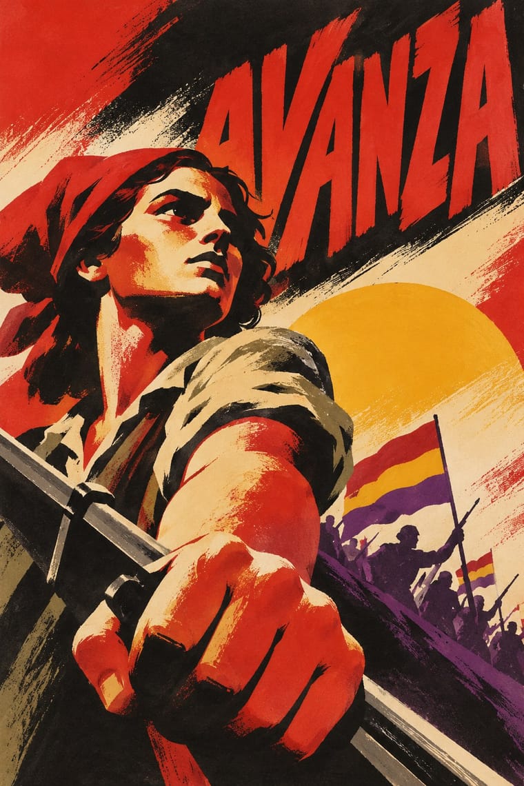
Russian Constructivism × Spanish Civil War Poster
Borrow Soviet photomontage and heavy bars, as Renau did, when a painted figure needs documentary force.
Mix them and make something Russian Constructivism Spanish Civil War Poster
01
What each style brings
Each part of the design comes from the style with the stronger say in it, and each style gives at least two.
Russian Constructivism Spanish Civil War Poster
- Type from Spanish Civil War Poster
- Colour from Russian Constructivism
- Form from Russian Constructivism
- Composition from Russian Constructivism
- Surface from Spanish Civil War Poster
02
The type
Open fonts standing in for each style’s own type, which is often hand-drawn or commercial.
Display · Spanish Civil War Poster
Now!
Anton, standing in for Hand-drawn condensed grotesque capitals (cartelista lettering)
Text · Russian Constructivism
Constructivism rejected art for art's sake in favour of the artist-engineer building useful things for the new Soviet society. In posters, books, film publicity and state advertising it fused bold grotesque type, heavy bars, photomontage and diagonal axes into an urgent, utilitarian language of agitation that shaped modern graphic design worldwide.
Archivo; Russian Constructivism used Soviet heavy grotesques and Rodchenko's constructed block lettering
03
The colours
The ground and leading colours come from Russian Constructivism, with a counter-accent from Spanish Civil War Poster. The ink reads on the ground at 4.5:1 or more.
Russian Constructivism Spanish Civil War Poster
-
#efe6d2ground · 36% -
#141414ink · 14% -
#d1261caccent · 18% -
#f1b52faccent · 14% -
#c9b28aaccent · 10% -
#6b6b66accent · 8%
As CSS
:root {
  --ground: #efe6d2;
  --ink: #141414;
  --accent-1: #d1261c;
  --accent-2: #f1b52f;
  --accent-3: #c9b28a;
  --accent-4: #6b6b66;
  --font-display: "Anton", sans-serif;
  --font-text: "Archivo", sans-serif;
}
04
The two styles
05
More combinations
With Russian Constructivism
- Punk & DIY Zine Pairs well · Punk borrowed Constructivist red-and-black agitprop; combine photomontage with xerox grit for protest graphics.
- International Typographic Style Pairs well · Tame Constructivist diagonals with a Swiss grid for informational work that still feels urgent.
- Art Deco Contrasts · Deco used similar geometry to sell luxury; set the two side by side to decide whether a layout should glamorise or agitate.
- Belle Époque Lithographic Poster Contrasts · Sensual drawn figures versus photomontaged workers: use the contrast to choose between seduction and mobilisation.
- ROSTA Windows Contrasts · In the same revolutionary years the ROSTA windows used stencilled cartoon frames and rhymed captions instead of photomontage and set grotesques; compare them to choose between folk legibility and machine-age form.
- Suprematism Pairs well · Add photomontage and heavy grotesque slogans to Suprematist floating planes to turn pure form into a message.
- British Style Press (The Face, i-D and Arena) Pairs well · Brody's source: take Rodchenko's diagonals, heavy bars and huge constructed letters, swap agitprop for fashion and club culture, and you get a Face spread.
- Mavo Pairs well · Borrow Constructivism's heavy bars and one red ink to steady a Mavo page, but keep Mavo's hand-drawn characters and abstract machine linocuts instead of a single clear slogan.
With Spanish Civil War Poster
- Cuban Revolutionary Poster (OSPAAAL & ICAIC) Contrasts · Cuba kept the raised fist but traded urgent painted bodies for one witty silhouette; use the pair to choose between urgency and wit.
- Art Deco Pairs well · The Deco commercial training behind these posters shows in their airbrushed gradients and geometric lettering; push that polish for a cleaner heroic image.
- Socialist Realist Propaganda Poster Contrasts · Keep figures stylised, foreshortened and flat-coloured rather than academically modelled; that is what separates street mobilisation from official doctrine.
- Spanish Bullfight Poster (Cartel Taurino) Contrasts · Josep Renau learned lithography at Ortega's Valencia works while a student; his generation traded the cartel's naturalistic brushwork and long programme for flat, foreshortened figures, diagonal slogans and photomontage.
- Escuela Bruguera (Spanish Humour Comics) Contrasts · Barcelona's wartime posters agitated openly in large single images; a decade later in the same city, Bruguera's cartoonists put postwar hunger and petty tyranny into children's gags under Franco's censors, who made them soften after the 1955 decree. Choose the poster for an open call, the gag strip for satire kept under the fun.
- Estado Novo Folk Modernism (SPN) Contrasts · Its Iberian contemporary: Republican posters are diagonal, urgent and red-and-black, while the Estado Novo's are static, pale and 'pseudo-tranquil'; set them side by side to stage revolt against order.
- Lebanese Civil War Party Poster Contrasts · Another civil war fought on the walls by rival factions, but with painted allegorical heroes; set them side by side to see what the straight photograph of a named dead partisan does that a drawn fighter cannot.
- Hungarian Revolutionary Poster Pairs well · Both throw one bursting figure across a red-and-black lithograph; borrow Spain's acronym signatures and stacked slogans to give a Budapest-style hero an organisation behind it.