Style combination · Pairs well
Bossa Nova Sleeve Modernism × Japanese Postwar Modernism
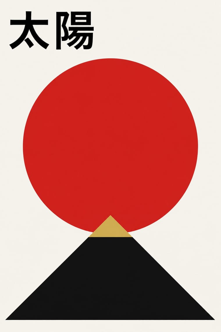
Both set a red disc against charged white space; add the Japanese school's single emblematic symbol and stricter alignment to an Elenco layout for a more formal, ceremonial sleeve.
Mix them and make something Bossa Nova Sleeve Modernism Japanese Postwar Modernism
01
What each style brings
Each part of the design comes from the style with the stronger say in it, and each style gives at least two.
Bossa Nova Sleeve Modernism (César Villela and Elenco) Japanese Postwar Modernism
- Type from Japanese Postwar Modernism
- Colour from Japanese Postwar Modernism
- Form from Bossa Nova Sleeve Modernism
- Composition from Bossa Nova Sleeve Modernism
- Surface from Bossa Nova Sleeve Modernism
02
The type
Open fonts standing in for each style’s own type, which is often hand-drawn or commercial.
Display · Japanese Postwar Modernism
Grid
Zen Kaku Gothic New, standing in for Gothic (kaku gothic Japanese sans)
Text · Bossa Nova Sleeve Modernism
The cover language of bossa nova, made in Rio by the self-taught designer César Villela, first at Odeon and then on the first sixteen LPs of Aloysio de Oliveira's label Elenco (from 1963), often around Francisco Pereira's photographs. Calling his method simplificação, Villela pushed photographs of the musicians to stark black and white, cut them out onto an empty white field and set three red dots (four with the one in the Elenco logo) as a syncopated reading path, under a single bold face or cut-paper capitals: two inks, no ornament, no drama.
Bodoni Moda; Bossa Nova Sleeve Modernism used Paper-cut capitals with slanted, uneven edges, heavy and often narrow and Twentieth Century Ultrabold Extended for the title and Neuzeit-Grotesk Fett in lowercase for the artist's name
03
The colours
The ground and leading colours come from Japanese Postwar Modernism, with a counter-accent from Bossa Nova Sleeve Modernism. The ink reads on the ground at 4.5:1 or more.
Bossa Nova Sleeve Modernism (César Villela and Elenco) Japanese Postwar Modernism
-
#f4f1eaground · 39% -
#111111ink · 15% -
#d7261eaccent · 20% -
#c8a24aaccent · 15% -
#1d3c78accent · 11%
As CSS
:root {
  --ground: #f4f1ea;
  --ink: #111111;
  --accent-1: #d7261e;
  --accent-2: #c8a24a;
  --accent-3: #1d3c78;
  --font-display: "Zen Kaku Gothic New", sans-serif;
  --font-text: "Bodoni Moda", serif;
}
Use it with care
Bossa Nova Sleeve Modernism (César Villela and Elenco): The covers, Francisco Pereira's photographs and the Elenco name and roundel belong to their makers and to the label's catalogue, now distributed by Universal Music: borrow the method (two inks, a cut-out high-contrast figure on white, three or four red dots as rhythm), not a particular sleeve, the Elenco logo or its 'de Aloysio de Oliveira' line, and never present a new design as an Elenco or Odeon release. The photographs show named musicians such as Vinicius de Moraes, Baden Powell and João Gilberto; photograph or license your own named subject rather than lifting their faces.
04
The two styles
05
More combinations
With Bossa Nova Sleeve Modernism
- Tropicália Graphic Design Contrasts · The next Brazilian generation went the other way: Rogério Duarte's 1968 covers fill the field with saturated colour, drawn tropical symbols and swelling hand lettering where Villela left white space, high-contrast black and white and three red dots. Set them side by side to choose between cool restraint and ironic excess.
- Risograph & Indie Print Culture Pairs well · A black and red riso run reproduces the Elenco recipe honestly, two flat inks, a high-contrast cut-out photograph and three red dots, which makes it a natural fit for small-run sleeves and gig posters today.
- ECM Sleeve Aesthetic (Munich) Contrasts · Both answer a quiet, intimate music with an empty field and sparse type, but ECM shows a wintry landscape and hides the players, while Elenco puts the musicians at the centre, cut out in stark black and white, and adds red dots for rhythm. Choose Elenco when the record should feel warm and swinging rather than still.
- Blue Note Jazz Sleeve Modernism Contrasts · The parent: Egeu Laus traces the first bossa-nova covers at Odeon to American jazz sleeves, and Vidal (2008) calls Reid Miles's Blue Note the main source of Elenco's covers too (compare Baden Powell à Vontade with Miles and Andy Warhol's line-drawn guitarist on Blue Note's Kenny Burrell), though Villela and Pereira denied it and blamed the economy on lack of money; Villela is often called the Brazilian Reid Miles. Both run a label's covers as a serial system of one or two inks and treated photographs of the players. Miles fills the square with a tinted, hard-cropped, often full-bleed photograph and flat colour bands, sometimes on black; Villela empties it to white, cuts the figure out and uses red only as a placed beat. Choose Elenco when the sleeve should breathe rather than shout.
- Brazilian Concrete Design Contrasts · Same country and years, and both use red primitives on white: concrete design generates abstract geometry from a rule, while Villela places his three or four dots by eye around photographs of people. Readings differ: Vidal (2008) finds concrete and neo-concrete traits in these covers (the balanced composition, the geometric red dots, the typographic inventions), while Montore and Umeda stress that his simplification owes nothing to the rigour of the International Style. Borrow concrete's grid only if you want the sleeve to lose its swing.
With Japanese Postwar Modernism
- Angura Theatre Poster Contrasts · Tadanori Yokoo's angura theatre posters broke with this school; set one beside a Kamekura poster to calibrate restraint against overload.
- Kawaii Design Contrasts · Kawaii shows the soft, crowded face of Japanese visual culture; use the contrast to tune a brand between gravitas and charm.
- Minimalist Graphic Design Pairs well · Muji-era minimalism grew from this school; enlarge the empty field further and reduce the emblem to a whisper.
- International Typographic Style Pairs well · Graft a single emblematic disc or crest onto a Swiss grid to add focus and warmth without breaking its order.
- Hong Kong East–West Graphic Modernism Pairs well · Take its single emblem on an empty field, then add a bilingual Chinese–English lockup and one ink stroke to move the poster from Tokyo to Hong Kong.
- Finnish Bold Print (Marimekko Modernism) Pairs well · Japanese postwar emblematic colour fields share the reduction of nature to a few flat silhouettes, and two of Marimekko's leading designers, Katsuji Wakisaka and Fujiwo Ishimoto, came from Japan; pair one Japanese-style emblem with a Marimekko-scale repeat for a calm, nature-led identity.
- Yuru-chara (Japanese Local Mascot Design) Contrasts · Postwar Japanese identities give institutions abstract, grid-built marks; a yuru-chara gives a prefecture a face, a name and a body that walks into festivals and shakes hands.
- Taishō Roman & Lyrical Illustration Contrasts · Postwar modernism replaced this sentimental figure with emblems and empty fields; set one against the other to calibrate warmth against austerity.