Style combination · Contrasts
Atelier Populaire × See Red Women's Workshop Feminist Screenprints
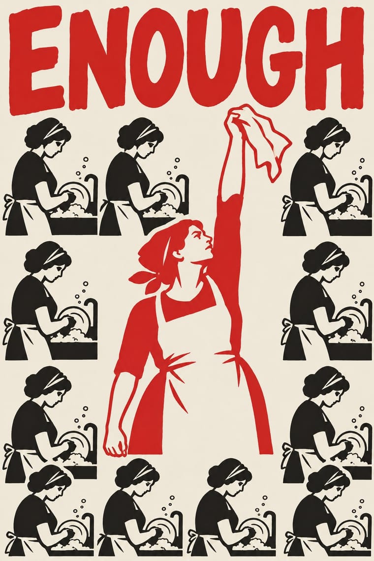
Both are collective, unsigned screenprints, but May '68 shouts one emblem and a strike slogan, while See Red tells a small domestic story with a wry caption.
Mix them and make something Atelier Populaire See Red Women's Workshop Feminist Screenprints
01
What each style brings
Each part of the design comes from the style with the stronger say in it, and each style gives at least two.
Atelier Populaire (May '68 Screenprint Poster) See Red Women's Workshop Feminist Screenprints
- Type from See Red Women's Workshop Feminist Screenprints
- Colour from See Red Women's Workshop Feminist Screenprints
- Form from Atelier Populaire
- Composition from Atelier Populaire
- Surface from Atelier Populaire
02
The type
Open fonts standing in for each style’s own type, which is often hand-drawn or commercial.
Display · See Red Women's Workshop Feminist Screenprints
Wake
Londrina Solid, standing in for Comic-strip captions and speech balloons in hand-lettered capitals (My Wife Doesn't Work, 1980)
Text · Atelier Populaire
The posters of the Atelier populaire, set up when students, teachers and artists occupied the École des Beaux-Arts in Paris on 14 May 1968, until police cleared the school on 27 June. Designs were voted on at evening assemblies, left unsigned and pulled on improvised silkscreens: one flat ink on cheap or donated paper, a single brushed silhouette (a riot policeman, de Gaulle, a factory) and a short punning slogan in rough capitals, pasted up across Paris overnight.
Oswald; Atelier Populaire used Brushed letters, left open on the silk while gum arabic is painted around them to block the screen, so the edges stay ragged and uneven and Wall-slogan handwriting of May '68, lifted from graffiti and marches
03
The colours
The ground and leading colours come from See Red Women's Workshop Feminist Screenprints, with a counter-accent from Atelier Populaire. The ink reads on the ground at 4.5:1 or more.
Atelier Populaire (May '68 Screenprint Poster) See Red Women's Workshop Feminist Screenprints
-
#f4f0e6ground · 36% -
#151515ink · 14% -
#d4262aaccent · 18% -
#1f2f6baccent · 14% -
#8fb4d4accent · 10% -
#6b4a2eaccent · 8%
As CSS
:root {
  --ground: #f4f0e6;
  --ink: #151515;
  --accent-1: #d4262a;
  --accent-2: #1f2f6b;
  --accent-3: #8fb4d4;
  --accent-4: #6b4a2e;
  --font-display: "Londrina Solid", cursive;
  --font-text: "Oswald", sans-serif;
}
Use it with care
Atelier Populaire (May '68 Screenprint Poster): The posters were made anonymously and given away, and some equate the police or de Gaulle with the Nazis (the SS on a riot policeman's shield, popularly 'CRS SS'; Hitler holding a de Gaulle mask); do not attribute them to individual designers, sell pastiches as May '68 originals, or aim those Nazi comparisons at real people today without that history in view. 'Nous sommes tous des Juifs allemands' answered antisemitic attacks on Cohn-Bendit's origins (the far-right press smeared him as a Marxist German Jew, and Georges Marchais wrote in L'Humanité of 'the German anarchist'); do not reuse it, or the 'indésirables' poster, as a generic 'we are all X' template without that history.
04
The two styles
05
More combinations
With Atelier Populaire
- South African Resistance Poster Pairs well · Both chose hand-made silkscreen because it was cheap, quick and teachable to non-artists; borrow the struggle posters' organisation emblems and second ink when a campaign must stay recognisable beyond one day's slogan.
- Cuban Revolutionary Poster (OSPAAAL & ICAIC) Contrasts · Same decade, opposite means: ICAIC's silkscreened film posters and OSPAAAL's mostly offset solidarity posters were polished, many-coloured and made to last, while the Atelier's one anonymous ink was pulled overnight for the next morning's wall; decide which of the two the brief needs.
- Polish Poster School Contrasts · Polish posters are signed painterly metaphors by named authors, while the Atelier stripped away signature and painterly finish; a recognisable individual hand breaks its collective voice.
- ROSTA Windows Pairs well · Like the ROSTA windows, each sheet answers the day's news by hand with a stark figure and a caption; run single posters as a numbered sequence when one image cannot tell the whole story.
- Punk & DIY Zine Pairs well · The House of European History traces a line from these posters to Jamie Reid's Sex Pistols graphics; set one brushed slogan in a single ink against xerox cut-up for a flyer with the same anti-authority bite.
- Grapus (French Militant Graphic Collective) Contrasts · The founders came out of the 1968 workshops, but the Beaux-Arts atelier pulled one flat ink, one brushed silhouette and a slogan in rough capitals; Grapus layers photographs, paint and coloured handwriting, mostly on white. Use the first for overnight urgency, Grapus for a warmer, longer campaign.
- ACT UP & Gran Fury AIDS Activist Graphics Contrasts · Both answered a crisis with overnight slogans on the street, but the May '68 posters were brushed by hand and pulled in one ink, while most ACT UP and Gran Fury posters were professionally printed in offset and modelled on advertising; choose rough urgency or seductive polish before mixing them.
- Ultras Graphics (Curva Banners and Tifo) Pairs well · The type designer Alessio D'Ellena, quoted by Vice, places ultras' vernacular letters 'more in the tradition of' the Atelier Populaire's anonymous May '68 posters; borrow their single brushed slogan and anonymous signature for a banner with something to say.
With See Red Women's Workshop Feminist Screenprints
- Underground Comix Pairs well · Borrow the comic strip and speech balloon, but cleaned up into a few flat inks and turned against the sexism much of the comix canon traded in.
- Australian Poster Collective Screenprints Pairs well · Sister screenprint collectives of the same years; add their brighter inks and halftone for a louder campaign poster.
- South African Resistance Poster Pairs well · Community silkscreen for movements; add its heavy slogans and organisation emblems to See Red's drawn everyday scenes.
- Punk & DIY Zine Contrasts · Same London years and anger, but See Red prints carefully in flat ink where punk photocopies and tears.