Style combination · Contrasts
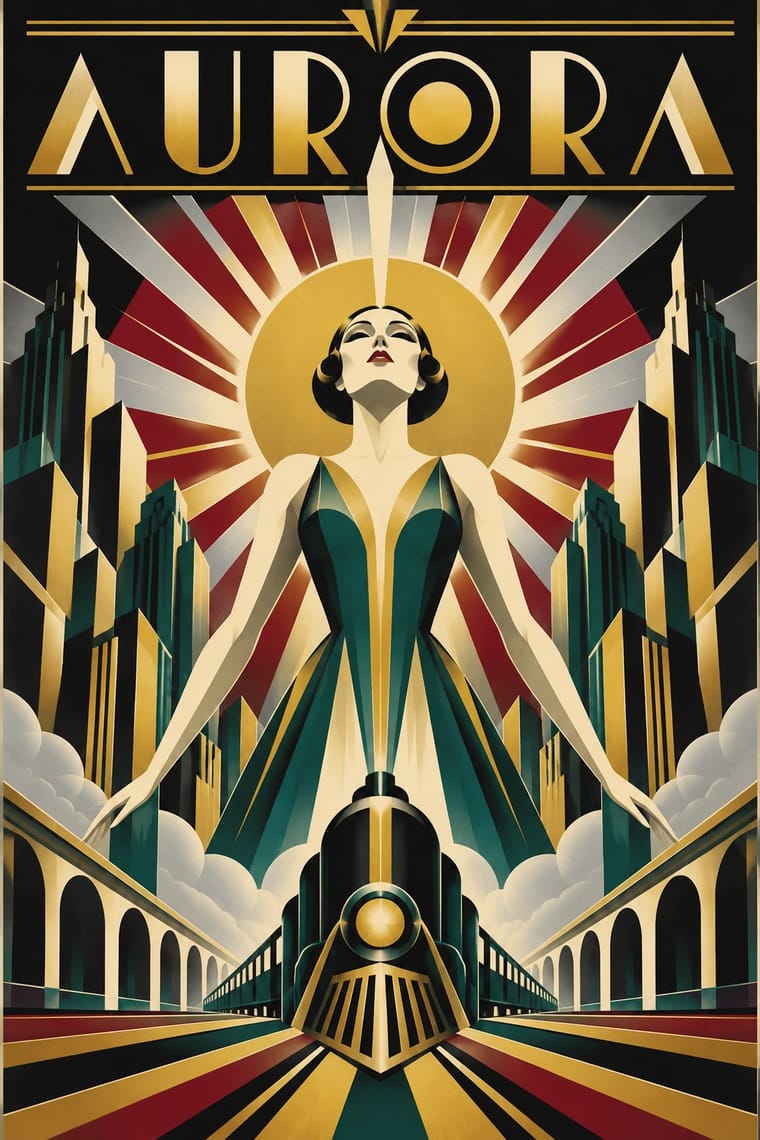
Art Deco × Bauhaus
Deco used the same circles and stepped forms for luxury; set its gold and ornament beside Bauhaus austerity to choose function over glamour.
01
What each style brings
Each part of the design comes from the style with the stronger say in it, and each style gives at least two.
Art Deco Bauhaus
- Type from Bauhaus
-
Art Deco avoids lowercase only: this is where the two pull against each other, which is the point of the contrast.
- Colour from Bauhaus
- Form from Art Deco
- Composition from Art Deco
-
Bauhaus avoids central symmetry: this is where the two pull against each other, which is the point of the contrast.
- Surface from Art Deco
02
The type
Open fonts standing in for each style’s own type, which is often hand-drawn or commercial.
Text · Bauhaus
The German school founded by Walter Gropius in 1919 moved from Expressionist craft ideals to a programme of 'art and technology' after 1923, when Moholy-Nagy, Herbert Bayer and Joost Schmidt made its printing and advertising workshops a laboratory for functional communication. Its graphics combine geometric sans-serif and lowercase type, bold rules, primary colours and basic shapes with photography in asymmetric, systematic layouts.
Jost; Bauhaus used Herbert Bayer's Universal alphabet and Josef Albers's stencil and combination alphabets
03
The colours
The ground and leading colours come from Bauhaus, with a counter-accent from Art Deco. The ink reads on the ground at 4.5:1 or more.
Art Deco Bauhaus
-
#f2efe6ground · 36% -
#121212ink · 14% -
#f2c12eaccent · 18% -
#c9a227accent · 14% -
#d7261eaccent · 10% -
#8c1c26accent · 8%
As CSS
:root {
  --ground: #f2efe6;
  --ink: #121212;
  --accent-1: #f2c12e;
  --accent-2: #c9a227;
  --accent-3: #d7261e;
  --accent-4: #8c1c26;
  --font-display: "Jost", sans-serif;
  --font-text: "Jost", sans-serif;
}
04
The two styles
05
More combinations
With Art Deco
- Googie & Atomic Age Pairs well · Googie's atomic starbursts extend Deco's celestial ornament; mix them for retro hospitality and signage.
- Punk & DIY Zine Contrasts · Puncture Deco polish with a single torn, photocopied edge when luxury needs irony.
- Art Nouveau Contrasts · Deco straightened Nouveau's whiplash; place a rigid sunburst beside one sinuous curve to show the evolution.
- Streamline Moderne Pairs well · Fold Streamline speed lines and rounded corners into a Deco layout to move from stepped geometry toward aerodynamic sweep.
- Basel Object Poster (Swiss Sachplakat) Contrasts · A source as well as a foil: Leupin studied at the École Paul Colin in Paris in 1935-36 and took strong impressions from Colin and from Colin's rival Cassandre. Both make a product a heroic icon, but Deco stylises it into a geometric silhouette with airbrushed gradation and geometric capitals, while Basel paints the real object, its material and its label, as a still life.
- Estridentismo (Stridentist) Graphics Pairs well · Both drew the 1920s skyline; pair Deco's setback towers and block display letters with Stridentist black-and-white relief for a skyscraper poster with a rougher, revolutionary edge.
- Vienna Secession Pairs well · Carry the Secession's squares, chequers and gold into Deco's stepped geometry for a luxurious but disciplined look.
- Greek Tourism Modernism (EOT) Contrasts · Katzourakis studied poster design under Paul Colin in Paris; set a Deco travel poster's heroic, airbrushed destination beside this flat, cut-out sign to show how the tourist poster was stripped down after the war.
With Bauhaus
- Memphis Design Contrasts · Memphis parodied Bauhaus primaries and solids; compare them to decide whether geometry should be earnest or ironic.
- Neo-Swiss Revival Pairs well · Neo-Swiss identities absorb Bauhaus primitives and lowercase easily for a contemporary system with historic depth.
- Scandinavian Functionalism Pairs well · Soften Bauhaus geometry with Scandinavian warmth and natural materials for approachable functional design.