Style combination · Contrasts
American Four-Colour Comic Book × Argentine Adventure Historieta
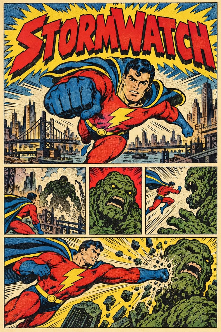
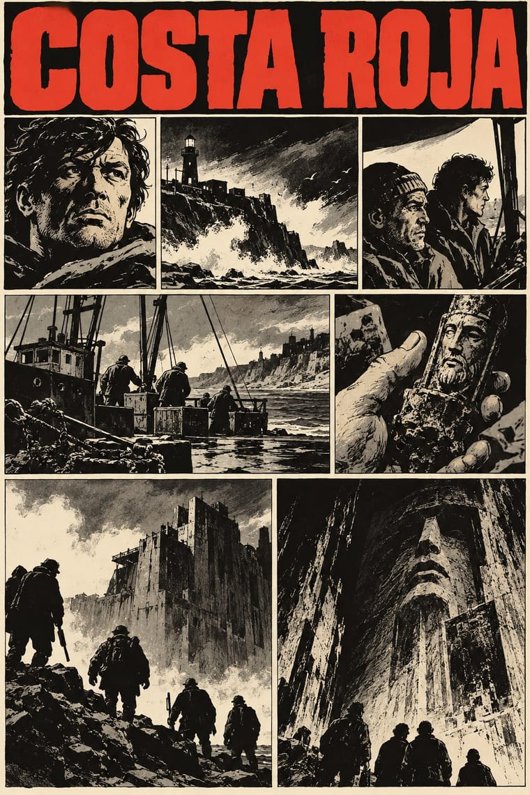
Pratt's early work leaned on Milton Caniff, and Spanish Wikipedia notes that expressionism was already present in Krazy Kat, The Spirit and Dick Tracy; the American comic book is the atlas's nearest entry for those newspaper-strip models. Choose the American comic book for four-colour dot tints and superheroes, the historieta for uncoloured black-ink pages, ordinary people and a collective hero.
Mix them and make something American Four-Colour Comic Book Argentine Adventure Historieta
01
What each style brings
Each part of the design comes from the style with the stronger say in it, and each style gives at least two.
American Four-Colour Comic Book (Golden to Bronze Age) Argentine Adventure Historieta (Oesterheld–Breccia)
- Type from Argentine Adventure Historieta
- Colour from American Four-Colour Comic Book
- Form from Argentine Adventure Historieta
- Composition from American Four-Colour Comic Book
- Surface from American Four-Colour Comic Book
-
Argentine Adventure Historieta avoids halftone & ben-day dots: this is where the two pull against each other, which is the point of the contrast.
02
The type
Open fonts standing in for each style’s own type, which is often hand-drawn or commercial.
Display · Argentine Adventure Historieta
Ours
Londrina Solid, standing in for Tall, condensed hand-drawn title capitals in white on black (ETERNAUTA on the first page of the serial in Hora Cero Semanal no. 1, 4 September 1957, with a small lowercase 'el' and slightly irregular strokes)
Text · American Four-Colour Comic Book
The American newsstand comic book from Famous Funnies (1934) and Action Comics #1 (1938) through the Golden, Silver and Bronze Ages, and past the Bronze Age's end in 1985 until computer colour replaced hand separations in the early 1990s. A black pen-and-brush keyline does the drawing, hand-lettered capitals fill balloons, captions and sound effects, and colourists' guides become flat mechanical tints of yellow, red and blue (popularly called Ben-Day dots), nominally 64 colours, on newsprint. Pages are grids of ruled panels; each cover sells the issue like a poster, with logo and blurbs.
Comic Neue; American Four-Colour Comic Book used Pen-lettered comic-book capitals and Hand-drawn masthead logo lettering
03
The colours
The ground and leading colours come from American Four-Colour Comic Book, with a counter-accent from Argentine Adventure Historieta. The ink reads on the ground at 4.5:1 or more.
American Four-Colour Comic Book (Golden to Bronze Age) Argentine Adventure Historieta (Oesterheld–Breccia)
-
#f3e9cfground · 36% -
#1b1a1aink · 14% -
#d9262caccent · 18% -
#2160adaccent · 14% -
#e2622caccent · 10% -
#4f9a3eaccent · 8%
As CSS
:root {
  --ground: #f3e9cf;
  --ink: #1b1a1a;
  --accent-1: #d9262c;
  --accent-2: #2160ad;
  --accent-3: #e2622c;
  --accent-4: #4f9a3e;
  --font-display: "Londrina Solid", cursive;
  --font-text: "Comic Neue", cursive;
}
Use it with care
American Four-Colour Comic Book (Golden to Bronze Age): The characters and logos of this tradition (Superman, Batman, Captain America, Spider-Man, the Fantastic Four) are still in copyright and trademarked by their publishers: draw your own heroes, logos and seals in the shared idiom, never ask an image model for these characters or for named artists such as Kirby, Ditko or Eisner, and never present a generated picture as a vintage comic. The period also traded in racial caricature, such as Ebony White in Will Eisner's The Spirit, whose blackface features Eisner later admitted were a conscious stereotype, and its wartime issues drew Japanese people as 'powerful monsters or incompetent subhumans' and, at the Writers' War Board's urging late in the war, Germans as a people who embraced aggression and violence. Give every character, enemies and foreigners included, the same anatomy, dignity and drawing care as the hero; never use skin tint, teeth, eyes or dress as ethnic markers, and do not revive the war cover's enemy caricature in a pastiche.
Argentine Adventure Historieta (Oesterheld–Breccia): El Eternauta, Mort Cinder, Perramus and the other serials remain in copyright with their authors' heirs and publishers: draw your own characters, titles and mastheads in the shared idiom, never ask an image model for these characters or for a named artist's hand (Breccia, Solano López, Pratt), and never present a generated page as a vintage historieta. Oesterheld was abducted by the dictatorship's forces on 27 April 1977 and remains disappeared; his four daughters were abducted or killed in 1976–1977, and three of their bodies were never found. El Eternauta is bound up with that memory, and its hero's figure has been redrawn for party campaigns (the 'Nestornauta' of 2010): do not use the figure as a mascot, an advertising gimmick or a casual political prop.
04
The two styles
05
More combinations
With American Four-Colour Comic Book
- Victorian Letterpress & Wood Type Pairs well · Both are cheap letterpress print that shouts to passers-by; borrow the playbill's stacked display capitals, banners and rules for a comic cover's blurbs and price box, while keeping the comic's hand-drawn letters and keyline art.
- Risograph & Indie Print Culture Pairs well · Riso's few flat inks, grain and overprint suit a small-press homage to four-colour comics; keep the black keyline, panel grid and hand lettering, and let riso's misregistration stand in for newsprint's.
- Pop Art Graphics Contrasts · Roy Lichtenstein enlarged the comic book's Ben-Day dots and single panels into ironic gallery icons; choose the comic book itself when the picture must tell a story across a page of panels at printed size, sincerely, with the dots as small colour tints rather than the subject.
- Push Pin Style Contrasts · Push Pin also drew outlined figures in flat colour in New York, but as single illustrations with revived Victorian and Art Nouveau display faces and witty ornament; switch to the comic book for sequential panels, balloon lettering and dot-screen tints on newsprint.
- Googie & Atomic Age Pairs well · Silver Age artists drew in the same postwar key: Arlen Schumer calls Carmine Infantino's Flash as sleek and streamlined as Detroit's tail fins; add Googie's boomerangs, starbursts and atomic motifs to a science-fiction cover or splash page.
- Lianhuanhua Picture-Story Books Contrasts · Both tell stories in inked drawings; lianhuanhua gives each pocket-sized page one framed monochrome picture with a caption beneath, while the American comic book packs a page with ruled panels, balloons, sound effects and flat four-colour tints.
- Ligne Claire (Franco-Belgian Clear Line) Contrasts · Both tell stories in ruled panels with balloon lettering and flat colour; ligne claire closes every form with a clear contour and no hatching, and keeps its colour free of dot screens and misregistration, while the American comic book models with feathered brush blacks and prints dot tints slightly off register on newsprint.
- Korean Webtoon Graphics Contrasts · Webtoon's single vertical phone-scroll strip, open gutters and digital gradients belong to the era that replaced hand separations; return to the newsstand comic for a dense page grid of panels, dot tints on newsprint and no gradients.
With Argentine Adventure Historieta
- Story Manga (Postwar Japanese Comics) Contrasts · Both are black-and-white serials of the late 1940s and 1950s; manga gets its greys from dot screentone and its motion from speed lines, while the historieta gets its tone from solid brush black, at most a flat grey tint, scraped white and monotype texture, and slows down for long captions.
- Expressionist Woodcut Graphics Pairs well · Breccia's white scraped out of a black ground looks like the gouge of a Brücke woodcut; borrow the woodcut's jagged hand-cut capitals for a historieta title page or cover, and keep the comic's panels and captions inside.
- Filipino Komiks Contrasts · Both are black-and-white anthology magazines of long serials with colour kept for the cover; komiks model romantic, naturalistic figures in hatched and feathered brush on a light page, while the historieta builds its pages from black masses, hard light and, in its darkest work, distorted faces.
- Bonelli Fumetto (Italian Popular Adventure Comics) Contrasts · Both are black-and-white newsstand adventure serials born in 1948 and drawn in pen and brush ink; Bonelli keeps a fixed cage of three strips of one or two panels on a small upright page and an even naturalistic line, while the historieta's 1950s weeklies run three tiers of two to six panels each across an oblong page, sink them in solid black, light faces from one side and, with Breccia, let the drawing break into expressionist texture.
- Fileteado Porteño Contrasts · Two Buenos Aires vernaculars that both work on dark grounds: fileteado frames a lettered name with polychrome, highlighted acanthus and ribbons, while the historieta rejects ornament and lets bare black ink and side light carry a story.
- Mexican Historieta (Pepines to Sensacionales) Contrasts · Both are Latin American newsstand comics of the mid-century with colour kept for the cover; the Argentine adventure historieta builds its pages from solid black brush ink and side light around an auteur's hand, while the Mexican historieta models its figures in tonal wash, prints them in one brown or green ink and tells anonymous, industrial melodrama.