Style combination · Contrasts
American Four-Colour Comic Book × Korean Webtoon Graphics
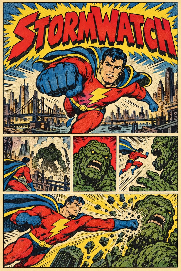
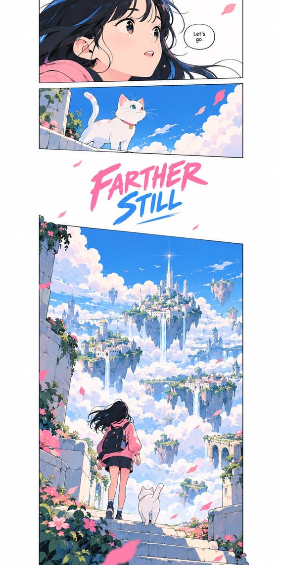
Webtoon's single vertical phone-scroll strip, open gutters and digital gradients belong to the era that replaced hand separations; return to the newsstand comic for a dense page grid of panels, dot tints on newsprint and no gradients.
Mix them and make something American Four-Colour Comic Book Korean Webtoon Graphics
01
What each style brings
Each part of the design comes from the style with the stronger say in it, and each style gives at least two.
American Four-Colour Comic Book (Golden to Bronze Age) Korean Webtoon Graphics
- Type from American Four-Colour Comic Book
- Colour from Korean Webtoon Graphics
-
American Four-Colour Comic Book avoids gradients: this is where the two pull against each other, which is the point of the contrast.
- Form from Korean Webtoon Graphics
- Composition from American Four-Colour Comic Book
- Surface from American Four-Colour Comic Book
-
Korean Webtoon Graphics avoids halftone & ben-day dots and misregistration & overprint: this is where the two pull against each other, which is the point of the contrast.
02
The type
Open fonts standing in for each style’s own type, which is often hand-drawn or commercial.
Display · American Four-Colour Comic Book
Hello
Bangers, standing in for Pen-lettered comic-book capitals (balloons and captions drawn with pen or brush and a lettering guide, traditionally all in upper case: Sam Rosen, Ben Oda, Artie Simek, John Costanza, Gaspar Saladino)
Text · Korean Webtoon Graphics
The full-colour, vertical-scroll comic that Korean web portals made standard in the 2000s and smartphone apps took worldwide. Each episode is one column read by scrolling: panels come one at a time, spaced by long gutters of white, black or tinted ground that pace time, suspense and reveals. Clean line art, cel shading, airbrushed glows and 3D-assisted backgrounds carry the story, with typeset dialogue in rounded balloons and drawn sound words, often out in the gutter.
Comic Neue; Korean Webtoon Graphics used Comic font in rounded balloons and Drawn sound words out in the gutter
03
The colours
The ground and leading colours come from Korean Webtoon Graphics, with a counter-accent from American Four-Colour Comic Book. The ink reads on the ground at 4.5:1 or more.
American Four-Colour Comic Book (Golden to Bronze Age) Korean Webtoon Graphics
-
#ffffffground · 36% -
#0f1a33ink · 14% -
#3d8bfdaccent · 18% -
#f6d02aaccent · 14% -
#ff7aa8accent · 10% -
#d9262caccent · 8%
As CSS
:root {
  --ground: #ffffff;
  --ink: #0f1a33;
  --accent-1: #3d8bfd;
  --accent-2: #f6d02a;
  --accent-3: #ff7aa8;
  --accent-4: #d9262c;
  --font-display: "Bangers", sans-serif;
  --font-text: "Comic Neue", cursive;
}
Use it with care
American Four-Colour Comic Book (Golden to Bronze Age): The characters and logos of this tradition (Superman, Batman, Captain America, Spider-Man, the Fantastic Four) are still in copyright and trademarked by their publishers: draw your own heroes, logos and seals in the shared idiom, never ask an image model for these characters or for named artists such as Kirby, Ditko or Eisner, and never present a generated picture as a vintage comic. The period also traded in racial caricature, such as Ebony White in Will Eisner's The Spirit, whose blackface features Eisner later admitted were a conscious stereotype, and its wartime issues drew Japanese people as 'powerful monsters or incompetent subhumans' and, at the Writers' War Board's urging late in the war, Germans as a people who embraced aggression and violence. Give every character, enemies and foreigners included, the same anatomy, dignity and drawing care as the hero; never use skin tint, teeth, eyes or dress as ethnic markers, and do not revive the war cover's enemy caricature in a pastiche.
Korean Webtoon Graphics: Series characters and artwork, such as those of Tower of God, Solo Leveling or Lore Olympus, belong to their creators and platforms; draw original characters, and do not trace or closely copy a working artist's panels or signature look. Korean webtoon creators have opposed AI-generated webtoon art: from 2 May 2023 some 60 'AI Webtoon Boycott' strips filled Naver Webtoon's Challenge Comics section for amateurs, and over 200 cartoonists said on social media that they would join, calling AI that learns without the original creators' permission theft. Label generated images as AI-made and never present them as a webtoon artist's work.
04
The two styles
05
More combinations
With American Four-Colour Comic Book
- Victorian Letterpress & Wood Type Pairs well · Both are cheap letterpress print that shouts to passers-by; borrow the playbill's stacked display capitals, banners and rules for a comic cover's blurbs and price box, while keeping the comic's hand-drawn letters and keyline art.
- Risograph & Indie Print Culture Pairs well · Riso's few flat inks, grain and overprint suit a small-press homage to four-colour comics; keep the black keyline, panel grid and hand lettering, and let riso's misregistration stand in for newsprint's.
- Pop Art Graphics Contrasts · Roy Lichtenstein enlarged the comic book's Ben-Day dots and single panels into ironic gallery icons; choose the comic book itself when the picture must tell a story across a page of panels at printed size, sincerely, with the dots as small colour tints rather than the subject.
- Push Pin Style Contrasts · Push Pin also drew outlined figures in flat colour in New York, but as single illustrations with revived Victorian and Art Nouveau display faces and witty ornament; switch to the comic book for sequential panels, balloon lettering and dot-screen tints on newsprint.
- Googie & Atomic Age Pairs well · Silver Age artists drew in the same postwar key: Arlen Schumer calls Carmine Infantino's Flash as sleek and streamlined as Detroit's tail fins; add Googie's boomerangs, starbursts and atomic motifs to a science-fiction cover or splash page.
- Lianhuanhua Picture-Story Books Contrasts · Both tell stories in inked drawings; lianhuanhua gives each pocket-sized page one framed monochrome picture with a caption beneath, while the American comic book packs a page with ruled panels, balloons, sound effects and flat four-colour tints.
- Ligne Claire (Franco-Belgian Clear Line) Contrasts · Both tell stories in ruled panels with balloon lettering and flat colour; ligne claire closes every form with a clear contour and no hatching, and keeps its colour free of dot screens and misregistration, while the American comic book models with feathered brush blacks and prints dot tints slightly off register on newsprint.
- Fotoromanzo (Italian Photo-Romance) Contrasts · Both read as ruled panels with speech balloons; choose the fotoromanzo when the cast should be real people posed in black-and-white photographs and the text may run long, and the comic book when drawn heroes, sound effects and flat colour tints should carry the action.
With Korean Webtoon Graphics
- Pop Art Graphics Contrasts · Pop froze a single comic panel and blew up its Ben-Day dots and off-register inks; the webtoon keeps the sequence, drops the print screen for smooth digital colour and lets the scroll do the drama.
- Kawaii Design Pairs well · For a slice-of-life or children's strip, give the webtoon's stacked panels kawaii's round, pastel characters and rounded type, keeping the long white gutters for comic timing.
- Lianhuanhua Picture-Story Books Contrasts · Both are picture stories for a mass readership, but lianhuanhua frames one monochrome line drawing per pocket-book page with a caption below; switch to the webtoon when the story should run as one full-colour column with the gutter, not the page turn, setting the pace.
- Out-of-Square Hangul Typography Pairs well · Set the series title and the big sound words in out-of-square Hangul, whose syllables hang from one top line and vary in height, to give a webtoon a Korean typographic voice of its own.
- Superflat Contrasts · Both grow from East Asian comics, but Superflat spreads cartoon figures across one flat, crowded plane while the webtoon gives one beat per screen, cinematic depth and a lot of empty gutter.
- Story Manga (Postwar Japanese Comics) Contrasts · The Korean webtoon turned manhwa, Korean comics shaped in part by Japanese manga, into a single full-colour scroll column with long empty gutters, first on PC portals and then on phones; return to story manga for a printed spread of black-and-white panels read right to left, with screentone and panels that bleed and break.
- Burmese Parabaik Painting (Konbaung Folding Books) Pairs well · A parabaik is a continuous strip read panel by panel; turn its horizontal concertina into a vertical scroll and keep the caption band under each scene for a long-form story.
- Chat Reaction-Sticker Cartooning (LINE) Pairs well · Both are app-native character cartooning; webtoon sequences scenes, stickers compress a scene into one beat.