Style combination · Pairs well
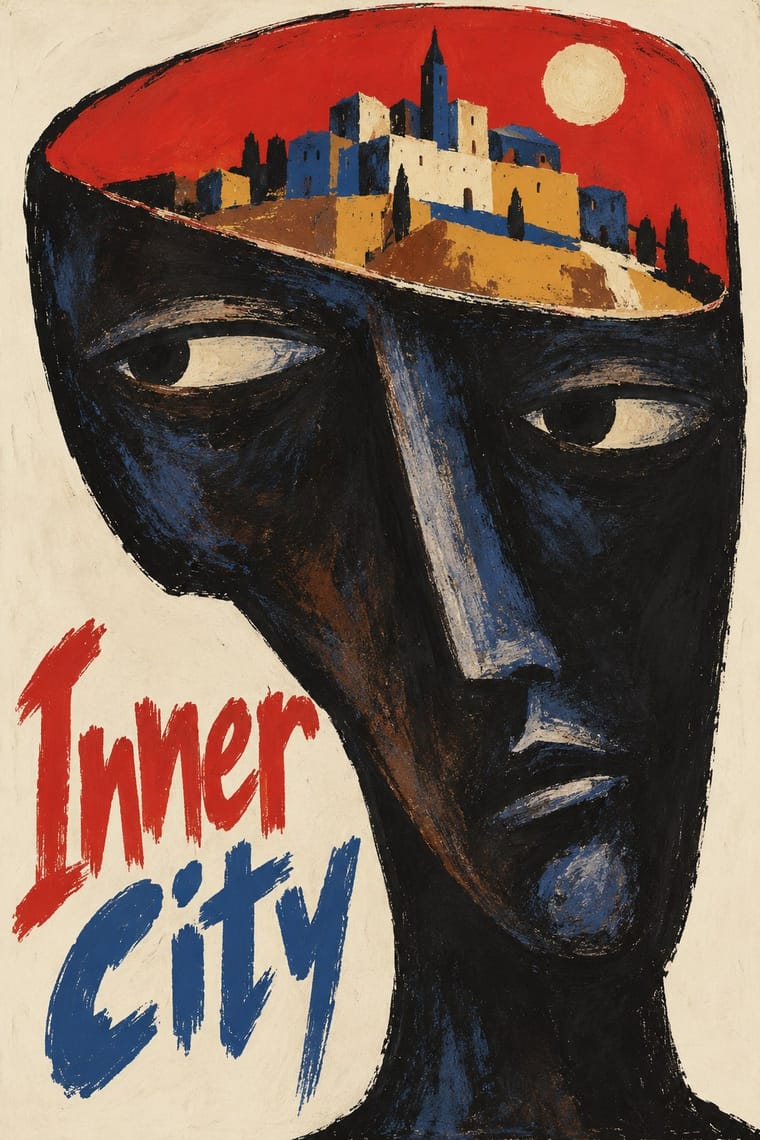
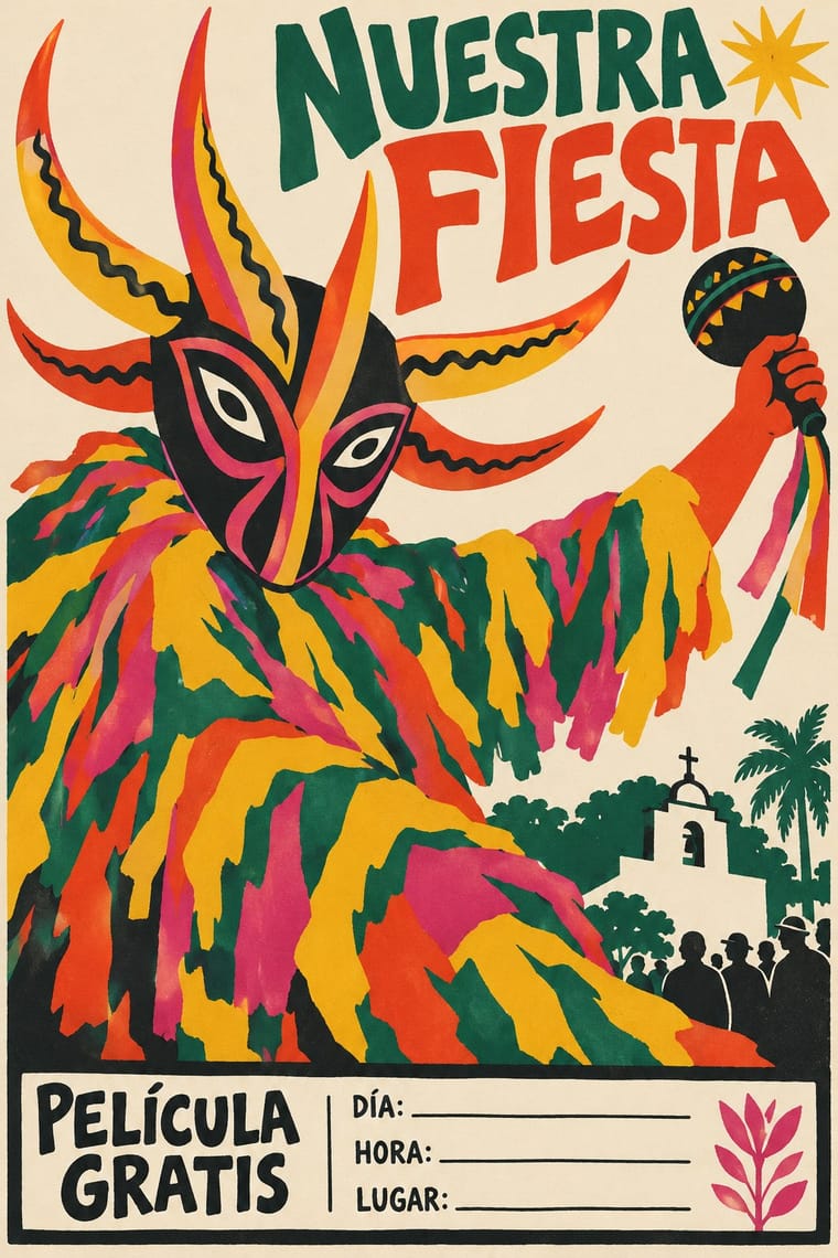
Polish Poster School × Puerto Rican Silkscreen Poster
Both are state-supported cultural poster schools in which the artist letters the title by hand; pair a Polish visual metaphor with Puerto Rican calligraphy that becomes part of the figure.
Mix them and make something Polish Poster School Puerto Rican Silkscreen Poster
01
What each style brings
Each part of the design comes from the style with the stronger say in it, and each style gives at least two.
Polish Poster School Puerto Rican Silkscreen Poster (DIVEDCO & ICP)
- Type from Puerto Rican Silkscreen Poster
- Colour from Puerto Rican Silkscreen Poster
- Form from Polish Poster School
- Composition from Polish Poster School
- Surface from Polish Poster School
02
The type
Open fonts standing in for each style’s own type, which is often hand-drawn or commercial.
Display · Puerto Rican Silkscreen Poster
Wow
Yatra One, standing in for Bold sans and slab-like display capitals cut for DIVEDCO film titles ('DOÑA JULIA', 'NENEN DE LA RUTA MORA'), with small sans capitals for the credit line 'Película hecha en Puerto Rico por la División de Educación de la Comunidad'
Text · Polish Poster School
A painterly, metaphorical poster culture that flourished in communist Poland, chiefly for film, theatre, opera and circus. Working for state publishers, free of commercial pressure but under censorship, designers such as Henryk Tomaszewski, Jan Lenica and Roman Cieślewicz replaced star photographs with a single witty or unsettling visual idea, painted or collaged by hand and lettered in the artist's own handwriting.
Archivo; Polish Poster School used Henryk Tomaszewski's casual handwritten capitals and Brush- and crayon-drawn title lettering
03
The colours
The ground and leading colours come from Puerto Rican Silkscreen Poster, with a counter-accent from Polish Poster School. The ink reads on the ground at 4.5:1 or more.
Polish Poster School Puerto Rican Silkscreen Poster (DIVEDCO & ICP)
-
#efe8d8ground · 36% -
#1b1a19ink · 14% -
#f1bf2eaccent · 18% -
#d4352baccent · 14% -
#d6427eaccent · 10% -
#1f6a55accent · 8%
As CSS
:root {
  --ground: #efe8d8;
  --ink: #1b1a19;
  --accent-1: #f1bf2e;
  --accent-2: #d4352b;
  --accent-3: #d6427e;
  --accent-4: #1f6a55;
  --font-display: "Yatra One", cursive;
  --font-text: "Archivo", sans-serif;
}
Use it with care
Puerto Rican Silkscreen Poster (DIVEDCO & ICP): The posters drew on living Puerto Rican traditions, among them the vejigante masks of the Afro-Puerto Rican fiestas de Santiago Apóstol in Loíza and the carved santos of household devotion, and many were public-education posters of the Muñoz Marín government; give these motifs their community and devotional context rather than using them as generic 'tropical' decoration, do not pass pastiches off as DIVEDCO or Instituto originals, and credit or commission Puerto Rican printmakers rather than lifting the look. The Instituto was founded in 1955 amid nationalist sentiment to foster a Puerto Rican identity distinct from that of the United States, and its Spanish hand lettering has been read as a passive resistance to US cultural influence, while DIVEDCO was a product of the governing Popular Democratic Party and its films, which these posters announced, often read as propaganda for it; keep the Spanish and the island subjects, and do not re-letter the look in English for US brands or reduce it to generic 'Latin' flavour.
04
The two styles
05
More combinations
With Polish Poster School
- International Typographic Style Contrasts · Painterly ambiguity versus objective grid and photography; borrow one hand-painted image to warm a Swiss-style cultural series.
- Socialist Realist Propaganda Poster Contrasts · The school defined itself against official heroic realism; use the pairing to show metaphor outperforming literal propaganda.
- Iranian Modernist Graphic Design Pairs well · Iranian designers absorbed the Polish metaphor poster; combine one surreal image with calligraphic lettering for cultural posters.
- Push Pin Style Pairs well · Both prize the illustrator-designer's hand and wit; pair Polish metaphor with Push Pin lettering for theatrical, idea-led posters.
- Polish Cold War Neon (PRL Neonisation) Pairs well · Some of the same artists drew posters and neons; take the poster's single witty idea and hand-drawn title and translate it into one line of light for a night version of a campaign.
- Polish Information Picture Book (Dwie Siostry) Contrasts · The poster designer and teacher Henryk Tomaszewski is credited with a role in the revival, but the poster school puts one painted, metaphorical image on a poster, while the picture books refuse paint and fill a spread with a hundred small labelled facts. Choose between a single idea that provokes and a dense page that informs.
- Turkish Modernist Poster & Graphic Design Contrasts · The same conceptual-poster network: Turkish designers showed at the Warsaw Poster Biennale from 1966 and Ertel's posters entered the Wilanów archive in 1968. The Polish school paints, collages and distorts its single idea; the Turkish posters cut it into flat shapes in two or three clean inks. Choose Warsaw for unease, Istanbul for a crisp visual pun.
- West German Conceptual Film & Culture Poster (Hillmann and Rambow) Contrasts · Its contemporary in art-film posters: the Polish school paints the metaphor and letters the title by hand in loose brushwork; take the Kassel route when the same single idea should come from a cropped photograph or a hard silhouette with set grotesque type.
With Puerto Rican Silkscreen Poster
- Cuban Revolutionary Poster (OSPAAAL & ICAIC) Pairs well · Both are state-backed Caribbean silkscreen cultures for cinema and the arts, and Puerto Rico's began more than a decade before ICAIC's workshop; combine ICAIC's single conceptual image with Homar's hand-drawn Spanish lettering built into it.
- Chicano Screenprint Poster Pairs well · Two Spanish-language screenprint traditions of the Americas; add Chicano bilingual slogans and posterised portraits to Puerto Rican letrismo for community event posters.
- International Typographic Style Contrasts · Hand-drawn calligraphy shaped to a figure against set grotesque on a grid; choose the Puerto Rican mode when the voice must be personal, local and in its own language.