Style combination · Contrasts
Corporate Memphis × Illustrated Rom-Com Book Cover
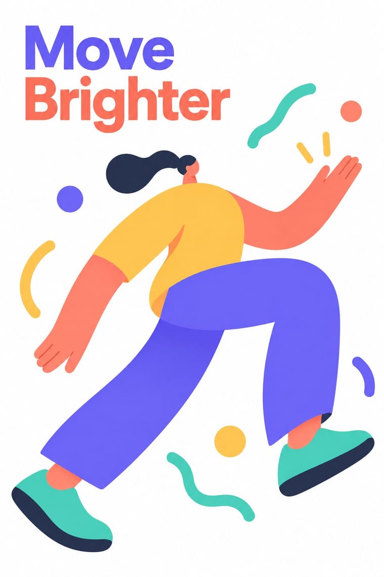
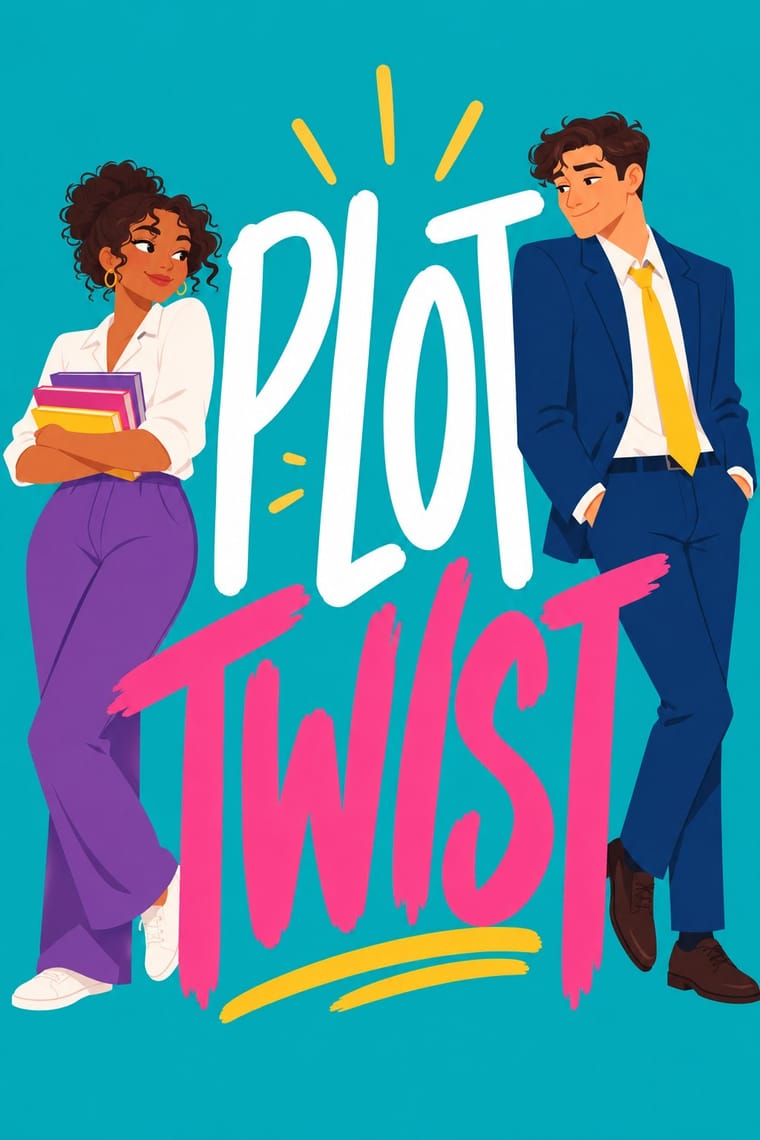
Both draw flat people on bright grounds in the late 2010s, but Corporate Memphis stretches anonymous, rubber-limbed figures to sell a platform and leaves the words to a neutral sans; the rom-com cover draws two particular characters in one situation and makes the hand-lettered title the largest element.
Mix them and make something Corporate Memphis Illustrated Rom-Com Book Cover
01
What each style brings
Each part of the design comes from the style with the stronger say in it, and each style gives at least two.
Corporate Memphis Illustrated Rom-Com Book Cover (Cartoon Couple Cover)
- Type from Illustrated Rom-Com Book Cover
- Colour from Corporate Memphis
- Form from Corporate Memphis
- Composition from Illustrated Rom-Com Book Cover
- Surface from Illustrated Rom-Com Book Cover
02
The type
Open fonts standing in for each style’s own type, which is often hand-drawn or commercial.
Display · Illustrated Rom-Com Book Cover
Yay!
Londrina Solid, standing in for Tall, condensed hand-drawn capitals in white, stacked in two to four lines down the cover: medium-weight on Beach Read (2020), People We Meet on Vacation (2021) and Book Lovers (2022), thin and monoline on Twice in a Blue Moon (2019) and It Happened One Summer (2021); the 'big block text' The Pudding found on the style
Text · Corporate Memphis
The flat vector illustration style that became the default visual voice of big tech in the late 2010s: faceless, ethnically non-specific figures with elongated limbs and tiny heads, drawn in bright flat colour among blobs, leaves and confetti. Codified in Buck's Alegria system for Facebook (2017) and spread by open libraries such as unDraw and Humaaans, it was later named, half-mockingly, after the Memphis Group.
Hanken Grotesk; Corporate Memphis used Circular and Airbnb Cereal
03
The colours
The ground and leading colours come from Corporate Memphis, with a counter-accent from Illustrated Rom-Com Book Cover. The ink reads on the ground at 4.5:1 or more.
Corporate Memphis Illustrated Rom-Com Book Cover (Cartoon Couple Cover)
-
#ffffffground · 36% -
#2f2e41ink · 14% -
#ffc857accent · 18% -
#fdc104accent · 14% -
#6c63ffaccent · 10% -
#ef3e84accent · 8%
As CSS
:root {
  --ground: #ffffff;
  --ink: #2f2e41;
  --accent-1: #ffc857;
  --accent-2: #fdc104;
  --accent-3: #6c63ff;
  --accent-4: #ef3e84;
  --font-display: "Londrina Solid", cursive;
  --font-text: "Hanken Grotesk", sans-serif;
}
Use it with care
Illustrated Rom-Com Book Cover (Cartoon Couple Cover): Draw the characters as the book describes them, in skin tone, body size, age, disability and gender, and do not lighten or slim them for the market: illustration spread partly because stock photography offered too few people of colour, and Helen Hoang chose it to get past readers' bias about her Asian lead. Because a cute cartoon cover does not show how explicit a book is and can be mistaken for young-adult fiction, say clearly on the book and in its retail listing that it is an adult romance. Critics have read the uniform look as sexist, making women's adult reading look like YA (Kelly Jensen, Book Riot, 2019), so draw this book's own premise rather than the template.
04
The two styles
05
More combinations
With Corporate Memphis
- Polish Poster School Contrasts · Polish poster metaphor and painterly ambiguity show how much illustration can say once it stops being generic.
- Risograph & Indie Print Culture Pairs well · Add riso grain and two spot inks to the figures to escape the over-familiar SaaS sheen and give them printed warmth.
- DTC 'Blanding' / Millennial Minimalism Pairs well · Its photo-led start-up sibling: pair Corporate Memphis figures with blanding's pastel ground and geometric sans when a brand needs both people and product.
- Brutalist Web Design Contrasts · Brutalism's raw honesty is the opposite of this friendly gloss; reach for it when a brand needs credibility over cheer.
- Memphis Design Contrasts · The original's real colour clash, irony and Sottsass or Du Pasquier patterns are the foil to generic confetti blobs; borrow one genuine Memphis pattern to give the illustration an edge.
- Rubber-Hose Revival (Cartoon Mascot Graphics) Contrasts · Both draw stretched figures in flat colour, but the revival gives each brand its own outlined, nostalgic mascot where Corporate Memphis uses interchangeable faceless people.
- CalArts Style (Rounded Cartoon Character Design) Pairs well · Both use flat fills and simplified figures; borrow its pastel UI-illustration palette, but keep faces and expressions, which Corporate Memphis drops.
- Data Humanism Contrasts · Both aim to feel warm and human, but Corporate Memphis draws generic faceless figures for mood, while data humanism draws the specific data of specific people. Replace stock warmth with a drawing of real data when a brand needs sincerity.
With Illustrated Rom-Com Book Cover
- Fotoromanzo (Italian Photo-Romance) Contrasts · The postwar photo-romance sold love stories with photographed couples in close-up; the illustrated cover gives up the photograph so that readers can picture themselves in the role and the cover tells nothing of the heat level.
- Modern Calligraphy and Brush Lettering Pairs well · Borrow its brush and pointed-pen scripts for the title, as The Kiss Quotient and The Wedding Date did, to tip a cover toward sweetness and the wedding plot; pair the script with block capitals to keep it readable small.
- French Post-War Visual-Gag Poster (Savignac, Villemot, Morvan) Pairs well · Savignac's and Villemot's one-figure, one-prop sight gags on a flat ground are the model for a strong premise image; borrow the single visual pun to sharpen a cover that has drifted into two figures simply standing side by side.
- Shōjo Manga (Japanese Girls' Comics) Pairs well · When the faces have to carry more feeling, as on the later, more detailed covers, borrow shōjo manga's expressive eyes and sparkle accents while keeping the flat ground and big lettering.
- Light Novel Cover Illustration Contrasts · Both sell prose with a drawn cover, but the rom-com flattens faceless figures on a saturated ground where the light novel paints one detailed, glossy character on a pale one.
- Ornamental Romantasy Book Cover Contrasts · Both are contemporary romance covers, but the rom-com cover uses two simplified lovers on a bright flat ground; this one replaces them with a title-led emblem inside ornamental symbolism.