Style combination · Contrasts
Emblem Book × Tarot de Marseille Woodcut Cards
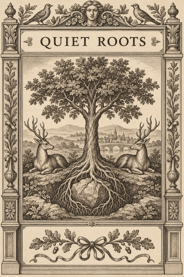
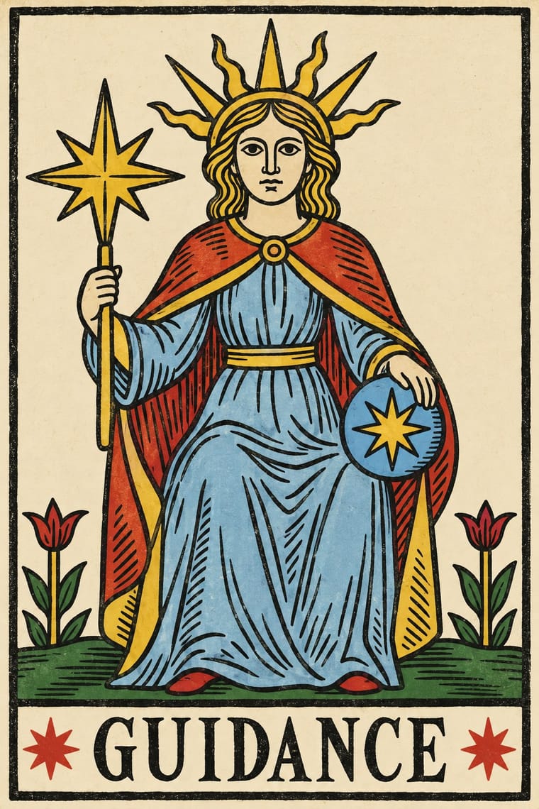
The emblem book explains its picture with a printed motto and epigram on the page, while the tarot gives only a carved title and a numeral and leaves the meaning to play or reading; choose the emblem book when the text must carry the argument.
Mix them and make something Emblem Book Tarot de Marseille Woodcut Cards
01
What each style brings
Each part of the design comes from the style with the stronger say in it, and each style gives at least two.
Emblem Book (Motto, Picture & Epigram) Tarot de Marseille Woodcut Cards
- Type from Tarot de Marseille Woodcut Cards
- Colour from Tarot de Marseille Woodcut Cards
- Form from Tarot de Marseille Woodcut Cards
- Composition from Emblem Book
- Surface from Emblem Book
02
The type
Open fonts standing in for each style’s own type, which is often hand-drawn or commercial.
Display · Tarot de Marseille Woodcut Cards
Wow
Cinzel, standing in for Roman capitals cut into the woodblock with the picture, in a band at the foot of each trump and court card, often with interpuncts and the copyists' spellings ('LE CHARIOR' and 'LA PANCES' on Dodal's cards, 'LE BATELEVR' with V for U)
Text · Emblem Book
A European book genre in which, from Chrestien Wechel's Paris edition of 1534 on, every page or opening repeats one fixed unit: a short motto, an allegorical picture and an explanatory verse, which only together yield a moral, amorous or religious meaning. It began with Andrea Alciato's Emblematum liber (Augsburg, 1531), whose emblems still ran on continuously, and moved from small framed woodcuts set in humanist roman and italic to engravings, from Bocchi's Bologna book of 1555 to the full-page copperplates of 17th-century Dutch, Flemish and Jesuit books.
EB Garamond; Emblem Book used Letterspaced roman capitals for the mottoes of Steyner's 1531 Augsburg edition, as 'REVERENTIAM IN MATRIMONIO REQVIRI', broken over two centred lines above the woodcut, with the couplets in italic below, alternate lines indented and Humanist roman capitals for running heads and the commonplace headings that group the emblems, as 'DEVS, SIVE RELIGIO.' over the framed emblems of Bonhomme's 1550 Lyon Emblemata
03
The colours
The ground and leading colours come from Tarot de Marseille Woodcut Cards, with a counter-accent from Emblem Book. The ink reads on the ground at 4.5:1 or more.
Emblem Book (Motto, Picture & Epigram) Tarot de Marseille Woodcut Cards
-
#efe4c8ground · 36% -
#1c1915ink · 14% -
#e6c13faccent · 18% -
#8a6a45accent · 14% -
#c8372daccent · 10% -
#c9b48faccent · 8%
As CSS
:root {
  --ground: #efe4c8;
  --ink: #1c1915;
  --accent-1: #e6c13f;
  --accent-2: #8a6a45;
  --accent-3: #c8372d;
  --accent-4: #c9b48f;
  --font-display: "Cinzel", serif;
  --font-text: "EB Garamond", serif;
}
Use it with care
Tarot de Marseille Woodcut Cards: Trace decks cut before 1800 (Noblet, Dodal and Conver in the BnF; Dodal cards and early 19th-century Conver printings at the Met) rather than recent redrawings such as Grimaud's 1930 'Ancien Tarot de Marseille' or the 1998 Camoin–Jodorowsky restoration, which are modern works; and do not present the occultists' story of an Egyptian origin, launched by Court de Gébelin in 1781, as history: the pattern descends from Milanese tarot and was made for the card game of tarot, which French and Swiss players used it for until the early 20th century.
04
The two styles
05
More combinations
With Emblem Book
- Imagerie d'Épinal & European Bilderbogen Contrasts · Both centre a framed picture over a block of text, but the Épinal sheet tells a popular story in stencil colour for a broad public, while the emblem is a learned monochrome riddle, one to a page, read slowly in sequence.
- Renaissance Book Typography Contrasts · Its parent shares the humanist roman and italic, the paper and the woodcut, but lets text carry the page with ornament at its edges; the emblem book puts a framed picture at the centre of every page and makes it part of the argument.
- Surrealist Graphics Pairs well · Both find meaning in the gap between a picture and the words beside it; pair a framed, uncanny object with a terse motto above and a short verse below for an editorial series that asks to be decoded.
- Corporate Identity Modernism Pairs well · The emblem's motto-plus-sign unit already works like a mark with a tagline; reduce its allegorical picture to one flat, repeatable sign with corporate modernism's discipline and keep the motto as the line beneath it.
- European Heraldry Contrasts · Alciato's book opens with the arms of the Duchy of Milan, but a coat of arms identifies a bearer by the rules of blazon, while an emblem is a freely invented moral riddle that needs its motto and verse; use arms to identify and an emblem to argue.
With Tarot de Marseille Woodcut Cards
- Literatura de Cordel Woodcut Contrasts · Both cut stiff figures in wood with no perspective or modelling, but the cordel cover is printed in black only, with solid blacks and gouged white lines, above a plain letterpress title, while the tarot card colours an outline key through stencils and cuts its numeral and title into the same block; choose cordel for a stark one-colour cover, tarot for a coloured emblem in a numbered set.
- European Heraldry Pairs well · The Emperor's and Empress's eagle shields and the maker's escutcheon on the 2 of Coupes come from armory; pair heraldic tinctures and charges with a tarot figure for a crest-like card or label.
- Nianhua & Chinese Folk Print Pairs well · Door gods and many tarot trumps are single frontal figures cut in wood and brightly coloured by hand; set them side by side for a cross-cultural series of guardian or allegorical figures.
- Lotería Card Imagery (Mexican Lotería) Contrasts · Lotería also gives each card one figure with its name at the foot, but in letterspaced sans capitals and soft offset colour; borrow the tarot's carved roman title band, ruled frame and stencil drift to make a lotería-type card set look older and graver.
- Imagerie d'Épinal & European Bilderbogen Contrasts · Both stencil-colour a black woodcut key in a few drifting colours, but the Épinal sheet tells a story in grids of captioned cases and marches rows of soldiers, while the tarot card isolates one emblematic subject under a numeral and a title; choose tarot for a single symbol, Épinal for a sequence.
- Risograph & Indie Print Culture Pairs well · Riso's few flat inks and loose registration reproduce the stencil drift of an old tarot; print a black woodcut-style key with red, yellow and pale blue for a contemporary deck or poster.