Style combination · Contrasts
ECM Sleeve Aesthetic × Slow-Living Editorial
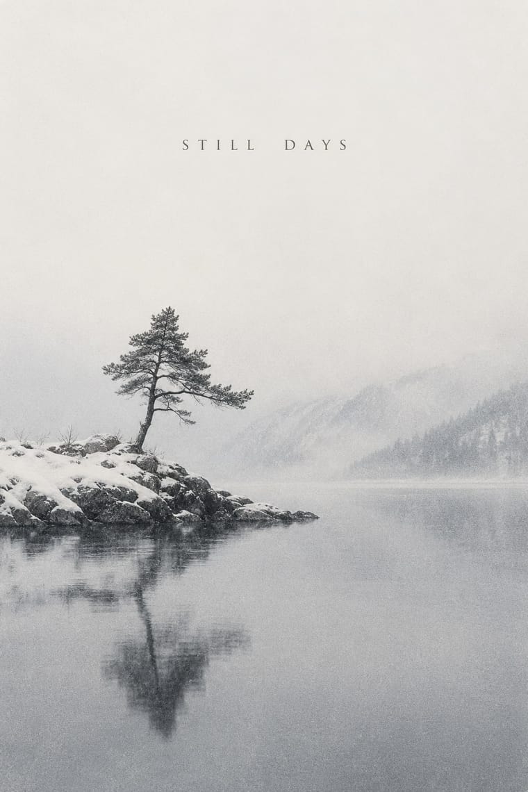
The nearest genome: one photograph, small type and silence, but ECM's picture is a wintry, often black-and-white landscape without people, while Kinfolk's is a warm, peopled interior or laid table; pick ECM for solitude and this for company.
Mix them and make something ECM Sleeve Aesthetic Slow-Living Editorial
01
What each style brings
Each part of the design comes from the style with the stronger say in it, and each style gives at least two.
ECM Sleeve Aesthetic (Munich) Slow-Living Editorial (the Kinfolk Look)
- Type from Slow-Living Editorial
- Colour from ECM Sleeve Aesthetic
- Form from Slow-Living Editorial
- Composition from ECM Sleeve Aesthetic
- Surface from ECM Sleeve Aesthetic
02
The type
Open fonts standing in for each style’s own type, which is often hand-drawn or commercial.
Display · Slow-Living Editorial
Quiet
EB Garamond, standing in for Garamond, Kinfolk's brand typeface, kept for body text through Charlotte Heal's 2015 redesign (It's Nice That, 2015)
Text · ECM Sleeve Aesthetic
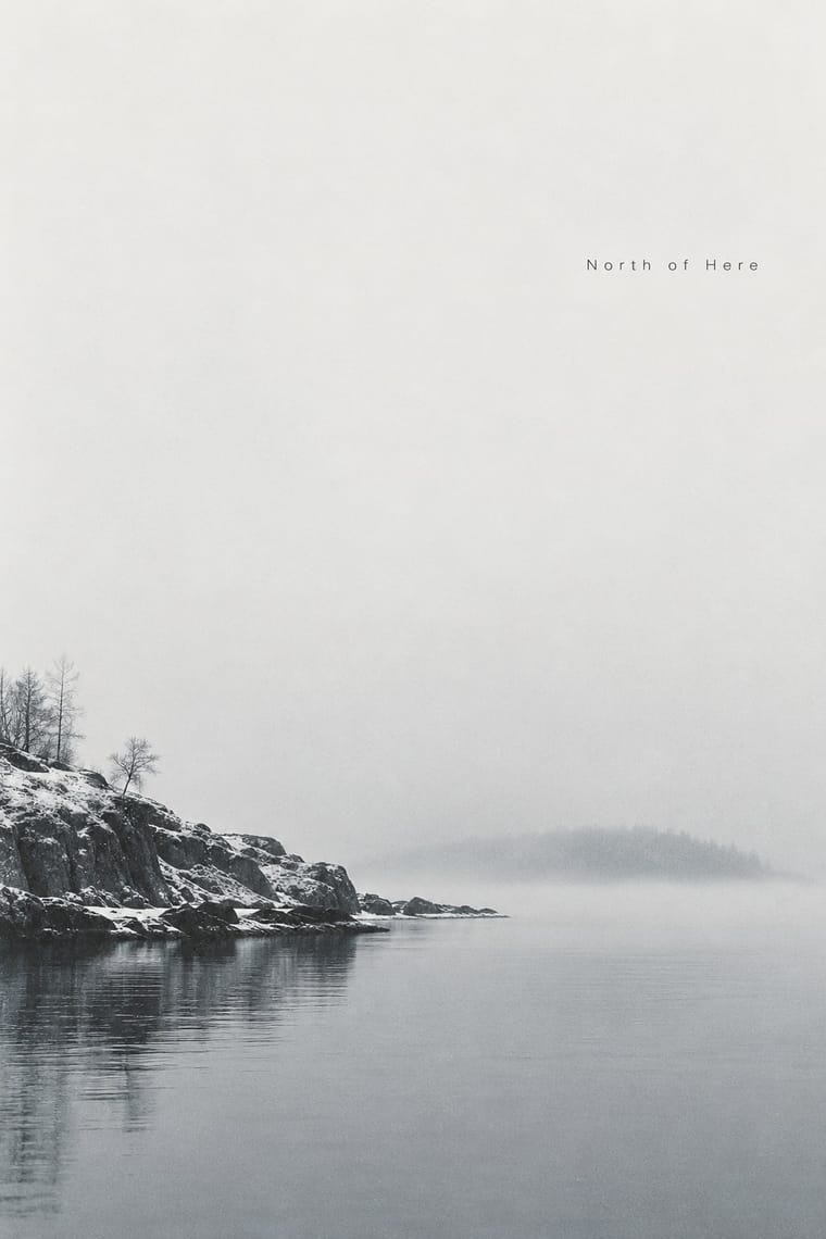
The cover language of the Munich label ECM, made since 1970 by Barbara Wojirsch, Dieter Rehm and later Sascha Kleis and Mayo Bucher with co-founder Manfred Eicher. Each sleeve carries one image chosen to correspond to the music and only rarely to show the players: a wintry, often black-and-white sea, sky or empty landscape, a film still, or in Wojirsch's covers a scribble, rune or handwritten title. A few slender lines of small type, usually sans-serif, give the barest information. The idiom has held across more than five decades of releases.
Inter; ECM Sleeve Aesthetic used Small light grotesque and Widely spaced light sans capitals
03
The colours
The ground and leading colours come from ECM Sleeve Aesthetic, with a counter-accent from Slow-Living Editorial. The ink reads on the ground at 4.5:1 or more.
ECM Sleeve Aesthetic (Munich) Slow-Living Editorial (the Kinfolk Look)
-
#f3f2eeground · 36% -
#1b1c1dink · 14% -
#a89f8daccent · 18% -
#9a7b5faccent · 14% -
#7d8a92accent · 10% -
#dfcabfaccent · 8%
As CSS
:root {
  --ground: #f3f2ee;
  --ink: #1b1c1d;
  --accent-1: #a89f8d;
  --accent-2: #9a7b5f;
  --accent-3: #7d8a92;
  --accent-4: #dfcabf;
  --font-display: "EB Garamond", serif;
  --font-text: "Inter", sans-serif;
}
Use it with care
ECM Sleeve Aesthetic (Munich): The sleeves, their photographs (by Franco Fontana, Christian Vogt and others) and the stills from Godard's and Tarkovsky's films belong to their makers and the label, which still issues records under its own look: take the method (one corresponding image, tiny type, silence), photograph or license your own image, and never present a design as an ECM release or letter the label's logotype or a catalogue number on it. Use borrowed signs knowingly: an ensō is a Zen Buddhist practice, and some runes carry far-right associations in Europe.
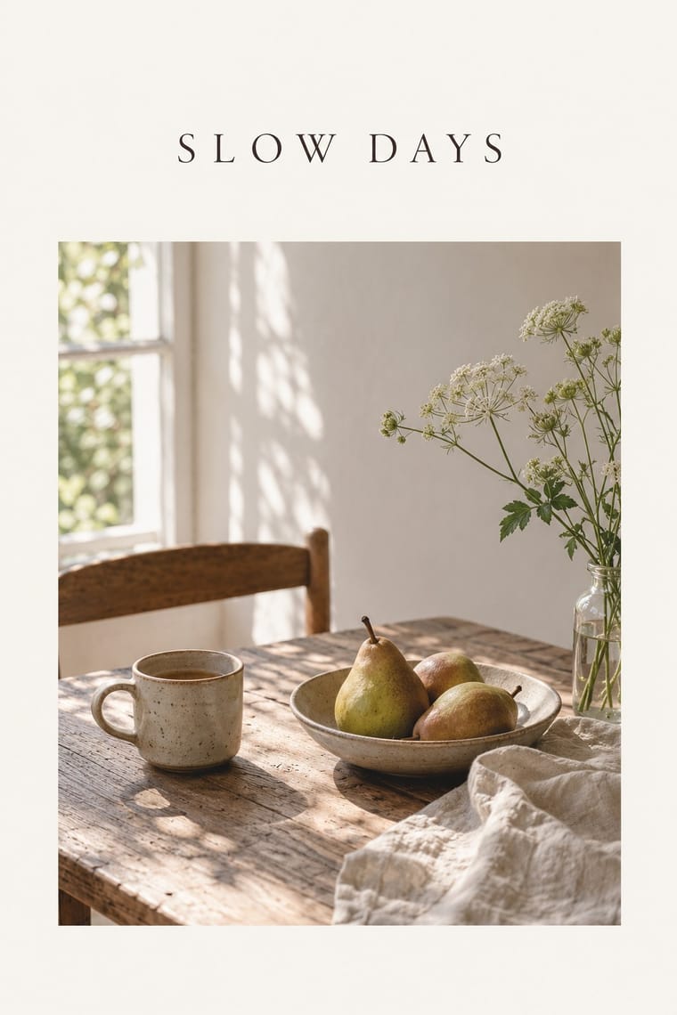
Slow-Living Editorial (the Kinfolk Look): Kinfolk and Cereal are living titles with their own mastheads and photographers: take the method (natural light, wide margins, a quiet serif), shoot or license your own pictures, and never letter the KINFOLK masthead or present a layout as an issue. Critics noted that its early pages pictured mostly young, white and beautiful people; cast, locate and style photographs widely so the calm does not become a single social type. By 2016 the magazine itself was casting more widely (FIT Library blog), so take the later issues, not the early imitators, as the model.
04
The two styles
05
More combinations
With ECM Sleeve Aesthetic
- Minimalist Graphic Design Pairs well · The parent and nearest genome: both stand one element on an empty field with small type, but minimalism keeps it flat, neutral and geometric, while ECM puts a grainy, wintry photograph or a hand-made scribble there and lets mood carry the cover. Choose ECM when the emptiness should feel like weather or silence rather than a product shot.
- Die Neue Typographie Pairs well · Barbara Wojirsch named Tschichold as an influence: borrow his asymmetric blocks of small sans-serif type and set them beside one quiet photograph instead of his photomontage.
- International Typographic Style Contrasts · Both set spare sans-serif type on white, but the Swiss style orders objective photographs and text on a grid to inform, while ECM withholds information and lets one ambiguous image set a mood.
- Post-Punk Record Sleeve (Stiff, Factory, 4AD) Pairs well · 23 Envelope's blurred, tinted photographs for 4AD share ECM's atmospheric register; add post-punk's quoted image and hidden riddle to an ECM layout for a darker, more knowing sleeve.
- Ma & Wabi-sabi Aesthetics Pairs well · Both trust emptiness and a single brush mark, as on Changeless (1989) with its Zen circle painting; add wabi-sabi's earth tones and paper texture to an ECM layout for a warmer, more material calm.
- Blue Note Jazz Sleeve Modernism Contrasts · The other jazz label idiom: Reid Miles blew the title up, tinted a hard-cropped photograph of the players and ran flat colour bands; ECM shrinks the title to a line and shows a landscape instead of the musicians. Choose between swing and stillness.
- Hipgnosis Photographic Concept Sleeve Pairs well · Both keep the musicians and most of the type off the front and let one photograph of a wide landscape carry the record; ECM leaves it wintry and still, Hipgnosis puts an absurd event in it. Add ECM's silence and tiny type to a Hipgnosis concept for a quieter, stranger cover.
- Bossa Nova Sleeve Modernism (César Villela and Elenco) Contrasts · Both answer a quiet, intimate music with an empty field and sparse type, but ECM shows a wintry landscape and hides the players, while Elenco puts the musicians at the centre, cut out in stark black and white, and adds red dots for rhythm. Choose Elenco when the record should feel warm and swinging rather than still.
With Slow-Living Editorial
- Ma & Wabi-sabi Aesthetics Pairs well · Leonard Koren, author of the 1994 book on wabi-sabi for designers, joined Kinfolk's editorial board in 2016; add a cracked bowl, raw linen or an off-centre object on a bare ground to make the calm less styled and more lived-in.
- Hipster Artisanal Revival Contrasts · The same Portland-era milieu of reclaimed wood and small makers, but where the craft badge piles crossed arrows, scripts and an 'Est.' date into one knowing emblem, the Kinfolk look drops the ornament and the irony and lets a quiet photograph carry the page.
- Scandinavian Functionalism Pairs well · The magazine moved to Copenhagen in 2015 and opened a gallery designed by Norm Architects; borrow Nordic furniture, plain materials and clear sans-serif signage to give the soft photography a sturdier, more architectural frame.
- Minimalist Graphic Design Contrasts · The parent: both stand one element in a great deal of white, but minimalism keeps it neutral, sans-serif and often abstract, while the Kinfolk look sets a classical serif beside a naturally lit photograph of people, food and rooms. Choose it when the emptiness should feel domestic and warm rather than cool and exact.
- DTC 'Blanding' / Millennial Minimalism Contrasts · Both use pastels and white space for warmth, but blanding sets lowercase geometric wordmarks and products on seamless backdrops for the phone, while this sets serif text beside lived-in rooms in natural light for print; choose between frictionless and slow.
- Modern Calligraphy and Brush Lettering Pairs well · Set one written name or headline over Kinfolk's humanist-serif text, white margins and soft natural-light photographs, so the hand carries the feeling and the type carries the reading.
- Dark Academia Contrasts · Shares muted earth tones and humanist serifs, but airy and light where this is dim and dense.
- Cottagecore Contrasts · Shares soft natural light and slow living, but is minimal and photographic where cottagecore is floral and illustrated.