Style combination · Pairs well
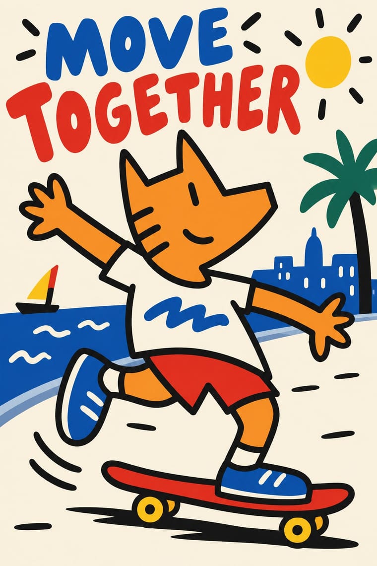
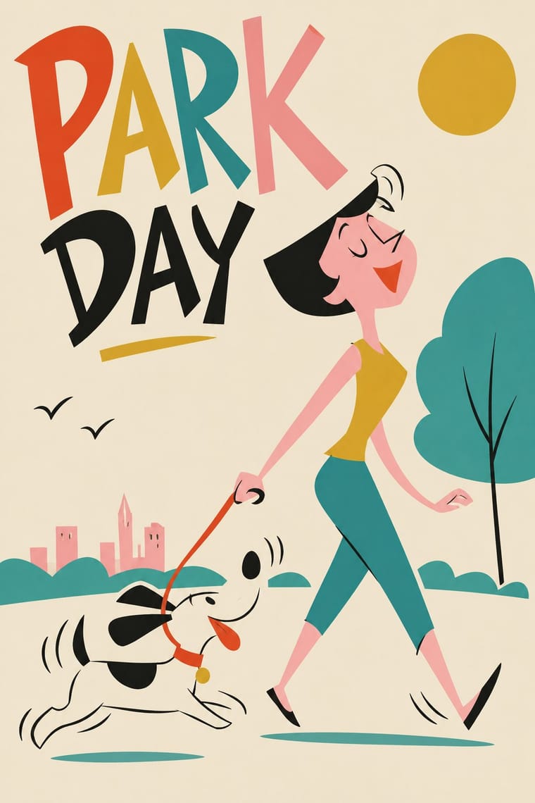
Cobi and Mariscal's Barcelona '92 Mascot Graphics × UPA
Shares flat colour and reduced, distorted cartoon figures; borrow its economy of line for a character-led identity.
Mix them and make something Cobi and Mariscal's Barcelona '92 Mascot Graphics UPA
01
What each style brings
Each part of the design comes from the style with the stronger say in it, and each style gives at least two.
Cobi and Mariscal's Barcelona '92 Mascot Graphics UPA & Cartoon Modern
- Type from UPA
- Colour from Cobi and Mariscal's Barcelona '92 Mascot Graphics
- Form from Cobi and Mariscal's Barcelona '92 Mascot Graphics
- Composition from Cobi and Mariscal's Barcelona '92 Mascot Graphics
- Surface from UPA
02
The type
Open fonts standing in for each style’s own type, which is often hand-drawn or commercial.
Display · UPA
Pop
Londrina Solid, standing in for Playful hand-drawn cartoon lettering (the hand lettering of mid-century American advertising, after 1920s and 1930s comics and newspaper cartoons, which animation title designers set apart as a design element; carried on by Phil Norman's titles and credits for UPA in the early 1960s)
Text · Cobi and Mariscal's Barcelona '92 Mascot Graphics
A mascot-led strand of the Barcelona '92 Games, narrowed here to the character and not the emblem or pictograms. Javier Mariscal's Cobi, an orange Catalan sheepdog in a Cubist manner after Picasso's Las Meninas, brought a cartoon grin to the Games, then spread to statues, a fountain and a cartoon series. It was initially criticised by Catalans who felt Mariscal was less worthy than Miro or Gaudi to represent them.
Archivo; Cobi and Mariscal's Barcelona '92 Mascot Graphics used Hand-drawn lettering and Generic rounded hand-drawn comic caps
03
The colours
The ground and leading colours come from Cobi and Mariscal's Barcelona '92 Mascot Graphics, with a counter-accent from UPA. The ink reads on the ground at 4.5:1 or more.
Cobi and Mariscal's Barcelona '92 Mascot Graphics UPA & Cartoon Modern
-
#fbf5e6ground · 36% -
#1a1a1aink · 14% -
#f28c1caccent · 18% -
#f6d523accent · 14% -
#d6482caccent · 10% -
#1e5fb4accent · 8%
As CSS
:root {
  --ground: #fbf5e6;
  --ink: #1a1a1a;
  --accent-1: #f28c1c;
  --accent-2: #f6d523;
  --accent-3: #d6482c;
  --accent-4: #1e5fb4;
  --font-display: "Londrina Solid", cursive;
  --font-text: "Archivo", sans-serif;
}
Use it with care
UPA & Cartoon Modern: Mr. Magoo and Gerald McBoing-Boing are still licensed characters, and the films are not free to copy. Borrow the method (a flat field, a caricature, colour slipping off the line), never the characters, and do not present new work as a UPA film. Leave out the Asian caricature of Magoo's houseboy Charlie, which was dropped in the late 1960s, and gags that mock disability: blind and low-vision groups, including the National Federation of the Blind, protested the 1997 Magoo film.
04
The two styles
05
More combinations
With Cobi and Mariscal's Barcelona '92 Mascot Graphics
With UPA
- Push Pin Style Contrasts · Its New York contemporary shared UPA's comic, distorted figures and irony but went the opposite way on ornament: Push Pin piled on revived Victorian and Art Nouveau lettering, borders and ornament, while UPA stripped the picture to a figure, a line and a flat field.
- Ligne Claire (Franco-Belgian Clear Line) Contrasts · Both draw cartoon characters in a clean line with flat colour, but the clear line closes every contour exactly and sets its figures in researched, deep, realistic streets. UPA often lets the colour slip off the line and erases the setting down to a single shade or tilts it into skewed perspective.
- American Mid-Century Modernism Pairs well · Its print parent: Alvin Lustig drew UPA's logo. Both use flat colour, simple shapes and visual wit. Add UPA's caricatured characters and stripped sets to a Rand- or Lustig-style layout when an idea needs a cast of people rather than a single symbol.
- Thaw Modernism (Soviet and Czechoslovak) Contrasts · The nearest genome in the atlas, and close kin in animation: critics found that Khitruk's Story of a Crime (1962) looked more like UPA than Disney, and called it a rare example of Soviet cartoon modern design. It shares the limited movement and the set cut down to its props. But Thaw modernism prints a few clear pastel inks on a light ground and aims at civic, Sputnik-age optimism, while UPA sets one or two caricatures on a single, often saturated, flat field, often lets the colour slip off the line and pokes fun at American folkways.
- Corporate Memphis Contrasts · A distant flat-figure descendant: both distort the body over flat colour, but Corporate Memphis is faceless, smooth and earnest. UPA often keeps a drawn line slipping off its colour, caricatures people and their movements, and pokes fun at them.
- Risograph & Indie Print Culture Pairs well · Riso's flat spot inks and loose registration naturally reproduce the divorced line, which suits small-run picture books, posters and zines today.
- Rubber-Hose Revival (Cartoon Mascot Graphics) Contrasts · UPA rejected exactly this: it traded rubbery full movement and round bodies for angular caricature, flat modernist sets and limited animation.
- Flash Vector Cartoon (Newgrounds-Era Web Animation) Contrasts · Same limited-animation logic, but hand-painted, off-register and spare; set against mechanical vector lines and tweened puppets.