Style combination · Contrasts
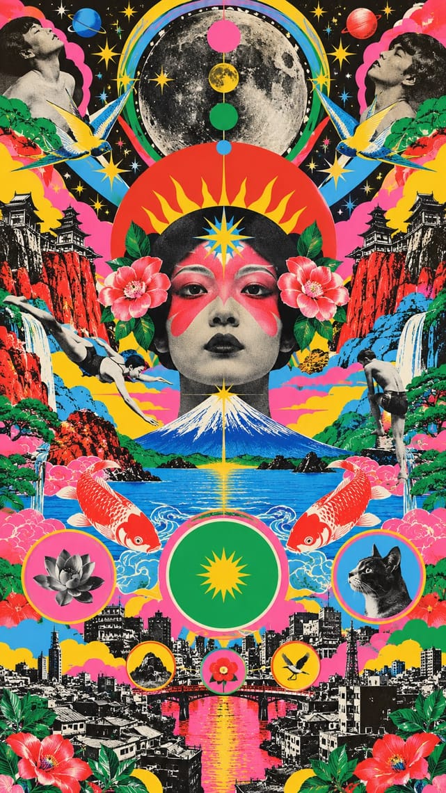
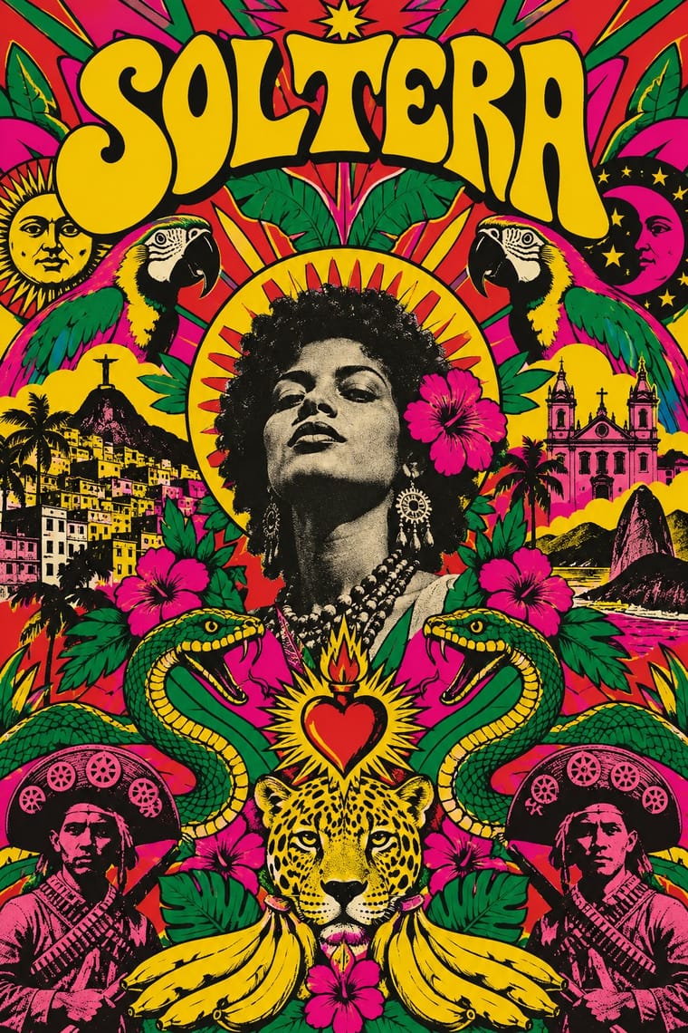
Angura Theatre Poster × Tropicália Graphic Design
The atlas's nearest genome and an exact contemporary: both mock national kitsch with photomontage, sun rays and crowded flat colour, but angura posters screenprint nostalgic Meiji and Shōwa photographs in fluorescent ink, while Tropicália offset-prints a photograph of the singer amid tropical flora and the flag's green and yellow.
Mix them and make something Angura Theatre Poster Tropicália Graphic Design
01
What each style brings
Each part of the design comes from the style with the stronger say in it, and each style gives at least two.
Angura Theatre Poster Tropicália Graphic Design
- Type from Tropicália Graphic Design
- Colour from Angura Theatre Poster
- Form from Angura Theatre Poster
- Composition from Tropicália Graphic Design
- Surface from Tropicália Graphic Design
02
The type
Open fonts standing in for each style’s own type, which is often hand-drawn or commercial.
Display · Tropicália Graphic Design
Riot
Federant, standing in for Art Nouveau-revival hand lettering (Rogério Duarte, Caetano Veloso, 1968)
Text · Angura Theatre Poster
The posters of Japan's underground (angura) theatre from the mid-1960s to the mid-1980s, made for troupes such as Kara Jūrō's Jōkyō Gekijō and Terayama Shūji's Tenjō Sajiki. Tadanori Yokoo, Akira Uno, Kiyoshi Awazu and others crammed silkscreen sheets with Meiji and Shōwa photographs, rising-sun rays, Mount Fuji, ukiyo-e waves and comic-strip figures in flat, often fluorescent colour, mocking prewar kitsch and the restraint of Japanese corporate modernism at once.
Shippori Mincho; Angura Theatre Poster used Hand-drawn and brush-written Japanese titles set vertically and Retro Meiji–Shōwa display lettering lifted from found print
03
The colours
The ground and leading colours come from Angura Theatre Poster, with a counter-accent from Tropicália Graphic Design. The ink reads on the ground at 4.5:1 or more.
Angura Theatre Poster Tropicália Graphic Design
-
#ffd400ground · 36% -
#1a1a1aink · 14% -
#e8352aaccent · 18% -
#d6177aaccent · 14% -
#3fa9f5accent · 10% -
#ff4f9aaccent · 8%
As CSS
:root {
  --ground: #ffd400;
  --ink: #1a1a1a;
  --accent-1: #e8352a;
  --accent-2: #d6177a;
  --accent-3: #3fa9f5;
  --accent-4: #ff4f9a;
  --font-display: "Federant", sans-serif;
  --font-text: "Shippori Mincho", serif;
}
Use it with care
Angura Theatre Poster: Rising-sun rays quote the ensign of the Imperial Japanese Army and Navy, which many people in Korea, China and across Asia read as a symbol of wartime aggression; Yokoo's ironic use belonged to a 1960s Japanese argument with its own past and does not travel safely as a decorative sunburst. The ero-guro imagery includes sexualised and violent bodies, and the posters remain in copyright, so quote or license them with context rather than tracing them.
Tropicália Graphic Design: The posters and covers remain under copyright and the photographs show named, living or recently living artists: borrow the method (a cut-out photograph in a saturated drawn world, national emblems turned ironic), not a particular sleeve or face. Tropicália used bananas, parrots and the flag's colours to mock the exotic image of Brazil and nationalist good taste; using them straight as tropical decoration reverses its meaning. Since 2015 the flag and the yellow team shirt have also become widespread conservative emblems in Brazil, so a straight verde-amarelo pastiche aimed at Brazilian audiences now reads as a partisan statement.
04
The two styles
05
More combinations
With Angura Theatre Poster
- Push Pin Style Pairs well · Yokoo started from Push Pin's illustrated eclecticism; pair Push Pin's period-pastiche lettering with angura's crowded Japanese ephemera.
- Japanese Postwar Modernism Contrasts · Angura rebelled against the Nippon Design Center generation's restraint; set an emblem-and-void poster beside a packed angura sheet to tune between order and overload.
- Psychedelic Poster Pairs well · Yokoo's late-1960s posters met San Francisco psychedelia halfway; combine fluorescent colour with Japanese found imagery rather than Art Nouveau curls.
- Taishō Roman & Lyrical Illustration Pairs well · Angura recycled Meiji and Taishō imagery as found material; cut a Taishō beauty into an angura collage for ironic retro nostalgia.
- La Movida Madrileña Graphics Contrasts · Both cram comic figures and their own country's imagery into flat, saturated colour with irony; Japan's angura posters were silkscreened for underground theatre from the mid-1960s, packed edge to edge with Meiji and Shōwa photographs, rising-sun rays and Mount Fuji around a central axis, while the Movida came after Franco's death and drew comics, hand lettering and cut-out photographs of its own people for magazines, bands and films.
- Garo and Heta-uma (Japanese Underground Manga and 'Bad-Good' Illustration) Pairs well · Both are 1960s-70s Tokyo underground print; set crude Garo-style figures against angura's crowded silkscreen colour.
- Superflat Contrasts · Both quote ukiyo-e and Pop from Japan, but angura crams photographs and fluorescent silkscreen into a rebellious collage while Superflat draws everything smooth and flat; set one flat Superflat character against an angura photomontage for a clash of eras.
- Mavo Pairs well · Two Tokyo undergrounds forty years apart: put Mavo's black-and-white newsprint collage and boxed text under Angura's flood of screenprinted colour for an anti-establishment poster with a longer memory.
With Tropicália Graphic Design
- Literatura de Cordel Woodcut Pairs well · The cangaceiro hero of the north-eastern chapbook stands behind Duarte's Corisco; a cordel woodcut figure in a Tropicalist field of saturated colour keeps the popular and the Pop in one frame.
- Brazilian Concrete Design Contrasts · The Brazilian rational design Duarte trained beside and then swallowed: the 1964 Deus e o Diabo poster keeps concrete's lowercase Helvetica and aligned text blocks, then splits them with one cut-out figure in a sun; the 1968 covers drop the grid altogether.
- Cuban Revolutionary Poster (OSPAAAL & ICAIC) Pairs well · Latin American film posters of the same years: Cuba's single silhouette and flat silkscreen colour can calm a Tropicalist composition that has grown too crowded.
- Afrobeat Sleeve Art Contrasts · Both crowd a political record sleeve with photographs and drawing, but Lemi Ghariokwu states the argument openly as captioned satire, while Tropicália hides it in irony and allegory to get past the censor.
- Psychedelic Poster Contrasts · Shares the crowded field and swelling hand lettering, but San Francisco melts type into whiplash ornament for a trance; Tropicália drops a photograph of the singer into the middle and adds national emblems, kitsch and political mockery. Choose Tropicália when the image must argue, not only dazzle.
- Bossa Nova Sleeve Modernism (César Villela and Elenco) Contrasts · The next Brazilian generation went the other way: Rogério Duarte's 1968 covers fill the field with saturated colour, drawn tropical symbols and swelling hand lettering where Villela left white space, high-contrast black and white and three red dots. Set them side by side to choose between cool restraint and ironic excess.
- Brazilian Modernismo Graphics (Klaxon and the Semana de 22) Pairs well · Tropicália revived Oswald de Andrade's Antropofagia as 'antropofagia visual' in the late 1960s; combine Klaxon's spare two-ink letterpress with Tropicália's saturated collage when a Brazilian theme needs both wit and heat.
- La Movida Madrileña Graphics Contrasts · Both answer a dictatorship with ironic, saturated, hand-lettered Pop that swallows national kitsch; Tropicália did it under the regime, with cut-out photographs of singers in Art Nouveau curves, while the Movida came after Franco's death, drawing comics and sacred camp with a democratic city council paying for some of the magazines.