Style combination · Pairs well
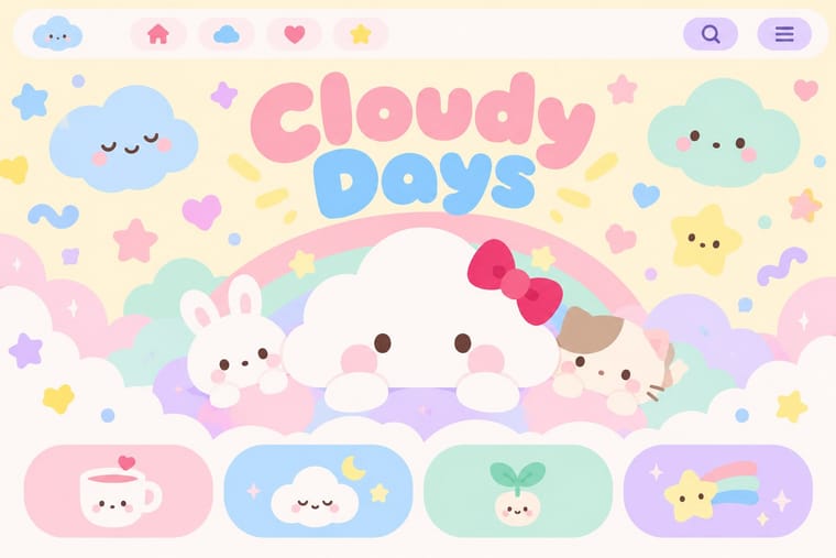
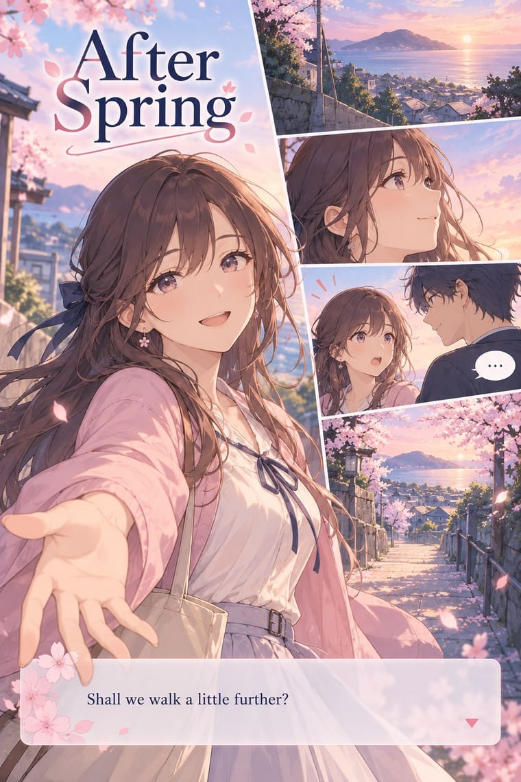
Kawaii Design × Visual Novel Graphics
Borrow its pastel, rounded decoration for menu and save-screen UI.
Mix them and make something Kawaii Design Visual Novel Graphics
01
What each style brings
Each part of the design comes from the style with the stronger say in it, and each style gives at least two.
Kawaii Design Visual Novel Graphics (Sprites, Backgrounds and Textbox UI)
- Type from Kawaii Design
- Colour from Kawaii Design
- Form from Kawaii Design
- Composition from Visual Novel Graphics
- Surface from Visual Novel Graphics
02
The type
Open fonts standing in for each style’s own type, which is often hand-drawn or commercial.
Display · Kawaii Design
Wow
Zen Maru Gothic, standing in for Maru-ji (rounded teenage handwriting, 1970s)
Text · Visual Novel Graphics
A fixed screen language for interactive reading: anime-derived character sprites stand over painted backgrounds, a semi-transparent textbox runs along the bottom (ADV) or fills the screen (NVL), and full-screen event illustrations replace the scene at dramatic moments. Menus and save screens carry the game's identity. Pacing is set by click, not by scrolling or page turns.
Shippori Mincho; Visual Novel Graphics used Japanese gothic (sans) system fonts for the textbox and Mincho (serif) faces for NVL prose and titles
03
The colours
The ground and leading colours come from Kawaii Design, with a counter-accent from Visual Novel Graphics. The ink reads on the ground at 4.5:1 or more.
Kawaii Design Visual Novel Graphics (Sprites, Backgrounds and Textbox UI)
-
#fff4a3ground · 36% -
#141414ink · 14% -
#e60033accent · 18% -
#e8c872accent · 14% -
#a8d8ffaccent · 10% -
#cdb4ffaccent · 8%
As CSS
:root {
  --ground: #fff4a3;
  --ink: #141414;
  --accent-1: #e60033;
  --accent-2: #e8c872;
  --accent-3: #a8d8ff;
  --accent-4: #cdb4ff;
  --font-display: "Zen Maru Gothic", sans-serif;
  --font-text: "Shippori Mincho", serif;
}
Use it with care
Visual Novel Graphics (Sprites, Backgrounds and Textbox UI): The commercial novel-game market of the 1990s was built largely on adult (eroge) titles, among them Shizuku and the Leaf, Key and Tactics wave, and many sprite and event-CG conventions grew up there, including sexualised depictions of young-looking characters. Borrow the layout, textbox and layering system rather than that figure vocabulary; keep characters clearly adult and depictions non-sexualised unless the context is explicitly adult.
04
The two styles
05
More combinations
With Kawaii Design
- Techno-Futurist Graphics Pairs well · A cute mascot inside a dense techno-corporate layout softens its satire; Groovisions' Chappie is the model.
- Grunge Typography Contrasts · Grunge's dirt and illegibility is kawaii's opposite; one cute character on a distressed texture creates knowing dissonance.
- Memphis Design Pairs well · Kawaii characters sit happily on Memphis pastel geometry; combine them for playful packaging with a little more edge.
- Dark Tech Minimalism Contrasts · Use a single pastel mascot or emoji moment to humanise a cold, dark interface without changing its structure.
- Claymorphism & Soft 3D Pairs well · Kawaii's oversized heads, minimal faces and scattered sparkles translate directly into clay volumes; use its character rules for mascots and emoji so the 3D figures stay simple and readable at small sizes.
- Moomin Graphics (Tove Jansson's Pen-Drawn World and its Licensed Afterlife) Contrasts · Its round, white characters sit near kawaii fancy goods, but they keep a hatched, melancholy world around them that kawaii fancy goods leave out.
- Superflat Contrasts · Kawaii offers sincere, simple, pastel cuteness for fancy goods; switch to Superflat when the cute should be saturated, crowded, many-eyed and ironic, a comment on consumer culture rather than a product of it.
- VTuber Avatar and Stream Graphics Contrasts · Its parent in cute character culture, but kawaii fixes a static mascot on pastel goods and print; switch to VTuber graphics when the character has to move, talk and answer a live chat, with a performer's voice and a whole stream screen around it.
With Visual Novel Graphics
- Lo-fi Anime Aesthetic Contrasts · A looping mood against an interface system of fixed parts.
- Korean Webtoon Graphics Contrasts · Scroll-driven panels against click-driven screens: the same drawn figures, opposite pacing.
- Story Manga (Postwar Japanese Comics) Pairs well · Take its character design and expression vocabulary, then replace panels and page turns with screen states.