Style combination · Contrasts
Kawaii Design × Purikura Photo-Sticker Decoration
Keep the hearts and candy accents, but replace kawaii's self-contained drawn mascot with the participants' photograph and personally addressed lettering; the photo-plus-annotation relationship, not pink alone, defines this entry.
Mix them and make something Kawaii Design Purikura Photo-Sticker Decoration
01
What each style brings
Each part of the design comes from the style with the stronger say in it, and each style gives at least two.
Kawaii Design Purikura Photo-Sticker Decoration
- Type from Kawaii Design
- Colour from Kawaii Design
- Form from Kawaii Design
- Composition from Purikura Photo-Sticker Decoration
- Surface from Purikura Photo-Sticker Decoration
02
The type
Open fonts standing in for each style’s own type, which is often hand-drawn or commercial.
Display · Kawaii Design
Wow
Zen Maru Gothic, standing in for Maru-ji (rounded teenage handwriting, 1970s)
Text · Kawaii Design
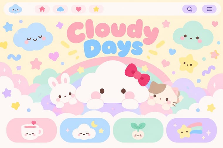
Japan's culture of cuteness, which grew from 1970s teenage rounded handwriting and shōjo fancy goods into a global design language through Sanrio, character merchandise and emoji. Its decisions are simple and consistent: rounded forms, oversized heads and minimal faces, pastel or candy colour in flat fields, scattered hearts and sparkles, and friendly rounded type.
Zen Maru Gothic; Kawaii Design used Maru-ji and Maru Gothic rounded type
03
The colours
The ground and leading colours come from Kawaii Design, with a counter-accent from Purikura Photo-Sticker Decoration. The ink reads on the ground at 4.5:1 or more.
Kawaii Design Purikura Photo-Sticker Decoration
-
#fff4a3ground · 36% -
#141414ink · 14% -
#e60033accent · 18% -
#ec168caccent · 14% -
#a8d8ffaccent · 10% -
#66c9e8accent · 8%
As CSS
:root {
  --ground: #fff4a3;
  --ink: #141414;
  --accent-1: #e60033;
  --accent-2: #ec168c;
  --accent-3: #a8d8ff;
  --accent-4: #66c9e8;
  --font-display: "Zen Maru Gothic", sans-serif;
  --font-text: "Zen Maru Gothic", sans-serif;
}
Use it with care
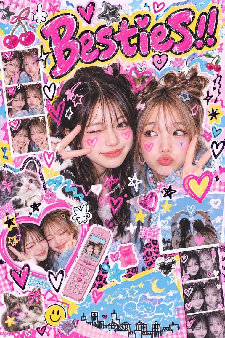
Purikura Photo-Sticker Decoration: Treat participants as people with privacy and consent interests, not anonymous visual resources. Distinguish their own poses and annotations from manufacturer-supplied lettering, stamps and commissioned overlays; selecting an asset does not make it participant-authored. Obtain consent before reusing identifiable portraits, especially those of minors; use original or explicitly licensed portraits and decoration assets. Do not sexualise adolescent subjects or present eye enlargement and skin-lightening conventions as requirements for attractiveness or Japanese identity. Print Club and Purikura are associated with Sega trademarks, and commercial booth designs and stamps are not automatically free to reuse. The manufacturer sample images researched here have no verified open-file licences and should remain link-only if later entered as specimens.
04
The two styles
05
More combinations
With Kawaii Design
- Techno-Futurist Graphics Pairs well · A cute mascot inside a dense techno-corporate layout softens its satire; Groovisions' Chappie is the model.
- Grunge Typography Contrasts · Grunge's dirt and illegibility is kawaii's opposite; one cute character on a distressed texture creates knowing dissonance.
- Memphis Design Pairs well · Kawaii characters sit happily on Memphis pastel geometry; combine them for playful packaging with a little more edge.
- Dark Tech Minimalism Contrasts · Use a single pastel mascot or emoji moment to humanise a cold, dark interface without changing its structure.
- Claymorphism & Soft 3D Pairs well · Kawaii's oversized heads, minimal faces and scattered sparkles translate directly into clay volumes; use its character rules for mascots and emoji so the 3D figures stay simple and readable at small sizes.
- Moomin Graphics (Tove Jansson's Pen-Drawn World and its Licensed Afterlife) Contrasts · Its round, white characters sit near kawaii fancy goods, but they keep a hatched, melancholy world around them that kawaii fancy goods leave out.
- Superflat Contrasts · Kawaii offers sincere, simple, pastel cuteness for fancy goods; switch to Superflat when the cute should be saturated, crowded, many-eyed and ironic, a comment on consumer culture rather than a product of it.
- VTuber Avatar and Stream Graphics Contrasts · Its parent in cute character culture, but kawaii fixes a static mascot on pastel goods and print; switch to VTuber graphics when the character has to move, talk and answer a live chat, with a performer's voice and a whole stream screen around it.
With Purikura Photo-Sticker Decoration
- Shōjo Manga (Japanese Girls' Comics) Pairs well · Borrow a small halo of flowers or sparkles to intensify a portrait's mood, but retain photographic faces and personal messages rather than turning the sticker into a drawn sequential story.
- Superflat Contrasts · Superflat's repeated drawn characters occupy a flattened cartoon field; keep photographic participants visibly distinct from the added doodles when using this decorated photo-sticker idiom.