Style combination · Contrasts
ACT UP × Hype Streetwear Graphics
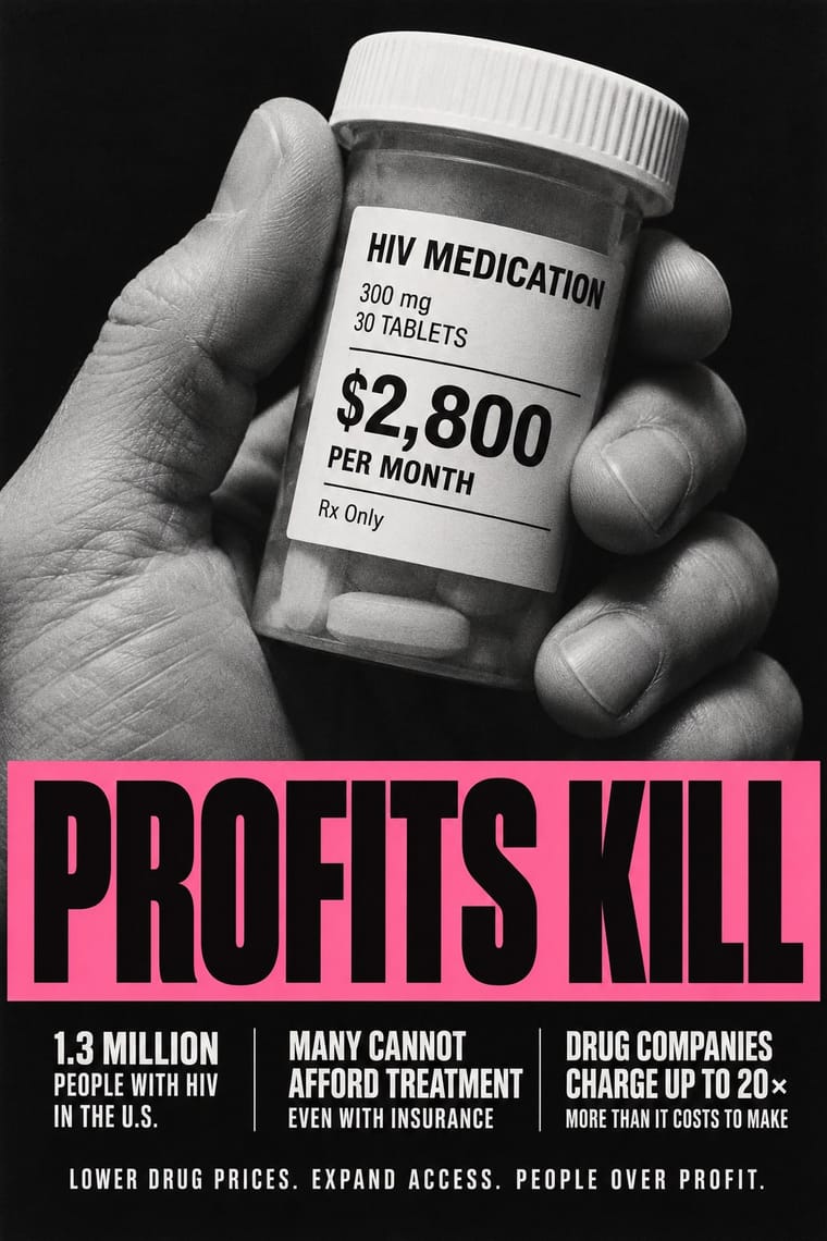
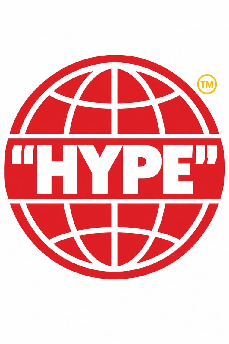
Both took Barbara Kruger's heavy Futura capitals on a bar, but Gran Fury used them to accuse government and drug companies on bus sides, while Supreme put them in a red box to create desire for a scarce shirt; decide whether the slogan sells or indicts before borrowing the idiom.
01
What each style brings
Each part of the design comes from the style with the stronger say in it, and each style gives at least two.
ACT UP & Gran Fury AIDS Activist Graphics Hype Streetwear Graphics (Box Logo to Quotation Marks)
- Type from ACT UP
- Colour from Hype Streetwear Graphics
- Form from Hype Streetwear Graphics
- Composition from Hype Streetwear Graphics
- Surface from ACT UP
02
The type
Open fonts standing in for each style’s own type, which is often hand-drawn or commercial.
Display · ACT UP
Loud
Anton; ACT UP used Gill Sans Bold Extra Condensed in white capitals reversed out of black for SILENCE=DEATH (1987), settled on after months in which the collective 'argued about issues, images and fonts' and Futura Extra Bold, Extra Bold Oblique and Extra Bold Condensed in black or white
Text · Hype Streetwear Graphics
The logo-led graphics of streetwear since the 1990s: one wordmark or emblem on a plain T-shirt, hoodie or object is the product. Supreme's white Futura Heavy Oblique in a red box (1994), modelled on Barbara Kruger's captions, set the type; A Bathing Ape in Tokyo spread camouflage prints; Virgil Abloh's Off-White (2013) added generic words in quotation marks, diagonal stripes and barricade tape. Co-branded lockups with luxury houses and mass brands, sold in scarce weekly drops, turn a flat spot-colour logo into a status object.
Jost; Hype Streetwear Graphics used Futura Heavy Oblique in white reversed out of a red box (Supreme, from 1994), taken from Barbara Kruger's captions, which are set in Futura Bold Oblique or Helvetica Ultra Condensed on red bars and Shawn Stussy's surname scrawled with a broad-tipped marker, in the early 1980s, derived from his uncle Jan Stussy's signature and then printed on T-shirts, shorts and caps: the signature as logo
03
The colours
The ground and leading colours come from Hype Streetwear Graphics, with a counter-accent from ACT UP. The ink reads on the ground at 4.5:1 or more.
ACT UP & Gran Fury AIDS Activist Graphics Hype Streetwear Graphics (Box Logo to Quotation Marks)
-
#ffffffground · 36% -
#111111ink · 14% -
#f6c90eaccent · 18% -
#c8102eaccent · 14% -
#f06ea9accent · 10% -
#556b2faccent · 8%
As CSS
:root {
  --ground: #ffffff;
  --ink: #111111;
  --accent-1: #f6c90e;
  --accent-2: #c8102e;
  --accent-3: #f06ea9;
  --accent-4: #556b2f;
  --font-display: "Anton", sans-serif;
  --font-text: "Jost", sans-serif;
}
Use it with care
ACT UP & Gran Fury AIDS Activist Graphics: These are the graphics of a movement of gay men, lesbians and people with AIDS who were burying their friends, and many of their makers and subjects are living or died of AIDS (Mark Simpson, who appears in Kissing Doesn't Kill, died in 1996; Oliver Johnston in 1990); HIV remains a global health issue and ACT UP is still active. The pink triangle recalls the homosexual prisoners of the Nazi camps and was turned to point up as 'a disavowal of victimhood' (in Finkelstein's account; the Henry Ford's history says the inversion began as a mistake that the collective kept): do not use it, the SILENCE=DEATH equation or the kissing couples as decoration, Pride merchandise or brand campaigns, since the style was made to turn advertising against corporate greed, and do not picture people with HIV as victims or as a threat. SILENCE=DEATH is © 1987 The Silence = Death Project, which lent it to ACT UP (the poster reads 'Used by permission by ACT-UP'); Gran Fury's website declares its own artwork public domain, but the photographed people and quoted brands are not: write your own slogan and stage your own photograph, and never present a generated image as a period work.
Hype Streetwear Graphics (Box Logo to Quotation Marks): Streetwear grew out of African-American and Latino hip-hop dress in New York, and its turn into a global luxury phenomenon has been criticised as cultural appropriation; Dapper Dan's Harlem boutique, which pioneered logo-covered garments, was closed by counterfeiting raids and a Fendi lawsuit in 1992, and Gucci's 2017 jacket followed his 1989 design for Diane Dixon and was called a homage only after criticism. The marks are living trademarks that their owners defend (Supreme sued Married to the Mob in 2013) and Kruger's work is her own: design your own wordmark and collaborations, do not reproduce the Supreme box, the Off-White stripes or luxury monograms (the Off-White stripes were themselves disputed as borrowed from Ben Kelly, who popularised the graphic in the early 1980s; generic hazard striping is free, a brand's lockup is not), credit the culture you draw on, including the AAVE origin of the word hypebeast, and never present a generated image as a real product or drop.
04
The two styles
05
More combinations
With ACT UP
- Extinction Rebellion Graphics Pairs well · A later movement that again reduces its cause to one emblem and a fixed set of slogans in heavy capitals; pair XR's flat colour grounds with ACT UP's facts in small print when a protest poster must both rally and inform.
- Atelier Populaire (May '68 Screenprint Poster) Contrasts · Both answered a crisis with overnight slogans on the street, but the May '68 posters were brushed by hand and pulled in one ink, while most ACT UP and Gran Fury posters were professionally printed in offset and modelled on advertising; choose rough urgency or seductive polish before mixing them.
- Punk & DIY Zine Contrasts · Gran Fury photocopied some posters and handbills like a punk zine, but kept the layout clean and legible: one image, one slogan and plain sans type in place of ransom-note collage, even when the photograph broke into coarse xerox dots (Read My Lips); add punk's torn xerox only when the message should look home-made rather than official.
- Pop Art Graphics Pairs well · RIOT (1988), a painting later issued as a sticker, reworks Robert Indiana's LOVE letters and Kissing Doesn't Kill copies a Benetton campaign: borrow Pop's habit of lifting mass-media images and lettering, but replace Pop's ironic detachment with a named target and a demand.
- Corporate Identity Modernism Contrasts · Stands here for the logo logic of SILENCE=DEATH, one emblem and clean sans capitals repeated like a corporate mark; the advertising Gran Fury and ACT UP otherwise copied was 1980s brand campaigns and mastheads (Benetton, Nike, Coca-Cola, The New York Times) rather than mid-century corporate identity. Set an AIDS-era slogan in a corporate format when the point is to turn a brand's own voice against it.
- Latin American Feminist Protest Graphics (Ni Una Menos and the Green Wave) Contrasts · Two movements signed with a triangle, ACT UP's pink one on black and the green kerchief, but Gran Fury bought ad space and printed offset photographs and Futura, while the green wave wears its sign and letters its placards by hand; polish against handmade multitude.
- Instagram Slideshow Activism (Social-Justice Infographics) Contrasts · Its confrontational opposite: black grounds, hot pink and one blunt slogan, where the typical slideshow shuns 'blood red or black messaging' (Ría Thompson-Washington) and softens the message to stay comfortable.
- Plain Tobacco Packaging Pairs well · Gran Fury's white capitals on black are the activist cousin of the mandated warning statement; borrow their wit when a health message must persuade without leaning on clinical shock photographs.
With Hype Streetwear Graphics
- Graffiti & Hip-Hop Graphics Pairs well · Streetwear grew out of New York hip-hop dress; pair a set geometric wordmark with a hand-drawn graffiti piece for a back print, but keep the logo flat and centred so the tag reads as the decoration and the box as the brand.
- DTC 'Blanding' / Millennial Minimalism Contrasts · Both centre one product on a plain ground, but direct-to-consumer brands use lowercase geometric sans and pastels to look friendly and always available, while hype graphics use loud spot colour, heavy oblique or capital wordmarks and scarcity; pick approachability or exclusivity.
- Superflat Pairs well · Takashi Murakami, who named Superflat, made a Supreme Box Logo Tee for COVID-19 relief in 2020; when a single red logo is too austere, bring in Superflat's polychrome cartoon figures, but keep them inside one flat, contained shape so the logo still reads first.
- Bandung Distro Graphics Pairs well · Shares the label-as-identity logic of small-run screenprinted apparel; hype streetwear is a later, Western, commercial scene, whereas distro is a city shop economy rooted in local pride.