Style combination · Pairs well
Bandung Distro Graphics × Hype Streetwear Graphics
Shares the label-as-identity logic of small-run screenprinted apparel; hype streetwear is a later, Western, commercial scene, whereas distro is a city shop economy rooted in local pride.
Mix them and make something Bandung Distro Graphics Hype Streetwear Graphics
01
What each style brings
Each part of the design comes from the style with the stronger say in it, and each style gives at least two.
Bandung Distro Graphics Hype Streetwear Graphics (Box Logo to Quotation Marks)
- Type from Bandung Distro Graphics
- Colour from Hype Streetwear Graphics
- Form from Hype Streetwear Graphics
- Composition from Hype Streetwear Graphics
- Surface from Bandung Distro Graphics
02
The type
Open fonts standing in for each style’s own type, which is often hand-drawn or commercial.
Display · Bandung Distro Graphics
Riot
Allerta Stencil, standing in for Hand-lettered and stencil street lettering
Text · Hype Streetwear Graphics
The logo-led graphics of streetwear since the 1990s: one wordmark or emblem on a plain T-shirt, hoodie or object is the product. Supreme's white Futura Heavy Oblique in a red box (1994), modelled on Barbara Kruger's captions, set the type; A Bathing Ape in Tokyo spread camouflage prints; Virgil Abloh's Off-White (2013) added generic words in quotation marks, diagonal stripes and barricade tape. Co-branded lockups with luxury houses and mass brands, sold in scarce weekly drops, turn a flat spot-colour logo into a status object.
Jost; Hype Streetwear Graphics used Futura Heavy Oblique in white reversed out of a red box (Supreme, from 1994), taken from Barbara Kruger's captions, which are set in Futura Bold Oblique or Helvetica Ultra Condensed on red bars and Shawn Stussy's surname scrawled with a broad-tipped marker, in the early 1980s, derived from his uncle Jan Stussy's signature and then printed on T-shirts, shorts and caps: the signature as logo
03
The colours
The ground and leading colours come from Hype Streetwear Graphics, with a counter-accent from Bandung Distro Graphics. The ink reads on the ground at 4.5:1 or more.
Bandung Distro Graphics Hype Streetwear Graphics (Box Logo to Quotation Marks)
-
#ffffffground · 36% -
#111111ink · 14% -
#f6c90eaccent · 18% -
#e4202aaccent · 14% -
#556b2faccent · 10% -
#a5a5a3accent · 8%
As CSS
:root {
  --ground: #ffffff;
  --ink: #111111;
  --accent-1: #f6c90e;
  --accent-2: #e4202a;
  --accent-3: #556b2f;
  --accent-4: #a5a5a3;
  --font-display: "Allerta Stencil", sans-serif;
  --font-text: "Jost", sans-serif;
}
Use it with care
Hype Streetwear Graphics (Box Logo to Quotation Marks): Streetwear grew out of African-American and Latino hip-hop dress in New York, and its turn into a global luxury phenomenon has been criticised as cultural appropriation; Dapper Dan's Harlem boutique, which pioneered logo-covered garments, was closed by counterfeiting raids and a Fendi lawsuit in 1992, and Gucci's 2017 jacket followed his 1989 design for Diane Dixon and was called a homage only after criticism. The marks are living trademarks that their owners defend (Supreme sued Married to the Mob in 2013) and Kruger's work is her own: design your own wordmark and collaborations, do not reproduce the Supreme box, the Off-White stripes or luxury monograms (the Off-White stripes were themselves disputed as borrowed from Ben Kelly, who popularised the graphic in the early 1980s; generic hazard striping is free, a brand's lockup is not), credit the culture you draw on, including the AAVE origin of the word hypebeast, and never present a generated image as a real product or drop.
04
The two styles
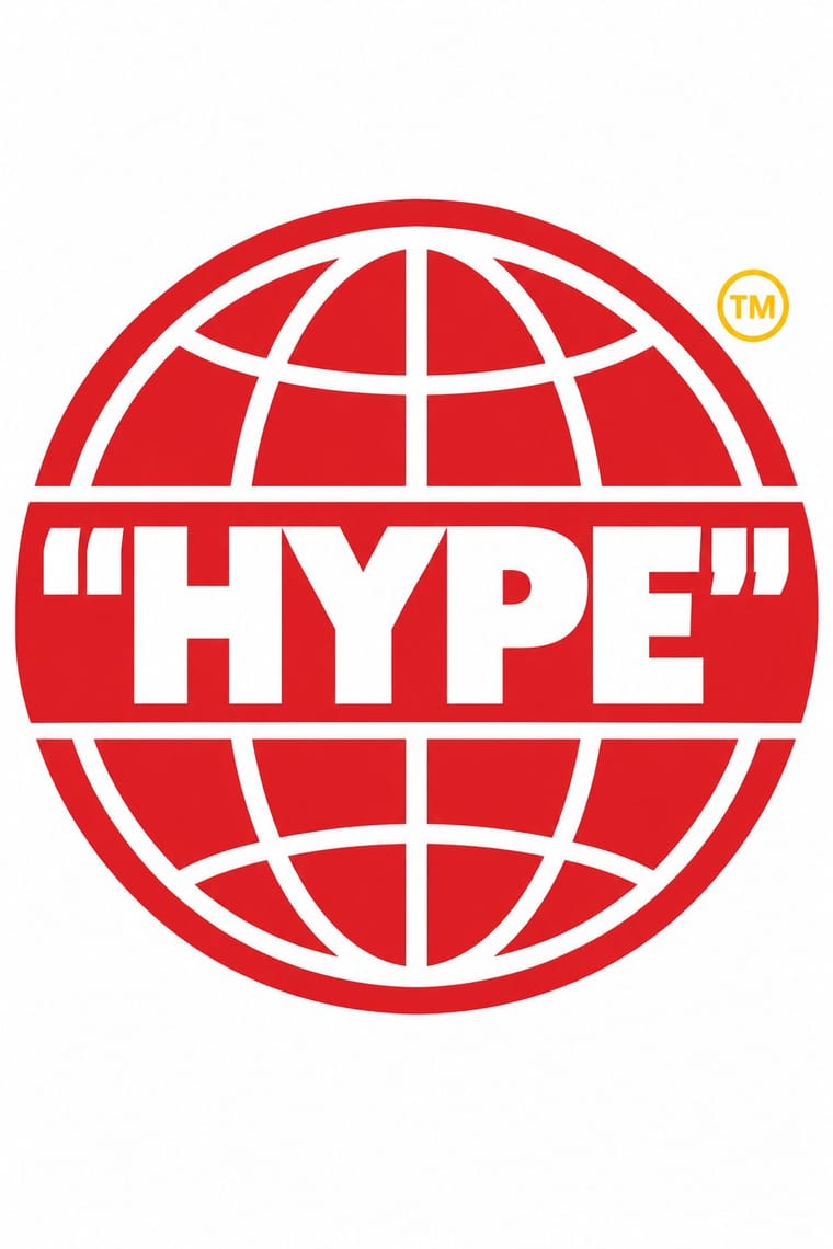
05
More combinations
With Bandung Distro Graphics
- Screenprinted Gig & Alt-Movie Poster Pairs well · Both screenprint scene-made graphics for bands; distro moves the print from paper onto cloth.
- International Typographic Style Contrasts · A neutral grid and whitespace against dense, logo-led, shout-loud merchandise.
- Hipster Artisanal Revival Contrasts · Craft badges on a polished, affluent brand look against loud, low-cost, scene-bound emblems.
With Hype Streetwear Graphics
- Graffiti & Hip-Hop Graphics Pairs well · Streetwear grew out of New York hip-hop dress; pair a set geometric wordmark with a hand-drawn graffiti piece for a back print, but keep the logo flat and centred so the tag reads as the decoration and the box as the brand.
- DTC 'Blanding' / Millennial Minimalism Contrasts · Both centre one product on a plain ground, but direct-to-consumer brands use lowercase geometric sans and pastels to look friendly and always available, while hype graphics use loud spot colour, heavy oblique or capital wordmarks and scarcity; pick approachability or exclusivity.
- Superflat Pairs well · Takashi Murakami, who named Superflat, made a Supreme Box Logo Tee for COVID-19 relief in 2020; when a single red logo is too austere, bring in Superflat's polychrome cartoon figures, but keep them inside one flat, contained shape so the logo still reads first.
- ACT UP & Gran Fury AIDS Activist Graphics Contrasts · Both took Barbara Kruger's heavy Futura capitals on a bar, but Gran Fury used them to accuse government and drug companies on bus sides, while Supreme put them in a red box to create desire for a scarce shirt; decide whether the slogan sells or indicts before borrowing the idiom.