Style combination · Contrasts
Kanoon Children's Book Illustration × Polish Information Picture Book
Dense, diagrammatic and all-over (and dated 2008 onward) where Kanoon is lyrical and narrative.
Mix them and make something Kanoon Children's Book Illustration Polish Information Picture Book
01
What each style brings
Each part of the design comes from the style with the stronger say in it, and each style gives at least two.
Kanoon Children's Book Illustration (Iran, 1965 to 1979) Polish Information Picture Book (Dwie Siostry)
- Type from Polish Information Picture Book
- Colour from Kanoon Children's Book Illustration
- Form from Kanoon Children's Book Illustration
- Composition from Polish Information Picture Book
- Surface from Kanoon Children's Book Illustration
02
The type
Open fonts standing in for each style’s own type, which is often hand-drawn or commercial.
Display · Polish Information Picture Book
Wow
Londrina Solid; Polish Information Picture Book used Mrs White and Cartographer
Text · Kanoon Children's Book Illustration
Picture books made at Tehran's Kanoon institute by Farshid Mesghali, Ali Akbar Sadeghi and others: simplified, flat-colour, graphic narrative art drawing on Iranian visual culture, within the Tehran modernist school (hence persian-modernism). Context: state-court-linked patronage; The Little Black Fish was read as political allegory and banned before 1979; legacy contested since. Persian lettering is Iranian hands' work, not a motif to borrow.
Archivo; Kanoon Children's Book Illustration used Hand-drawn Persian lettering, often integral to the image and Hand-lettered title forms
03
The colours
The ground and leading colours come from Kanoon Children's Book Illustration, with a counter-accent from Polish Information Picture Book. The ink reads on the ground at 4.5:1 or more.
Kanoon Children's Book Illustration (Iran, 1965 to 1979) Polish Information Picture Book (Dwie Siostry)
-
#f3e7ccground · 36% -
#1b1b1bink · 14% -
#e8b32eaccent · 18% -
#d6402baccent · 14% -
#e0876aaccent · 10% -
#2a7f8eaccent · 8%
As CSS
:root {
  --ground: #f3e7cc;
  --ink: #1b1b1b;
  --accent-1: #e8b32e;
  --accent-2: #d6402b;
  --accent-3: #e0876a;
  --accent-4: #2a7f8e;
  --font-display: "Londrina Solid", cursive;
  --font-text: "Archivo", sans-serif;
}
Use it with care
Polish Information Picture Book (Dwie Siostry): The leading authors are living, named illustrators whose books are in copyright, so draw your own figures, maps and lettering instead of asking an image model for the Mizielińskis', Bajtlik's or Karski's hand, and never present a generated spread as a page from Mapy, Mamoko or another Dwie Siostry book. Picture atlases sum up whole countries in a few small figures: show people through what they do, make and celebrate, ask people from a country to check its spread, and avoid reducing a culture to costume, cliché or skin colour.
04
The two styles
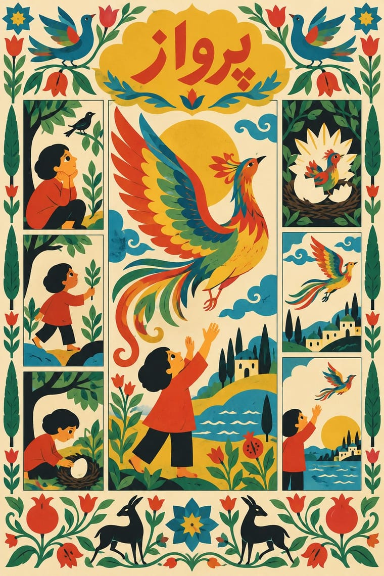
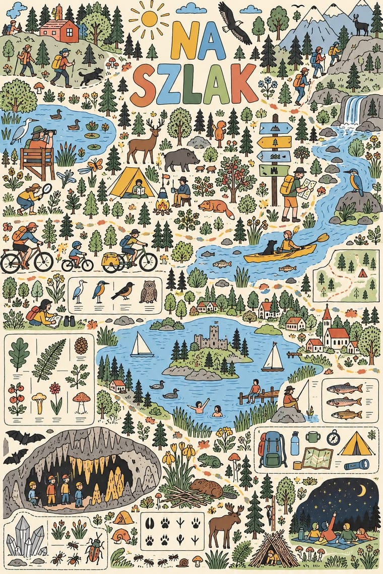
05
More combinations
With Kanoon Children's Book Illustration
- Persian Miniature (Ilkhanid, Timurid and Safavid Book Painting) Pairs well · A possible visual kinship in framed compartments and ornament; not established by the cited sources.
- Leningrad Avant-Garde Picture Book Pairs well · A loose parallel, not an influence: flat colour and a bold figure-led picture-book sequence.
With Polish Information Picture Book
- Leningrad Avant-Garde Picture Book Contrasts · Both explain the world to children in flat colour, but Lebedev's production books float a few large planes on bare paper while a Mizieliński atlas crowds the page with small figures and labels; decide between one clear object per page and a field to explore.
- Polish Poster School Contrasts · The poster designer and teacher Henryk Tomaszewski is credited with a role in the revival, but the poster school puts one painted, metaphorical image on a poster, while the picture books refuse paint and fill a spread with a hundred small labelled facts. Choose between a single idea that provokes and a dense page that informs.
- Ligne Claire (Franco-Belgian Clear Line) Pairs well · The same even, unmodulated outline and flat colour on a light ground; borrow Ligne Claire's clean contour and legible caption lettering, but scatter hundreds of small labelled figures across one spread instead of telling a story panel by panel.
- Isotype Pictorial Statistics Pairs well · Isotype's rule of one sign, one meaning keeps a crowded atlas spread legible; use a consistent pictogram for each kind of thing (animal, food, building, custom) and let the hand-drawn wit live in the details.
- Risograph & Indie Print Culture Pairs well · The activity-book strand of the idiom, black line and one or two flat colours on white, prints well in two or three riso inks for a small-run children's workbook or museum trail.
- Corporate Memphis Contrasts · Both draw flat, simplified figures on light grounds, but Corporate Memphis uses them for mood around a single message, while here every small figure is labelled and stands for a fact; give each figure a job.
- Thaw Modernism (Soviet and Czechoslovak) Pairs well · Borrow the airy pages and laconic pastel figures of 1960s Eastern European illustration, which the Mistrzowie Ilustracji reissues keep in view, to open up a spread that has grown too crowded.
- Victorian Colour Toy Books (Evans, Crane, Caldecott and Greenaway) Pairs well · Both put flat printed colour and picture-led narrative first; carry the toy-book key-block approach into a modern picture book.