Style combination · Pairs well
Internet Ugly × Ukrainian Wartime Graphics
NAFO's Fellas come from the Doge meme and the image-macro habit of pasting a character into a photo; pair a rough meme edit with a clean flat vector figure for a quick reply to the day's news.
Mix them and make something Internet Ugly Ukrainian Wartime Graphics
01
What each style brings
Each part of the design comes from the style with the stronger say in it, and each style gives at least two.
Internet Ugly & Meme Vernacular Ukrainian Wartime Graphics (Saint Javelin, War Stamps and Be Brave Like Ukraine)
- Type from Internet Ugly
- Colour from Ukrainian Wartime Graphics
- Form from Ukrainian Wartime Graphics
- Composition from Ukrainian Wartime Graphics
- Surface from Internet Ugly
02
The type
Open fonts standing in for each style’s own type, which is often hand-drawn or commercial.
Display · Internet Ugly
Wow
Anton, standing in for Impact (Geoffrey Lee, Stephenson Blake, 1965), set white with a black outline
Text · Ukrainian Wartime Graphics
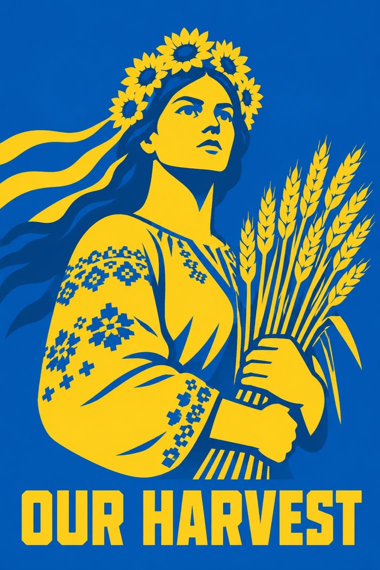
The graphics of Ukraine's defence since Russia's full-scale invasion in February 2022, made by the state, the national post, agencies, illustrators and volunteers at home and abroad. Flat figures in the flag's blue and yellow are drawn to read at sticker and stamp size; sacred and official forms are recast with dark humour, from an icon Madonna cradling a Javelin missile to a soldier giving the finger to the cruiser Moskva on a postage stamp. Memes, merchandise and photographs under the trident turn morale into fundraising and a national brand of bravery.
Space Grotesk; Ukrainian Wartime Graphics used KTF Jermilov (Kyiv Type Foundry, 2021), a modular display face whose capitals are built from a few geometric elements on a 3 × 5 square grid, after the typographic practice of the Kharkiv avant-garde designer Vasyl Yermylov; used in Be Brave Like Ukraine and Yermylov Bold, made in 2018 for Banda's Ukraine NOW country brand and inspired by Yermylov's constructivist work
03
The colours
The ground and leading colours come from Ukrainian Wartime Graphics, with a counter-accent from Internet Ugly. The ink reads on the ground at 4.5:1 or more.
Internet Ugly & Meme Vernacular Ukrainian Wartime Graphics (Saint Javelin, War Stamps and Be Brave Like Ukraine)
-
#f4f1e8ground · 36% -
#1c1c1cink · 14% -
#0057b7accent · 18% -
#00a2e8accent · 14% -
#c9a14aaccent · 10% -
#ff7f27accent · 8%
As CSS
:root {
  --ground: #f4f1e8;
  --ink: #1c1c1c;
  --accent-1: #0057b7;
  --accent-2: #00a2e8;
  --accent-3: #c9a14a;
  --accent-4: #ff7f27;
  --font-display: "Anton", sans-serif;
  --font-text: "Space Grotesk", sans-serif;
}
Use it with care
Internet Ugly & Meme Vernacular: Most meme templates are photographs of real people, often children, or licensed stock. Success Kid is Laney Griner's son: the photo has been licensed to advertisers, and in January 2020 she sent a cease-and-desist letter to a congressman whose fundraising campaign used it without permission. Distracted Boyfriend is microstock, and its photographer says use without a proper licence is not allowed. License a template or make a new picture for commercial or political work. Check what a format means now: some characters that spread through 4chan were taken up as hate symbols (the ADL listed Pepe the Frog, Matt Furie's 2005 Boy's Club character, in 2016, while noting that most uses are not hateful). Reaction images of Black people posted by non-Black users and brands read as digital blackface (Lauren Michele Jackson, Teen Vogue, 2017), and deep-fried memes came out of Black Twitter, so credit where formats come from. When brands and campaigns borrow a format, its makers often protest or drop it (Douglas).
Ukrainian Wartime Graphics (Saint Javelin, War Stamps and Be Brave Like Ukraine): This is the visual culture of a country under invasion, and most of it refers to real events and real people, among them the Snake Island border guards, the Moskva and the tractors that towed away abandoned Russian tanks, so use it to support Ukraine and its fundraisers, not as an edgy 'war' look for unrelated products. Saint Javelin is a charity brand run by Christian Borys, built on Chris Shaw's painting with his after-the-fact acceptance; lawyers for the soldier who spoke the warship line and for the Ukrainian military filed for an EU trademark on it in March 2022 against clothing firms that tried to register it; the stamps belong to Ukrposhta and the campaign to the state and Banda, so do not sell copies or close pastiches. The icon parodies put a weapon where the Christ child should be, and Borys defends them by the tradition of icons that comforted soldiers, but they can hurt believers, and even the murals have been contested (a trident halo on a Kyiv Saint Javelin mural was painted over), so do not put weapons into the sacred images of other faiths. Scholars such as Nadia Kaneva describe the Be Brave campaign as nation branding used as propaganda, so label state material as state material, and never present a generated image as a Ukrainian stamp, campaign poster or work of a Ukrainian artist.
04
The two styles
05
More combinations
With Internet Ugly
- Punk & DIY Zine Pairs well · Both make amateur, cheap reproduction a stance; combine ransom-note cut-ups with Impact captions and crude pasted photos for zine-style posters that still read as a joke.
- International Typographic Style Contrasts · Drop one rage face or Impact caption into a strict Swiss grid to show how much of design's authority comes from polish.
- Brutalist Web Design Pairs well · Put MS Paint drawings and image macros on a raw-HTML page of default fonts and blue links; both treat software defaults as honesty rather than lack of taste.
- Acid Graphics / New Ugly Contrasts · Acid Graphics' 'New Ugly' is rendered by professionals in chrome and 3D; Internet Ugly is ugly because it is quick and amateur. Decide which kind of ugly a brief needs before borrowing either.
- Corporate Memphis Contrasts · Brand-safe flat illustration is what meme makers mock; a brand that borrows meme templates risks the backlash Douglas describes, as communities drop co-opted formats.
- Indie Sleaze Pairs well · Both live on casual web platforms and refuse polish; Indie Sleaze takes the music-scene snapshot where Internet Ugly takes meme vernacular.
- Instagram Slideshow Activism (Social-Justice Infographics) Contrasts · The meme vernacular is its ironic other and the language of its parodies: crude, found and knowing where the slideshow is polished and sincere.
- 'Good Morning' Greeting Images (WhatsApp Forward Vernacular) Contrasts · The same forwarding networks with the opposite intent: borrow the meme's speed and template logic, and even its jokes, but keep the greeting affectionate rather than ironic.
With Ukrainian Wartime Graphics
- Syrian Revolution Graphics (Kafranbel Banners & Poster Collectives) Contrasts · Both were made for the feed in wartime and answer violence with irony, but the Syrian posters came from an unsponsored, pseudonymous collective facing its own regime, while Ukraine's national post and president's office commission and sign theirs; the comparison shows what state backing does to protest graphics.
- Solidarność & Polish Underground Graphics Contrasts · Both resist Moscow-backed power in their flag's colours, with a brand-like mark, stamps and ironic humour (the separate Orange Alternative's dwarfs; the warship stamp), but Solidarność was a union movement against its own state, drawn by hand and printed underground, while much of Ukraine's wartime graphics is a state's own brand at war; compare them to choose between a movement's sign and a nation's.
- Russian Constructivism Pairs well · The campaign lettering quotes Vasyl Yermylov of the Kharkiv avant-garde, which the atlas's Russian Constructivism entry absorbs without naming him and Ukrainian designers reclaim as their own; the link runs through one campaign's typeface, not the composition. Add constructivism's diagonals and heavy bars to a blue-and-yellow slogan for urgent information posters.
- Cuban Revolutionary Poster (OSPAAAL & ICAIC) Pairs well · Both reduce a cause to one flat figure in a few colours on a plain ground; borrow the Cuban poster's screen-printed colour clash and op-art pattern to scale a blue-and-yellow sticker image up to a full poster.
- Socialist Realist Propaganda Poster Contrasts · Soviet posters idealised soldiers and leaders in heroic painted realism; Ukraine's wartime images keep morale up with flat figures and jokes instead. Set them side by side to choose between idealisation and irony, and mind that the Soviet style belongs to the past Ukraine is removing from its streets.
- Narbut School (Ukrainian Baroque Revival Graphics) Pairs well · A later revival (2022 onward) that draws on Ukrainian national imagery; not an influence on Narbut.